Hi Guys,
This is the year of large corporations changing their logos for the worst. What do you think of the new Wells Fargo? Looks boring to me
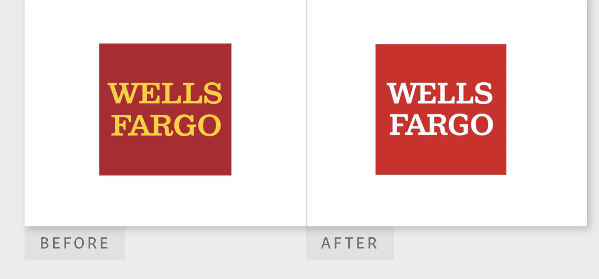
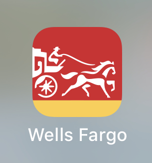
Wells Fargo App:
Wells Fargo Logo:
Hi Guys,
This is the year of large corporations changing their logos for the worst. What do you think of the new Wells Fargo? Looks boring to me
Wells Fargo App:
Wells Fargo Logo:
Looks like they were going for more contrast.
I don’t think it’s a fail, but it isn’t a prize winner either.
Financial companies need to convey an image of stability, responsibility and prudence. Boring, staid and buttoned-down for a bank is better than fun and daring — especially Wells Fargo, a bank mired in various scandals and fines over the past two or three years.
They needed to separate themselves from their recent past but not from their decades-old identity as one of the most well-known brands in the world.
I don’t really care for their new stagecoach icon, but as for the logo itself, it’s really not much of a change. They got rid of the yellow, which I think is good. They also modernized the typography just a bit without losing the character of the old type. As far as bank logos go, I think it’s an improvement.
This. I’m sure that’s exactly why they are looking for a new look. But, not too wild a change. They have been on quite the roller coaster. I personally would avoid them like the plague .. new logo or not ![]() LOL
LOL
I’m not quite familiar with their history but I think they’re doing great by updating their logo. I can see that there is not much change but the meaning of that little change gives new wave to me.
Something like they’re telling us that despite of everything we can always keep up and we are a stable and tough company no more no less.
It’s not that they weren’t stable.
They were dishonest.
Opening accounts for people already on their books who didn’t know they were being opened, just so the account agents could meet their quotas.
Not sure why they didn’t think people wouldn’t notice. More people should probably check their credit reports more often.
Other things they’ve done that garnered fines:
A new logo without color is not going to save them from that.
Judging from their ongoing series of separate scandals, the internal culture of the company seems fundamentally rooted around lies, dishonesty, thievery and cheating their customers. At this point, I’m unsure why anyone would do business with them.
I wouldn’t want this to be construed as “youngster-shaming,” (holy hell, I just old-guy-shamed myself by typing that), but call things “boring” is a hollow, non-statement that betrays a touch of immaturity. Was it supposed to entertain or excite you? Why? Why would Wells Fargo owe you that?
To be clear, I’m not saying your assertion is false or incorrect, especially if you find yourself bored by it. Personally, I don’t find it exciting at all either. My point is that everything isn’t either “boring” or “amazing”. In fact, I’d contend that if this is boring, then maybe 90% of graphic design product is at least this boring, if not more so. I shudder to wonder how boring you’d find the technical materials I create all day every day. Graphic design product can’t be evaluated that way; the only measure of graphic design that matters is whether it achieves the desired outcome; produces the desired effect.
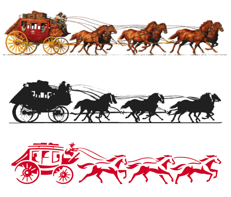
To me, it looks like the direction here might have been something like: “Let’s take our image back to its historical roots, back when our stagecoach stood for integrity, reliability, and forward movement. Let’s revive the venerable old identity in a more modern package.” In that sense, I’d say they pulled it off. I’m not sure I understand the gap in the wheel, or a couple of the other stylistic choices, but in any case, there’s plenty to see there, and it does remind me of their pre-scandal image. Boring does not preclude effective.
That stagecoach is only the app icon.
I wondered about that gap in the wheel myself until I realized it’s been made appropriately to be a stencil, for whatever reason. The gap keeps the spokes from falling out when cut as a stencil.
Otherwise, the red box logo is pretty much the same, though I think the kerning between the R and the G suffers a bit without the upward “serif” on the R filling that gap.
100 years to build a reputation. Less than one to totally ruin it.
It’s a more than that. The app icon only shows a part of a redo of their iconic stagecoach and horse trademark they’ve used as sort of a secondary logo for many years.
Wow, this is cool
The stagecoach reminds me of a time where my old boss would use live trace on everything, including stock photos
@Obsidian That is depressing.
B, that just makes it worse.
Those two lead horses are sloppily drawn. Not to mention the one nearest the carriage is trotting while the two on the right show some semblance of galloping.
Yeah. ![]() As someone who grew up around horses, there are some coordination and yoke issues going on there that would have them stumbling all over each other.
As someone who grew up around horses, there are some coordination and yoke issues going on there that would have them stumbling all over each other.
I think a lot of designs are trending towards the sharp, edgy kind of look now.
I think its alright I guess
I think logo should be meaningful and attractive, i didn’t like this so much but it can be good if you use different colors combination.
I’m sure you can let Wells Fargo know they should change up the customer-recognized colors they’ve been using for decades.
I think they should make it more attractive and eye catching.
For some reason companies of this size suddenly want to change their logo even though the end result turns out worse than the way it was?
It’s not terrible, but it’s very boring and I don’t understand their decisions.
Why change the color red and completely get rid of the yellow? The older red seems more classic to me. They could’ve given the yellow a different role.
I really like the horses with the stagecoach!
Represents trust to me because it indicates that they’ve been around for some time, their wikipedia says they were founded at least 167 years ago. They should’ve used this to their advantage with the new logo.
Someone got a nice paycheck for changing the colors I guess ![]() !
!