I am VERY new to design so looking for critical and really helpful advice and heard this is a great place to learn and grow.
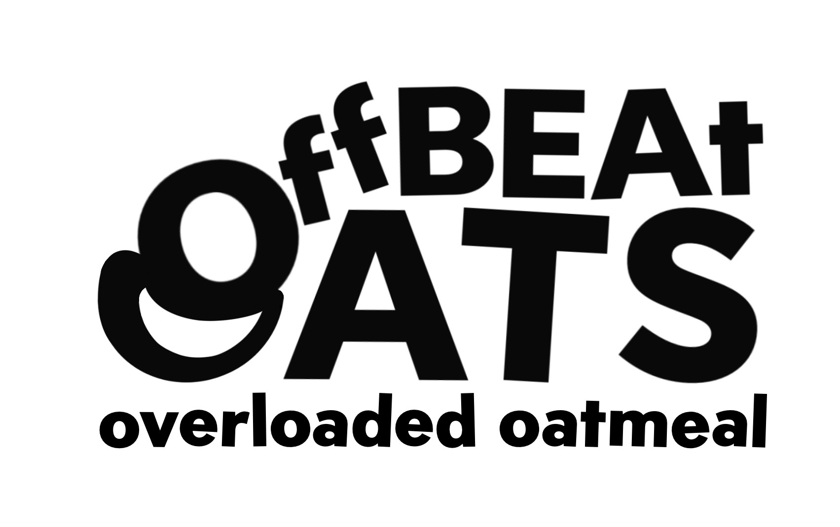
Working on a new logo for a new brand. Right now, hoping to play with typography to not only play on the word offbeat but also help to signify oats or the bowl from the O. I am liking the direction of this logo but feel like it could still be improved. Also hoping to end with a part of the logo that can be used as a symbol for other brand assets w/o needing the full name (example being the top O squishing the lower O maybe can be its own thing maybe?)
Here is a blurb on company position: We are offbeat oats, grain rebels and flavor fanatics. We believe your spoon deserves more than bland so we overloaded these oats with real organic freeze-dried food, hearty grains and unexpected deliciousness
Are you doing this as part of a contest or crowd sourcing website?
Just a crowd sourcing. I am just starting up and looking for advice from people in the industry.
Don’t participate in crowd sourcing or contests.
The tag is so crooked, it hurts.
Crowd source is exploitation at its finest.
1 Like
You’ve got a good starting concept, and it’s great that you’re thinking about how the typography can reflect both the name and the product. The overlapping O’s could evolve into a recognizable symbol on their own. Maybe try refining the shapes to feel more intentional or explore making the top O feel more like a spoon or lid to reinforce the food angle. It might also help to test how it looks at small sizes or in one color to make sure it holds up well as a standalone mark. Keep experimenting, you’re heading in a strong direction.