Nintendo Style Magazine WIP

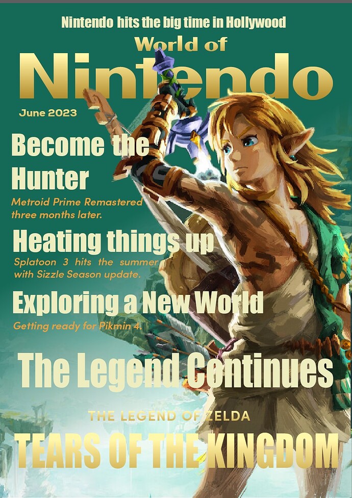
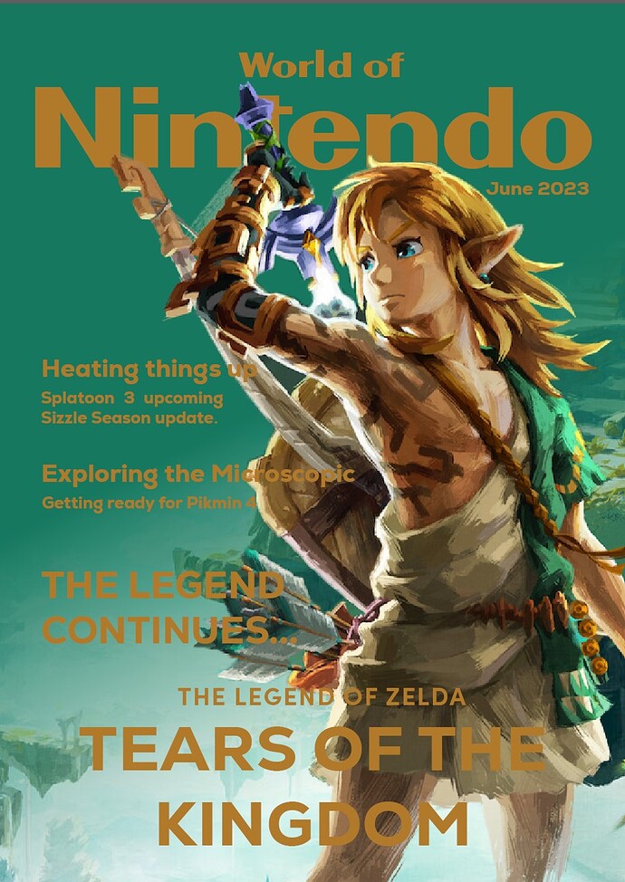
This is a personal project for portfolio building, I wanted to create a interactive magazine based off the Nintendo Power and Nintendo Dream Magazines. The idea would be craft a Nintendo style magazine that would inform and update video game enthusiasts regarding Nintendo News.

Feedback is more than welcome.

Two comments — both related to the typography.

I think you need more value contrast between the type and the rest of the layout. If you squint your eyes, it all blurs together.

Second, I’d be inclined to use a more interesting and less corporate-looking typeface.

Thank you for the feedback,

I was worried about the typography not being clear and I needed a second opinion, regarding the typeface, any suggestions I’m currently using Nexa

I don’t have any specific suggestions on a typeface because there are so many to choose from that could work. Instead of suggesting a typeface, let me expand on my first two comments.

The illustration is great, so I won’t spend time critiquing it. (Did you do it?)

I can see what you tried to do with the color of the typography. You wanted to make it match the general color scheme of the figure in the illustration. I think you should have made it contrast with the figure to make it stand out rather than blend in.

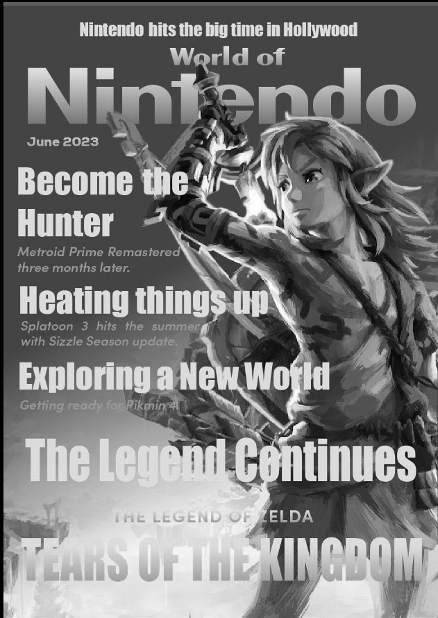
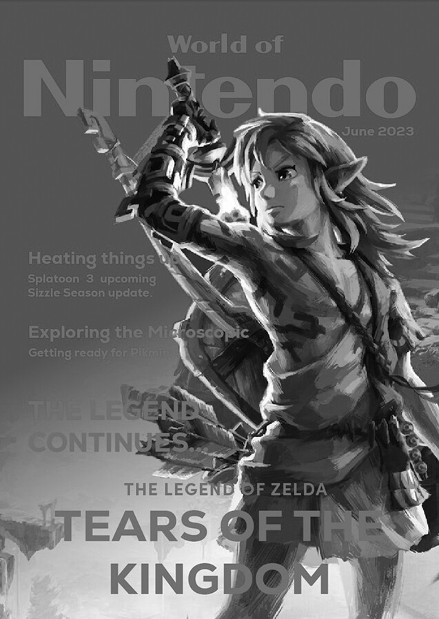
Similarly, there’s not enough value contrast (value being where something lies on a continuum of light to dark) between the typography and the other elements. Paying attention to value is extremely important. The best way to see what I’m referring to is to convert the cover to grayscale. As you can see, the typography almost disappears.

image

As for the typeface you used for the teasers, it’s a nice typeface, but as I said, it’s a bit too conservative and businesslike for the subject matter. Probably more important is that you’ve used it too conservatively. It’s a bit like you didn’t know what to do with it, so you just typed it in and left it that way. In addition, there’s way too much leading on the Tears of the Kingdom lines.

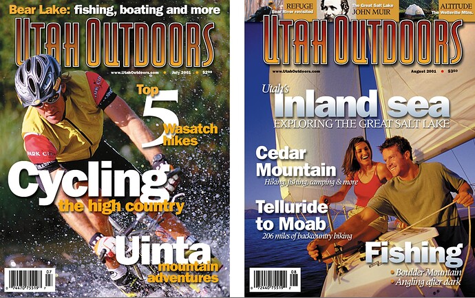
I don’t often use my work as examples here, but it might be a good way to show you what I’m talking about. I’ve designed tons of magazines, and here are two examples (from, oh boy, 22 years ago :grimacing:) that show how I used a conservative typeface — Franklin Gothic — in a not-so-conservative way with lots of value contrast.

1 Like

Once more thank for your feedback and advice, regarding the illustration no it not mine but official work from Nintendo, I intended to use the image as way to convey the importance of the recent iteration of The Legend of Zelda Series so I felt that the layout would work with it. As far as my usage of typography, I didn’t want it to become to distracting However after seeing your own work I’m more inclined to experiment and utilize it more freely. I also took to heart on your suggestion regarding the color for the typography and brighten it up to give it more contrast. I’ve done some editing since yesterday but I think I’m going to keep tinkering with the typography to make it pop more, once again thank you for the feedback and I’ll put everything you mentioned into thought as I make the necessary adjustments.

I would like to thank you for your feedback, I’ve done some adjustments and think I’ve made some progress, feel free to critique the new cover and if there is anything you can suggest feel free to make it known.

I’ve added a grayscale version in taking your advice

Nintendo World Magazine Cover WIP (Grayscale)

The cover is lacking hierarchy and focus. Everything is screaming for attention. Maybe this is personal opinion, but I don’t care for the green and gold color palette. It looks pretty drab to my eye. Keep pushing. I think you can do better.

Thank for your feedback, I can understand the lack of hierarchy and will make the necessary adjustments. The color can be adjusted but I intend to keep it around the green and gold as it matches with game’s own color palette. With the Hierarchy perhaps I can shrink the size of the teasers. and make them less prominent?

Regardless thank you for the feedback.

Everywhere the yellow lays over yellow or the white lies over white, it become illegible.
Just B’s suggestion of a contrasting color might work better.
Look at your handy color wheel. What color contrasts with the green or gold?
Don’t go too overboard against the muted tones of the cover though.

Yes, they are now too dominant, collectively, and filling all the available space. They should each be an independent burst of interest, with some breathing room in between. And there should be one that’s the focal point; most relevant to the cover visual. Right now you have that poorly positioned at the very bottom, with insufficient contrast between the type and the background. Also look at your alignment down the left side, and consider how much better it would look if all those items were left-aligned with the mast. I’d also tighten up all the leading.

Your second try is better than the first. Great!

Moving on, there’s still room for improvement. :smiley:

First, let’s go over the reasons for teasers on magazines. They serve three main purposes: (1) They attract interest on newsstands, (2) They entice subscribers to open the magazine, and (3) They provide additional options for creating interest when the cover art is less than great. I’ll add a fourth reason: people have just come to expect them since so many magazine covers have them.

However, these teasers are not a substitute for the table of contents — they shouldn’t be crammed into every empty space. In addition, they can easily turn a nice cover into a cluttered mess and create design challenges regarding hierarchy and integration.

With those things in mind…

You’ve stacked the teasers on top of each other as though they’re a list of what’s in the magazine. As I mentioned, the cover isn’t the table of contents. The teasers need to be dynamic and visually interesting, as well as a bit titillating or enticing. Stacking them up in a less-than-dynamic list is visually a bit dull.

The typography at the bottom of the page still has value contrast problems. If it were me, I’d eliminate a couple of the teasers and concentrate on what seems to be the main story: The Legend of Zelda. I’d also move it up higher on the page to get it away from the bottom. It seems a bit weird that the main story is at the bottom instead of prominently displayed in the best position.

The typeface you’ve chosen (is it Impact?) isn’t the most graceful typeface in the world. It has its place, but your magazine cover probably isn’t that place. Impact is better than the first face you chose, but I think you need something with a bit more grace and nuance — something more consistent with the mood and personality of the subject matter. Again, I’m not going to suggest a specific typeface because that’s for you to decide.

As @Steve_O mentioned, green and gold don’t come across as an ideal color combination. It’s a bit dreary for the subject matter. Then again, if that’s the color of the artwork you need to work with, well, sometimes you’re stuck having to make do with something that’s less than ideal. On my examples, we hired photographers and models for the cover shots, but this isn’t usually possible. Again, sometimes you need to work with what you have. However, for a cover designed specifically to flesh out your portfolio, you do have some options that you might not have at a real magazine, so you might want to explore them.

Pay attention to the underlying grid. Yeah, covers are a bit loose, but when an opportunity arises for aligning elements, use them. Look at the alignment of the typography on the left side: it needlessly zig-zags in and out.

For what it’s worth, all magazines intended for newsstand sales needs a 12-digit UPC bar code. Yes, they’re ugly, but they’re essential in the real world. Fortunately, you have a great spot to place one: in that lower left light space where you currently spell out TEARS OF THE

Also, what’s up with the double spaces in the line Splatoon 3 hits the summer?


Anyway, five hours later, I came back to say that I’m not meaning to be too critical because there’s much to like about what you’ve done. There are no failures as long as you’re learning and considering all the options (which is something I always remind myself about). It’s all part of the never-ending process.
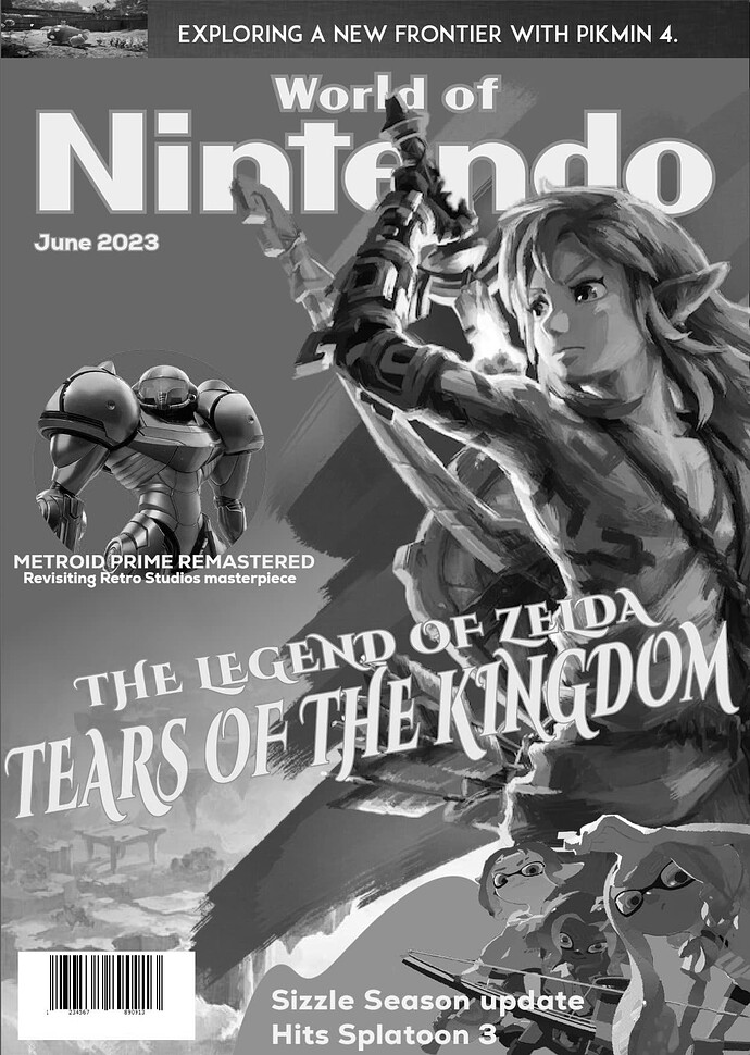
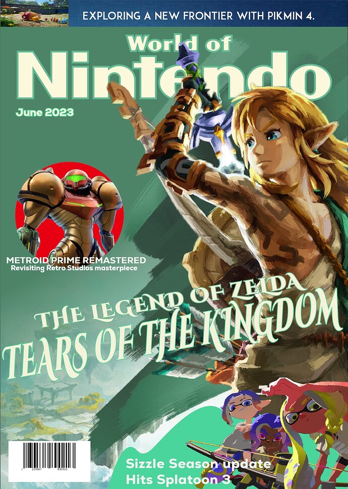
Thank you for being a help in this, I’ve really tried to take your advice (and thank you for taking the time to help a someone who’s green.), and use in my layout. I’ve tried to experiment with the typography, making more legible and dynamic to catch someone’s attention. Regarding color I’ve decided to change the palette to match with the game’s aesthetic. Overall this has been a challenge and I am grateful for the feedback I’ve received from this forum, so once again thank you for your help. Note: I know that I’ve haven’t posted in the last few days but I’m pursuing other creative endeavors also.

Anyway here’s the updated covers