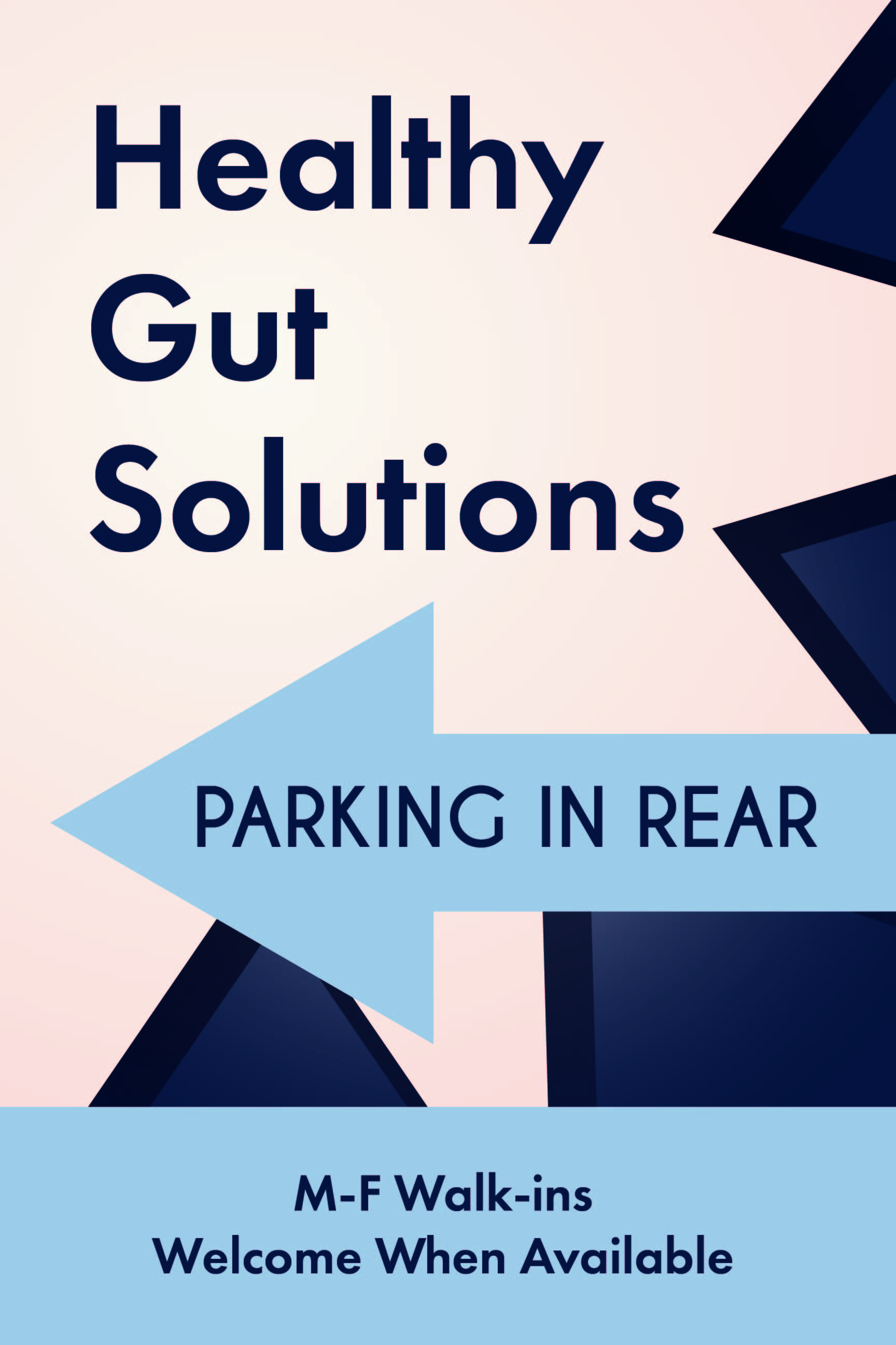
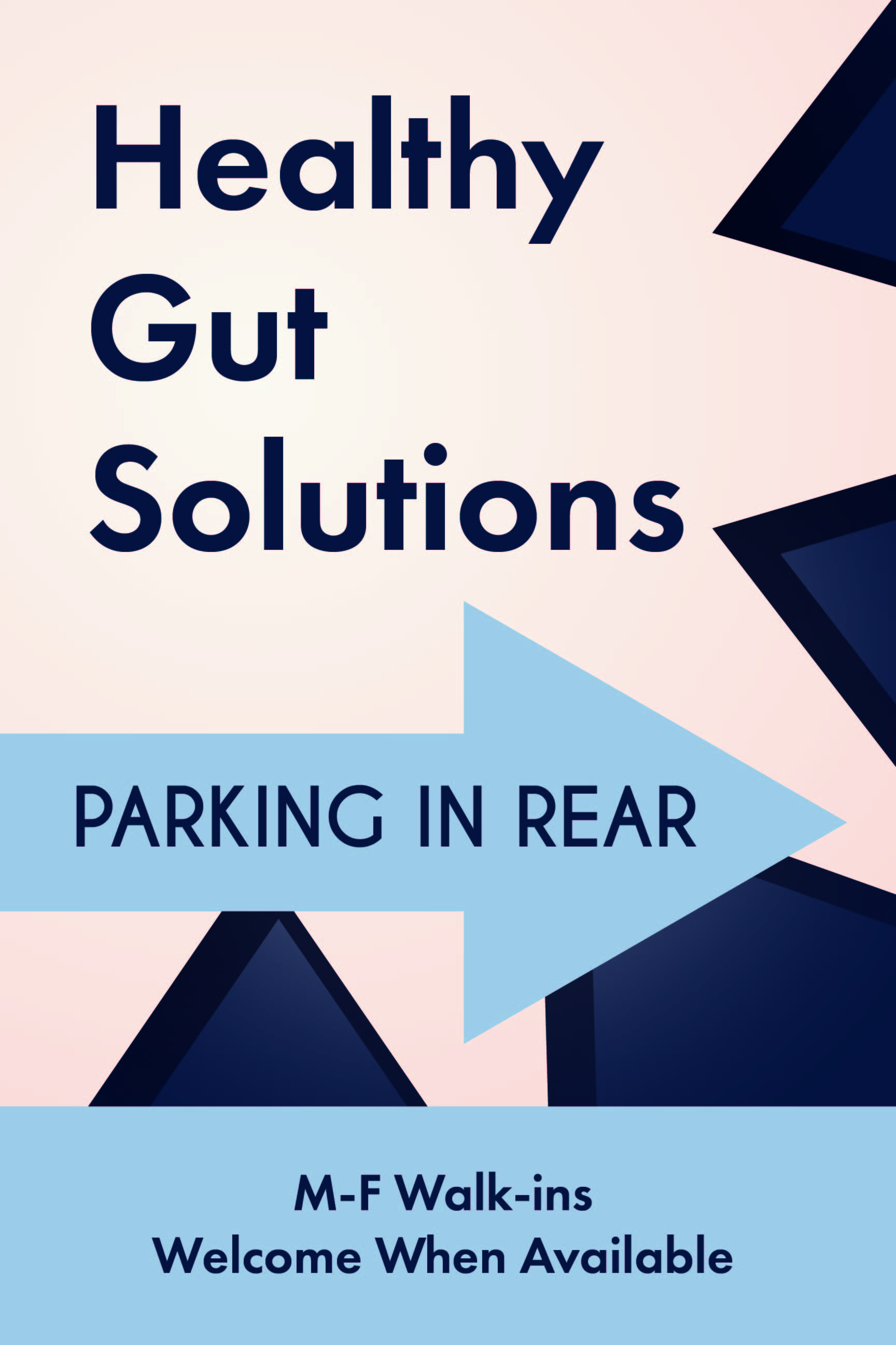
Hey, this is a low pressure post, but I’ve got this sign and I’m just feeling like it’s not hitting the mark. I’m in a bit of a funk, so I’m not sure if it’s just me feeling down, or if I’m missing something that’s off. I’m going to revisit it in the morning since the day’s almost out here, but I wouldn’t mind some feedback from other designers before I try and work it over again.
The design brief was pretty open to interpretation - it’s a 24x36 sign going into an A-Frame to be put on the side of the road so people can find the clinic and parking spaces. I was given a block of text, told it needed an arrow and needed to “pop.” With the exception of some emphasis lines around the “Healthy Guts Solutions” copy, I didn’t really have more direction for color or style, so I went to the clients website and used colors and fonts from there - and it’s a memorial clinic, so the style there is very soft and muted. Here’s what I’ve come up with so far - I’m sure I need to kill some aspect of this design, but I’m not sure what - had a passing coworker suggest centering the starburst and text, and using brighter colors, so that’s on the list of things to try. Of course, bright red and yellow might stand out phenomenally, but they’re probably not the best choices for a clinic on stomach health…
Again, there’s no real rush or pressure on this - I’m just feeling a little off about it, and wouldn’t mind some different takes on the same very simple concept before I come back to it.
(And yes, “Parking in Rear” was their choice of words, but that doesn’t make it any less amusing.)
Good design starts with an appreciation of the problem before proceeding to whatever solution best addresses the problem. With that said, I think you’re turning a basic traffic-management sign into something that it isn’t.
I’m assuming the sign is primarily meant to tell people where they can park, you’ve got lots of triangular shapes muddying the message in ways that seem a little chaotic and might take a couple of seconds to figure out. Two extra seconds spent on a parking sign are two seconds lost in making a split-second driving decision.
I have no idea what the “Healthy Gut Solutions” is all about. Is that the name of the business?
Blue isn’t really a color associated with traffic management, so that alone might cause the sign to not register quickly. If incorporating the business’s branding will help drivers recognize this sign is for them and will help steer them to the right parking location, that’s great. I wouldn’t, however, feel compelled to try to turn this into a piece of marketing collateral. It’s a traffic sign. Make it look like one. If there’s ever a case where form should follow function, this is it.
Agreed with everything @Just-B wrote, except for the comment that blue wouldn’t be suitable for parking signs. In most parts of the world, blue is the traffic management color that indicates parking, so I think it’s a perfect choice, especially if it also matches the color scheme of your customer. But I would probably make it the background color.
Another thing that irks me is that you did not include the customer’s logo. Does he not have one? Depending on the simplicity/complexity of the logo, including it might also help you to make it look more like a traffic sign.
IMO, the type isn’t heavy enough for signage meant to be read by drivers.
PARKING IN REAR is the primary message, but not at the top of the hierarchy.
“M-F” is a risky expression of Monday-Friday.
“Walk-ins Welcome When Available” leaves too much ambiguity; when what or who is available, and how would one know whether it is or they are available before attempting to walk in?
What is important here in the hierarchy?
→ Parking
Go from there
I also gotta say Monday thru Friday was not the first thing that popped into mind on seeing M-F
That whole section is unnecessary on a Parking sign
Check your alignments too. Parking In Rear should likely be centered.
And like B said, too many points pointing in too many directions for the 3 seconds people have to figure this out.
You have too much going on for wayfinding signage. Simplify, simplify, simplify.
It looks like you’re using Futura for Healthy Gut Solutions, some other sans font for parking in rear, and a third sans for the walk-ins copy. Mixing sans serif families rarely works out. Stick to one family for the type.
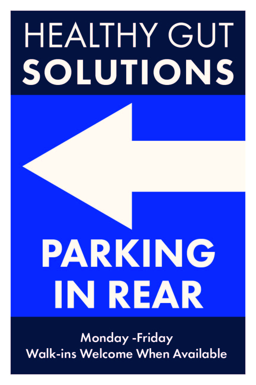
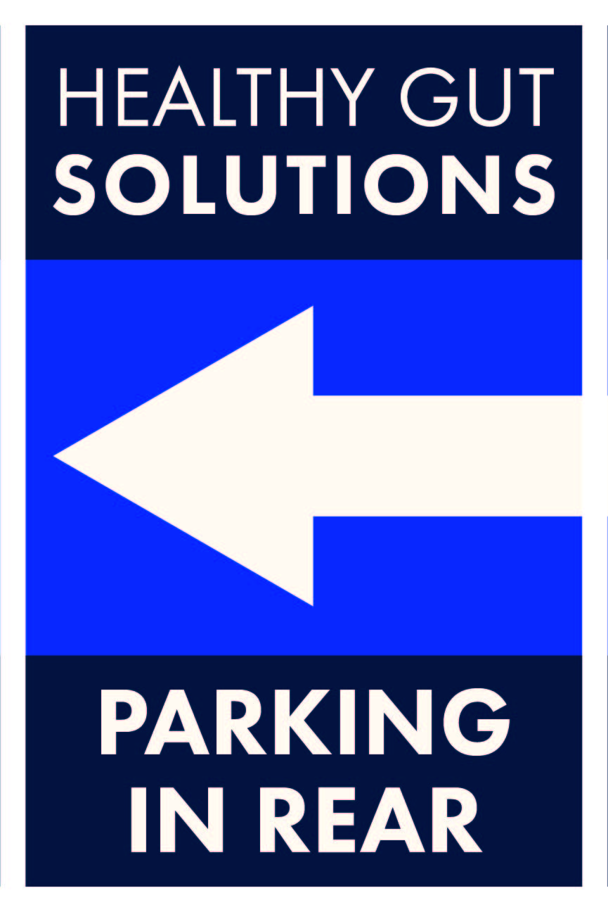
Thanks for the feedback - you’ve definitely hit the mark there, I definitely think I was trying a bit too hard to make it a branding image when it’s not one - or at the very least, I don’t have enough from the client to make it into one. As OVOAO asked, they don’t have a logo, near as I’ve been able to deduce, “Healthy Gut Solutions” is the name they’re using for a specific office inside the clinic, and the nearest the clinic at large has to a logo is a header in the font face Cinque Donne on their website.
I do still think having the emphasis on the “Healthy Gut Solutions” is the first way to take this, since they’re wanting to indicate this specific clinic location first, but I think the lack of a brand or logo for quick recognition I went a bit too hard in trying to make up for that, and sacrificed the rest of the sign readability in order to “make it pop”. I also agree with PrintDriver and HotButton in that the bottom chunk of text is confusing and unnecessary - unfortunately it’s part of what the client wants, so I’ll show them an option without, but I’m expecting them to insist on it’s presence. I will take the liberty of switching M-F to Monday-Friday on the type, though; you’re definitely right that in a medical context, the days of the week are not the first thing that’ll come to mind.
Having stripped it down and looking at it next to the draft I started last night, I definitely feel better about sending these out for review.
…I swear the blue is not that 0-0-255 it looks like on my preview after uploading here, not sure why that’s happening. Thanks for the critique, and if you’d like I can post back when I hear back from the client, just to see if they decide it’s not “popping” enough.
(just noticed the errant space after the Monday, fixed that on the draft the client’s going to see)
Why are you working in RGB?
And How are you having that sign produced? Cuz that light blue color borders on unprintable (according to my work monitor) I’m not even sure there is a stock vinyl in that color (I’m actually pretty sure there isn’t.)
I’m not, and I exported it in CMYK, which is why I’m not sure it’s looking like pure RGB blue, except maybe that my saved swatches are messing with the JPEG conversion on upload? The raw files on my screen looks fine, same on my hard copy proof. It’s going to be a full color print on Coroplast, and the blue mix is 97/85/0/0, if you’d like a more accurate preview on it.
The hyphen in that spot should be replaced by an en dash.
An en dash is used to represent a span or range of missing numbers, dates, or time. That’s just about the only use for an en dash, so don’t waste the chance.
If it’s going on coroplast, then I’m guessing you know the frame capture safeties (if it slides into something) Either you might lose most of that white border or the lettering might be very close to the frame edge. If it’s going on step stakes, print a bunch. It’s very tall and skinny.
These are so much better than the first attempt, @Kaegro!
I like the second one better than the first one though, because the text and the arrow have a better harmony in the second. If they insistent on the “Monday - Friday Walk-Ins Welcome When Available”, I’d still keep the arrow on it’s own color block. It’s nice and simple that way.
And to repeat what someone wrote above already: “Monday - Friday Walk-Ins Welcome When Available” is actually not a great way to put it, and I think “Walk-Ins Welcome” would suffice. I mean, when the joint is full it’s full, just like in my barber shop. And “Monday - Friday” is only necessary if they are also open on the weekends.
Aside from comments others have made, this is probably more to do with my juvenile, barrel-scraping, schoolboy sense of humour, but the whole ‘healthy guts’ and ‘parking in the rear’ makes for a bit of a snigger-worthy association. No? Probably just me then.
As it its a parking sign it might be printed on dibond (dont know if mentioned haven’t read the thread)
Keep that in mind that more colour could be more costly. Some places print directly onto the substrate. Others print paper and glue and laminate to the substrate.
I would find out what way and any cost factors in production first.
Most parking signs are single colour blue with white text. Or a white background with black text.
I’ve definitely done fancy parking signs before. Most important thing is the location of the parking. As people driving by looking for parking expect to see a parking sign.
DiBond is $$$. There are some knockoff brands about half the price, but you are still talking about 6x the cost of coroplast (at least here in the US) Plus the OP hasn’t really told us how this sign is standing. Usually a parking sign for an establishment is done on something far more durable than crappy coroplast which is meant for temporary signage only. Maybe this is just temp signage.
-shrug-
Either way, printing direct on the coroplast would be cheaper than printing on vinyl and sticking it to coroplast. The price for the inks would still be the same (and might even be done on the same machine.) Where multiple colors would get expensive is if this were being done in cut vinyl and applied. Where the OP said they were printing on coroplast, my guess is it’s actually direct on the coroplast. Can’t get any cheaper than that kind of outdoor print. But it has a limited life expectancy, and if used on step stakes in that config will bend over/crease in the wind. That’s why most of that kind of signage is landscape-oriented.
I’d have expected it to be a permanent sign that’s why I mentioned dibond.
Of course, plenty of options. It could be a swinging cafe sign for all we know.
It might be a poster in the window.
It might be an outdoor poster holder with a plastic front.
Questions well worth asking before proceeding.
Plus printing directly onto dibond isn’t as durable as mounting and laminating it.
All the OP said was printing on Coroplast.
Which surprised me as I expected it to be permanent too, in which case I’d have said, die cut vinyl on an aluminum sign blank rather than a print. Cost is relative. How many times do you want to pay to replace it.
Printing directly on dibond, the longevity depends on the inkset. but generally 3-5 years. Printing on vinyl with a lam then adhering it to the dibond all depends on the inkset AND the vinyl/lam combo used. Most UV inks for direct printing to dibond or equal are good for about 3 years outside. Add a lam you get to 5. Printed premium vinyls with a good UV-stable lam ~ 5-7 years max before you see noticeable fading. The cut vinyls, some of the premium ones are rated for 9 years, but I have a cut vinyl on aluminum sign on the outside of my building that I put there in 2005 and it’s only now about due for replacement. It’s been in the shade most of its life, so not a lot of sun exposure. Still, it didn’t peel or crack either.
At a previous job, we had a good-sized government natural resources client that needed lots of one-off signs similar to what we’re talking about here — signs for parks, wildlife refuges and various traffic/people management sorts of things.
We usually chose the substrate that the fabricator recommended. Coroplast was usually recommended only for temporary outdoor signs. For temporary or out-of-the-reach-of-passersby indoor use, FoamCore or Gator Board was sometimes used. DiBond was chosen for certain smaller signs — kiosks, interpretive panels and that sort of thing.
For most any medium-sized to larger sign, the solution was almost always printed on vinyl and glued to aluminum. For the really permanent signs exposed to the elements in rural area and subject to being riddled with bullet holes (a western U.S. thing), we typically went with an appropriate gauge aluminum with screen printing directly onto the aluminum. Screen printing on signs seems to be getting hard to come by, but it lasts much longer than the glued-on digitally printed vinyl that fades and can sometimes start to peel off after a few short years (or less) when exposed to weather and direct sunlight.
What always surprised me about any of these kinds of signs was the relatively inexpensive cost. For a one-off parking sign, I’m not sure the price of the substrate should be the deciding factor. Durability, if it were up to me, would be the reason one was chosen over the other. Then again, most of my experience in any of this comes from working with government agencies that have contracts with large sign shops and state prisons, so perhaps the rates I’m used to don’t reflect the true retail costs.