Hi guys! I did a logo design for two friends of mine and I would greatly appreciate some feedback from you!
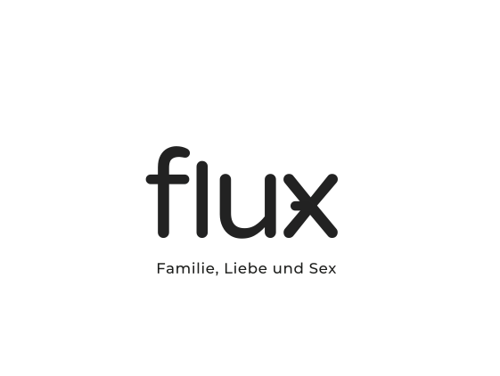
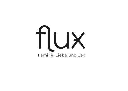
flux - Familie, Liebe und Sex
(english: flux - family, love and sex)
The background:
It`s going to get a bit explicit. I am sorry for this and hope to not offend anyone here!
They both met when they were working as midwifes and realized, that a lot of women and parents do have troubles with their sexuality after a child is born. And there are nearly no services that help or support people in such situations (here in Germany).
The two women want to start a workshop series for sexual education (this will be their focus), plus a sexuality counseling service.
It’s all still a bit in the process of finding and a pretty new idea. Also there are nearly no competitors.
In their work they wanna focus more on women and parenting couples (all gender). The workshops will include theoretical and practical elements but will NOT be about couple dynamics (psychological) and there will be NO explicit/sexual activities!
The Logo:
They asked for something that is not cliche, kinky or stereotype. It should look and feel as something official and professional, as they are trying to get in touch with various German institutes, through which they want to offer their services trough (for this it might even help, to have a bit of a „conservative look“).
The two women are very practical oriented and not spiritual or stereotype-women. So it should visually not go into a typical „girly“ direction (e.g.: not pink,- violett,- playful, …)
Also what they do is something new and something brave to address (a lot of people/parents find it very hard to talk about this issue). Something that is out of the line. Something with a twist.
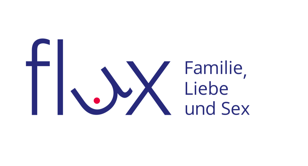
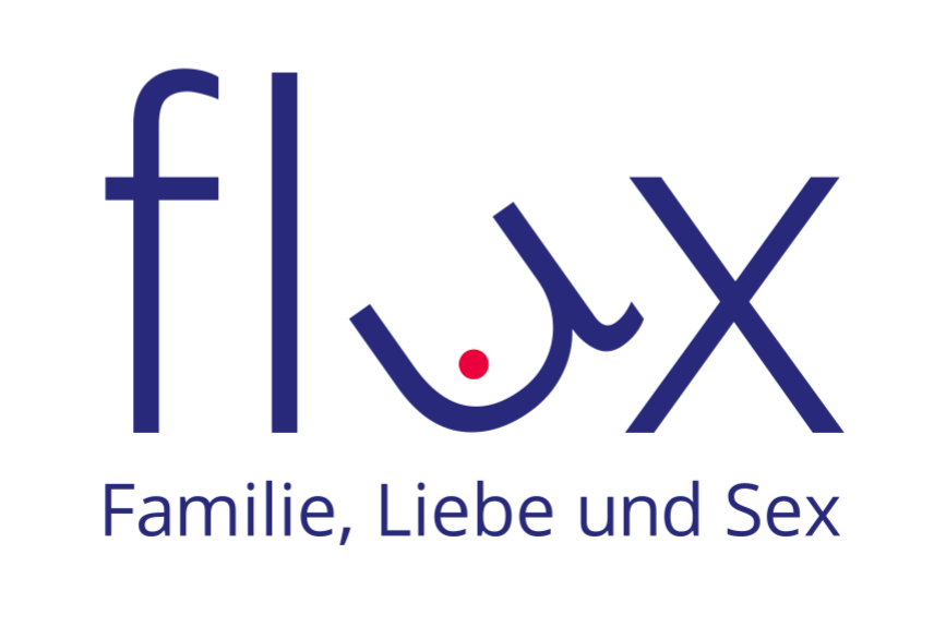
I found it pretty challenging to find something that implies sexuality in combination with family (including children! …).
So I thought about pregnancy and the the belly of the mother. Also about the breast, G-Spot, and about the forbidden, difficult issue (red flag, hot topic, …).
As they are still growing and finding themselves, I tried to keep it very simple, so that more characteristics can be added to the logo later on, if needed.
Me: I studied design, but haven`t done something like this in a longer time, so please show mercy ![]() Also this work was not a job, not paid.
Also this work was not a job, not paid.
I would really appreciate all kind of thoughts from you guys.
And sorry for being so explicit again!
Many thanks in advance!!!