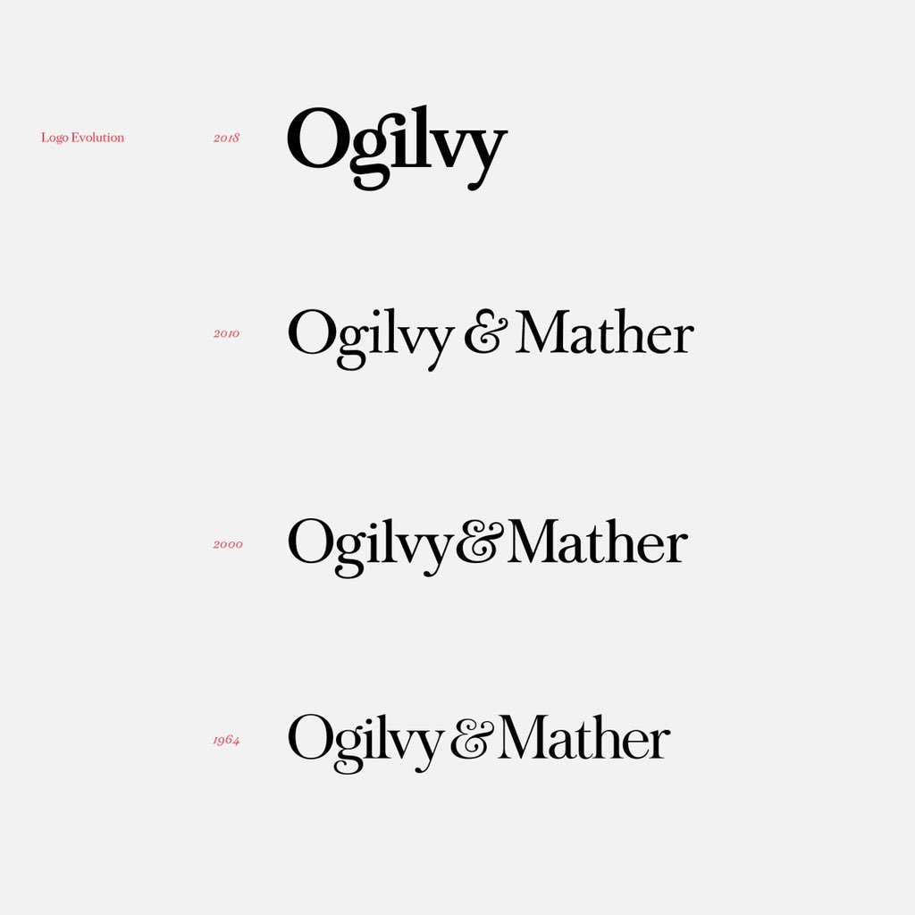
Ogilvy has introduced a new organisational structure and new brand identity. The newly integrated brand will bring together the three distinct units of OgilvyOne, Ogilvy & Mather Advertising and Ogilvy Public Relations, along with various company sub-brands and specialty brands, under a single, unified group with a common identity, positioning, client service model and P&L.
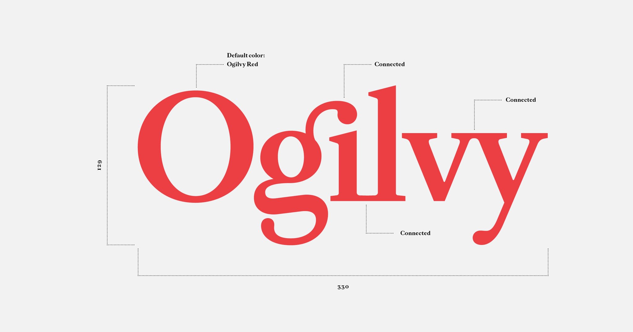
The new Ogilvy logo represents the agility, collaboration and connectedness that the brand is capable of delivering for its clients, according to the agency. “The iconic Ogilvy red has been reintroduced in a brighter Pantone and a secondary palette of gray, pink, blue and yellow has been added to emphasise the company’s desire to modernise, while maintaining, its strong heritage,” the group statement reads. “The Ogilvy fonts have also been recut and customised as Ogilvy Serif and Ogilvy Sans.”