Oh, thanks. I’m glad you liked it. I was delighted to have him on. I’ve always loved his books, newsletters and advice.
Setting up an LLC online is a quick, trivial and inexpensive matter in most states. Operating a business out of a separate legal entity, like an LLC or INC, is also standard business practice for anything more than a hobby.
Agreed. There are so many “freelancers” who don’t do it though, so I think it can also convey longevity, that you plan to be around a while and take it seriously (as opposed to a hobby).
This seems especially problematic when the business’s branding needs to convey a sense of warmth, style, friendliness or, case in point, passion.
Interesting point. Perhaps in those cases, if it does in fact need to be included, it could be handwritten or done in such a way that adds to and is consistent with the design and desired perception.
Just adding a couple pennies out of my own pocket on the Inc./LLC question:
To me, a logo represents a brand, not necessarily the company structure. Its purpose is to serve as the visual trigger of the market’s perception of the product or its maker. So, if I see branding that includes Inc. or LLC, the visualization that’s triggered is of the operation. The Movie “Monsters Inc.” was so very clearly about some kind of operation, rather than just about Monsters, and you knew that, even without seeing the movie itself.
So a law firm logo for Smith & Smith LLC (I see a lot of law firms doing that) triggers my visualization of their offices. For a law firm, that might be a good thing, but for a company producing consumer goods, maybe it isn’t. For instance (and this may be an extreme example for the sake of extreme example), if the proliferated Nike branding had been something like NIKE CORPORATION, and then news of their sweatshop-like operations became known, the brand association might have been enough to take them down. But because the ubiquitous swoosh visual trigger became much more strongly associated with its appearance on the premium products than with the setting where the products are made, the products remain desirous despite news of the company’s questionable practices. Apple anyone?
Anyway in my view, branding that includes Inc. or LLC, or whatever legal-entity designation, only works in a small minority of scenarios in which the operation is the desired market association. Otherwise, I’d say it clouds or hampers a brand’s potential associative strength by, figuratively speaking, “talking too much.” Imagine if someone like, say, Jackson Pollock signed his paintings Jackson Pollock, Paint Dripper.
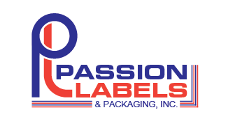
The .Inc is staying (for now). It’s a legal requirement according to the boss’s lawyers. Good discussion, but mute point for this logo.
Ms. Creative Boost, I read your articles for ideas and I really love the optical illusion “SPARTAN” logo. That is remarkable thinking imo. I believe most of your comments were addressed in my last post but if not, please feel free to jump back in.
Just-B, the hurdle isn’t as much in the name itself. I could make a very flowing passionate feeling logo but the client simply doesn’t want that. He wants it to be all about precision and he wants it clean and simple. I presented some softer ideas previously - no go.
The company was started by one guy after the printshop in which he worked closed their local office. It was an award winning company so he just took as many clients as he could and worked from home for 5 years. Printing is his passion - ergo the name. Our promotions are based around “What’s Your Passion?”. So the company name is not about passion as an adverb but as a noun.
I’m reigning myself in creatively a lot on this. Here’s the latest idea:
Well, the boss is the boss and the boss has the final say.
Judging from everything you’ve said, this sounds like a person who wouldn’t be inclined to like my suggestions, which wouldn’t be the first time (nor the last).
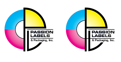
So with that said, your latest logo looks like a printer’s logo with all the clichés checked off: there’s the CMYK color scheme and the stylized registration mark. It even has the full legal, non-passionate passion name tucked into the initials.
Understood.
If the boss wants a generic printer’s logo for his generic bread and butter clients who pay the bills, I think you’re on the right track. That’s not a criticism of your work, by the way. Instead, it shows your adaptability to the circumstances (something I always have trouble with).
I would likely be inclined to remove the thin, black lines, however — especially the one that bridges the gap between the P and the L.
There’s also the potential of an overlap issue where the cyan meets the magenta. Trapping or choking that spot isn’t doable since it would produce either a purple or white line. In other words, the registration will always need to be perfect.
And then there’s the standard need for a non-grayscale, B&W version, which could be problematic.
What typeface are you using? Microgramma, maybe? Personally, I’d likely use a different face. Microgramma always suggests the 1970s or 80s to me, but then again that might be what the boss likes.
I get that the lawyers (ugh) insist on the inc. … but its not needed. I know you’ve lost the battle, but look at this fortune 100 list. None of them include inc., llc, ltd. etc.
Yeah, that’s how I feel about it too. No matter how much I want to go nuts and create the “Ultimate Logo” - he just doesn’t want that. This is truly a lowest common denominator logo. It needs to appeal to the guy who’s never printed before.
The 2 lines are there to create the “label” being printed from the circle of cmy… The one on the left has a really strong focal point at the P in Passion (yeah!). The one on the right has better flow through the design because it defines the “label” better and keeps the eye moving through the design. I could use either.
I’ll worry about the black and white part later if the boss chooses this one, but the gradient will def be replaced with b&w “something”. Or we may even just use the b&w part. Cross that bridge later…
The font is the Eurostyle family. It’s one of my favs because it’s a little Art Deco-y. Fonts are not my strong suit though.
Yep, but we’re a small shop. Fortune 100 are huge mega companies that are already in the collective consciousness of the populace. We have to take baby steps and slowly devalue the information we want to eventually get rid of.
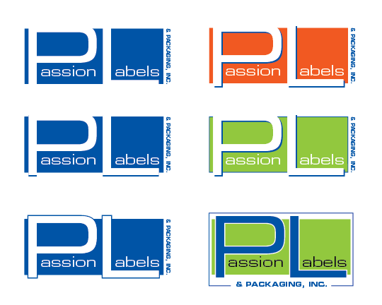
Here’s another that does it best of all the designs so far:
Agreed. I may have to work a better solution for use when smaller. It might be as simple as just using 2 lines instead of 4. The colors might change too…
I got the motion that I wanted though. The P being the press roller. L being the label. The alternating lines imply the box (package).
I haven’t even started with embellishment yet though. Still in the rough stages and very flat.