Updating the branding for our company over the next few months. So for everyone who’s been annoyed by me in the last few months has their chance to dig in. Go ahead. I can take it lol.
1 Like
I’ll be back in a couple days to see how many new holes you all tear into me lol.
A few questions…
- What type of collateral is the logo going to be placed on? (rhetorical question)
- Is there a little more background on the company?
- I get that it’s a “Labels & Packaging” company, but what is the ‘PL’ (other than the initials of name) represent?
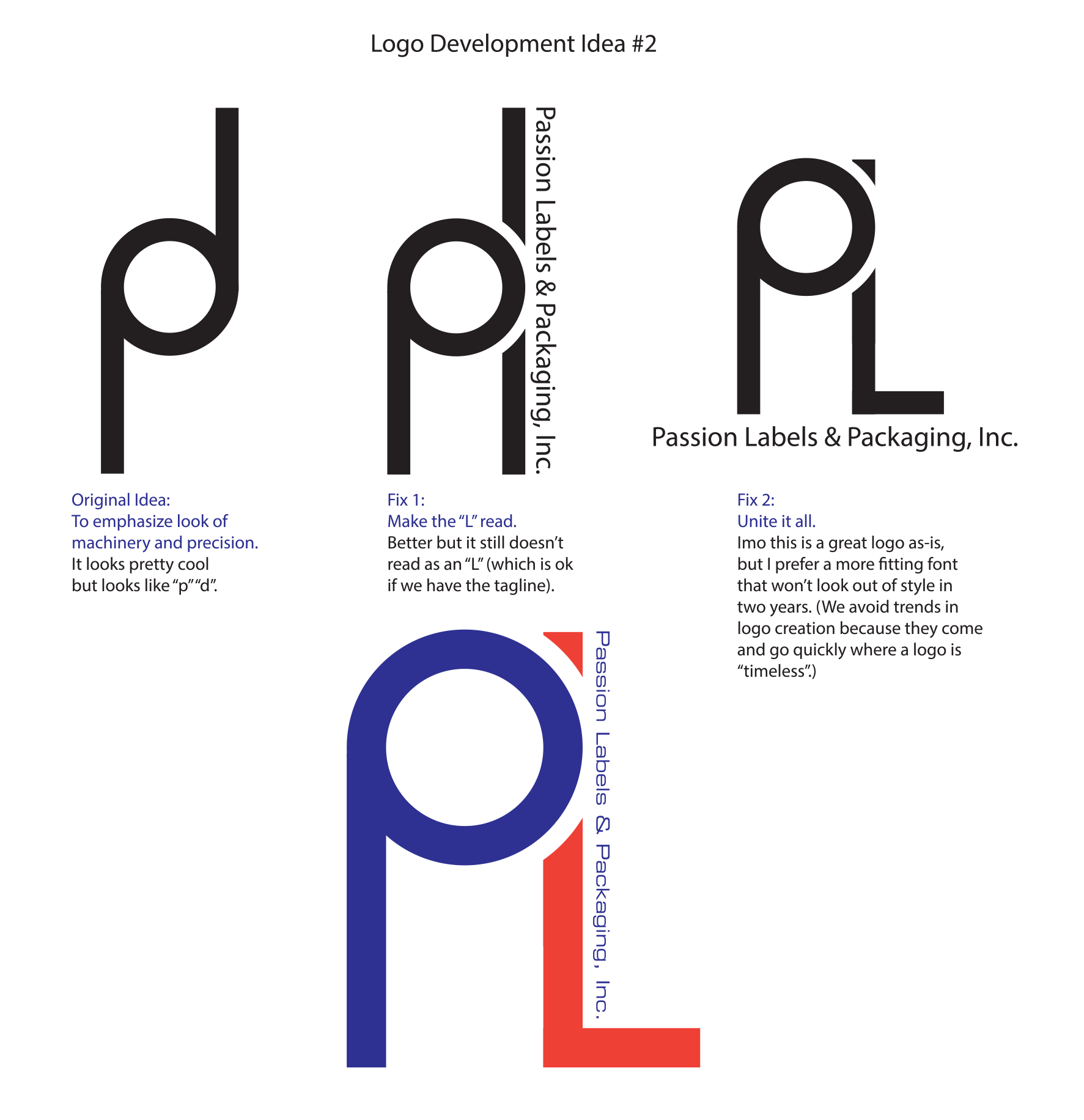
Similar to what Sparrow mentioned, the stylized PL begs to be interpreted as something that represents some aspect of the company. After studying it, however, I’m thinking that it’s just a stylized PL that probably doesn’t say anything about labels or packaging.
Also, I wouldn’t be inclined to incorporate the name of the company in tiny type, like you’ve done. The company is important (more important than the logo), and should probably stand on its own as a separate design object rather than being integrated into the trademark.
Okay, you said you can take it, so here goes.
For my initial comments, I’m just going to be addressing the PL monogram.
Technically, it’s okay. It’s simple, easy to reproduce, would work on a wide variety of mediums, works in black and white, and it’s limited to two colors. So, bravo, you hit a lot of marks.
While I said it’s technically okay, it’s also aesthetically okay. And that’s the problem. By that, I mean it’s only “okay.” It’s not very engaging or creative.
My suggestion would be to step away from the computer and spend much more time sketching and brainstorming on PL monograms. Work up some ideas with a capital P in addition to the lower case p.
I am sure you can come up with something more interesting.
If you choose to keep this design, the type needs some work. Neither option (type across the bottom or the type up the L) are working. Make sure you pay attention to how the type meshes with the monogram. Also, the size of the type to the size of the mark is off. I think the type needs to be quite a bit bigger.
I’d almost be inclined to calling out Passion more, now I know hat could be dangerous since Passion by itself may be misconstrued, but I think there may be some benefit to something along the lines of
PASSION
Labels&Packaging
Combined with a logo mark in some way.
I think the initials by themselves, the way that you’re treating them aren’t doing any favors. Especially the ones where the foot of the L extend out somewhat awkwardly. I also would not officially include, inc. in the logo unless it’s “vital”. This website briefly communicates why I would remove it.
Going back to my advice on focussing on passion, its because in that case Passion is an evocative and memorable word. PL is bland. I think of somebody like UPS. United Parcel Service is bland, as is International Business Machines (IBM). The reason they probably go by initials is 1) brevity and 2) memorability. Just my 2 cents.
2 Likes
A lot of good points made here already. You can have your logo bug, or initials, etc, but make the company name visible. Whatever simple, distinctive mark you come up with might see limited usage by itself sometimes, but you should focus on including the name in a meaningful way to begin with.
About the only thing I’d have to add is that on a personal matter of taste, the letterforms aren’t doing much for me. Especially with a name like “Passion” these seem rather sterile and impersonal. Your brief mentions emphasizing precision and machinery, but for a label company I think you want a friendlier tone. An effective label invites you to take it off the shelf. Your company may be precise and high tech, but you don’t have to convey an industrial tone.
I’m replying to my original post, because I cant figure out how to edit it.
A few more questions, just out of curiosity. Why have you neglected the ‘P’ in packaging?
I was thinking should the logo not be ‘PLP’ or ‘PL&P’ as oppose to ‘PL’. Is “Passion Lables” more important than “Packaging” or “Passion Labels & Packaging”?
Do you see the pencil icon beneath your post, like the one I’ve circled below? New forum members might not see it, but you’ve been here long enough that it should show up. If not, I might need to adjust the settings.

Doesn’t the ability to edit time out after a bit?
Oh, yeah, that’s true. Nevermind. ![]()
I keep forgetting that I have a different set of editing permissions than most.
I was confused (that I didn’t see the pencil originally) than excited that there was actually one when I saw the image you posted. Then optimistic that it would be unlocked (like some of the badges) at a certain level of posting. Then utterly crushed…
1 Like
Thank you all for your input. All very good points.
The logo we have now is really boring. It’s the standard stacked name kind. With Times New Roman on top and Verdana on the bottom. ugh.
PASSION LABELS
& Packaging, Inc.
As far as the style not really fitting the word Passion: Yeah, that’s a hurdle because the name of the company doesn’t really fit the industry. That will be an ongoing problem I have to work through on the roughs. (This is just one of 5 styles so far).
I will be back again to respond to the comments. But quickly:
- this is a symbol version only. We’ll have a whole family of logos for different uses based around whatever style is chosen.
- Yes, the text is waaaaayyyyyy too small if this is printed as a business card logo or such.
- I have no problem with how the l sticks out. In fact, I believe it helps with the movement of the piece from left to right (since so much is vertical).
- We’re Incorporate under the full name, although we are trying to dump the “packaging” part over time so we are de-emphasizing that over time. I’ll show another style soon to show how the problem was solved in a completely different way.
- Is it too bland or cold? Maybe. My natural style is very bauhaus - clean and crisp. But that comes off as stiff in design sometimes. I have a couple former colleagues looking at these for exactly that reason.
- The owner of the company is excellent but he’s not an artist at all. He made the logo in Word. Though it’s been recreated in photoshop and Illustrator, it is “eh”. It would be easy to take it way too far too quick.
Thank you all again for taking the time.
As far as the logo is concerned, I don’t think the name is a hurdle at all. It’s an opportunity on which to base the logo. Just because the industry lacks passion, doesn’t mean the logo needs to reflect that lack of excitement.
I see nothing wrong with something warm, friendly, bright and passionate — especially if it helps the company stand out as a little more interesting than its dull, boring and non-passionate competitors.
I would, however, be inclined to drop the “.inc” from the name. That might be part of it’s legal name, but it doesn’t need to be part of the branding.
Others have made some great points. A huge issue is the size of the letters relative to the words. They don’t work as a group well. Once everything is scaled down, then the words will be too hard to read.
What I’ve always been told by lawyers, when it comes to LLC and Inc., is that you must incorporate them into the logo.
I would focus on “Passion” more to distinguish the company from others in the industry and make it more memorable. I would brainstorm—on paper—some words that represent “passion,” “packaging” and “labels” and then see which of those things could visually be combined to represent “passion” and “package” or “passion” and “labels”—meaning figure out how you could cleverly merge two icons that represent “passion” and “package” or “label,” i.e., flame or passionflower with a ribbon, box or label (curved a bit at the edge as if it’s being pulled off a sheet).
After consulting their attorneys, people should always decide for themselves, but here’s a brief summary of my non-lawyer opinions and anecdotal experience.
I’ve talked to attorneys about this very thing too and gotten similar advice to yours — even so far as them suggesting that the business pronounce its full legal name when answering the phone. Many (if not most) lawyers tend to err on the side of excessive caution instead of offering practical advice.
When asked the same question over beers after work, I’ve been told by two separate attorney friends that it makes no practical difference in trademarks, trade names and most marketing materials. As long as the business entity refers to itself by its full name in most other instances and that there’s no credible possibility of someone seeing it as an attempt at deception, it’s extremely unlikely to ever cause a problem.
As evidence, look at the logos of every big corporation. None of them, from Google to Starbucks to Adobe to, well, any of them, place their full corporate names in their logos.
For even more evidence, call up a few attorney websites that have logos. I just did so, and in a brief search didn’t find any with their entire legal names spelled out in their logos.
If a business is still antsy about it, it can always register its trade name as a DBA for a few dollars.
- https://indielaw.com/llc-need-included-companys-logo/
- https://llc-made-easy.com/logos-and-llc.html
- https://www.bradmillerdesign.com/does-my-company-logo-need-to-include-inc-or-l-l-c/
- https://andiamocreative.com/does-my-logo-need-to-include-llc/
In fairness, there are other websites (some by attorneys) suggesting that the full legal name always be used in logos. In light of all the evidence to the contrary, I don’t find their advice especially credible — especially when weighed against the cheesiness of including it.
It’s just a personal reaction, but to me, including .inc or .llc in a logo screams out that the business is a small-time operation, which isn’t a desirable message to convey in a logo.
It’s just a personal reaction, but to me, including .inc or .llc in a logo screams out that the business is a small-time operation, which isn’t a desirable message to convey in a logo.
I have the opposite opinion. I think paying and going to the effort of creating an LLC or Inc. actually adds credibility and don’t think it conveys anything about the size. A lot of smaller operations tend to go the way of an LLC but there are larger companies that do it too.
Interesting about what you found about the lawyers not necessarily taking their own advice. ![]()
That’s an interesting perspective. I’ve never seen any research into how those letters in a logo are perceived by most. It would be useful to know, but I suspect nothing exists along those lines.
Setting up an LLC online is a quick, trivial and inexpensive matter in most states. Operating a business out of a separate legal entity, like an LLC or INC, is also standard business practice for anything more than a hobby. So those letters in a logo, at least to me, suggest little about credibility or effort. Instead, I get more of a gut-level inference about a certain naiveté or small-time thinking regarding their marketing or, um, coolness. This seems especially problematic when the business’s branding needs to convey a sense of warmth, style, friendliness or, case in point, passion.
By the way, I found your latest Podcast with Cameron Foote especially useful and interesting. Highly recommended.
1 Like