Hello again.
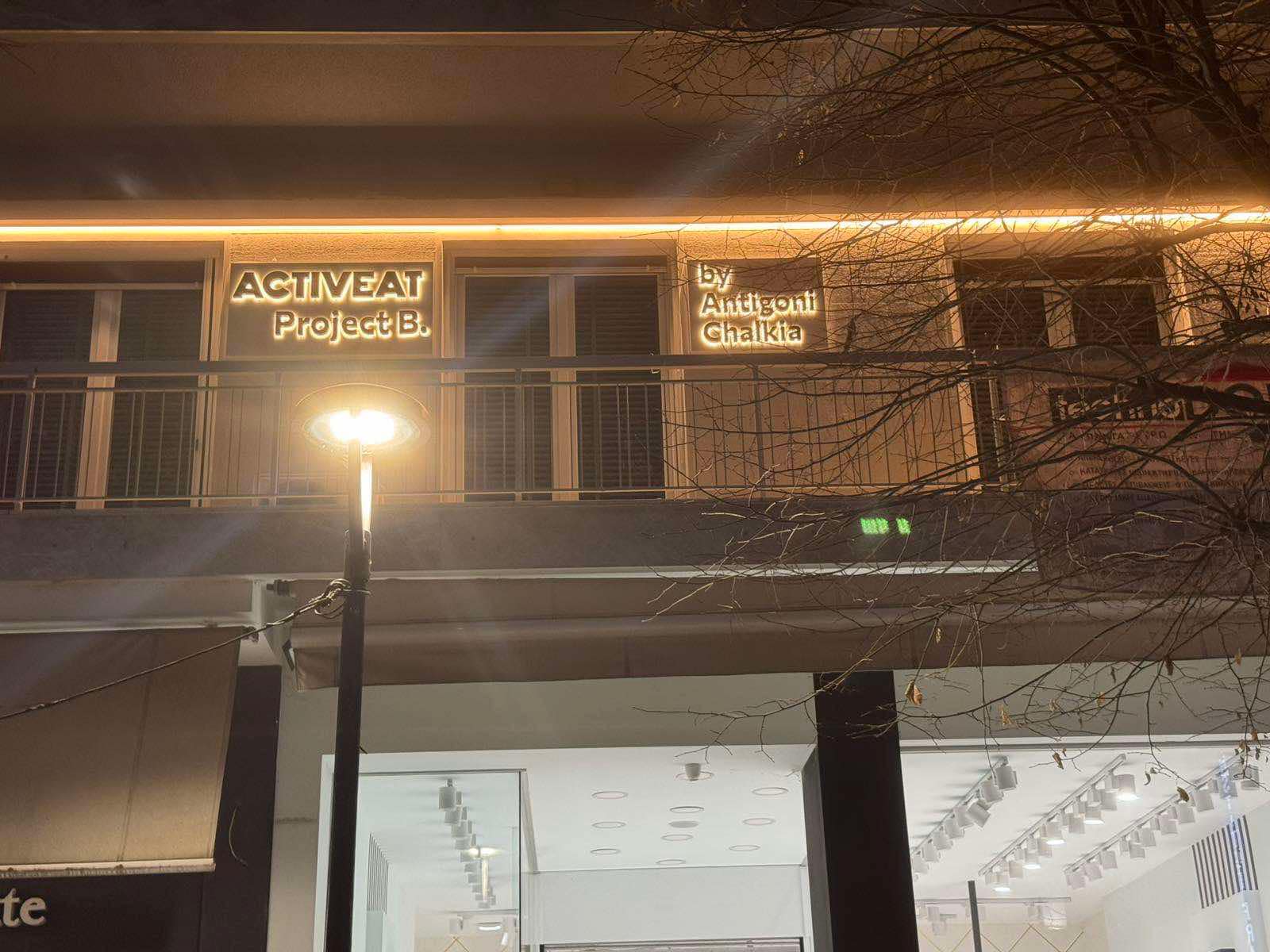
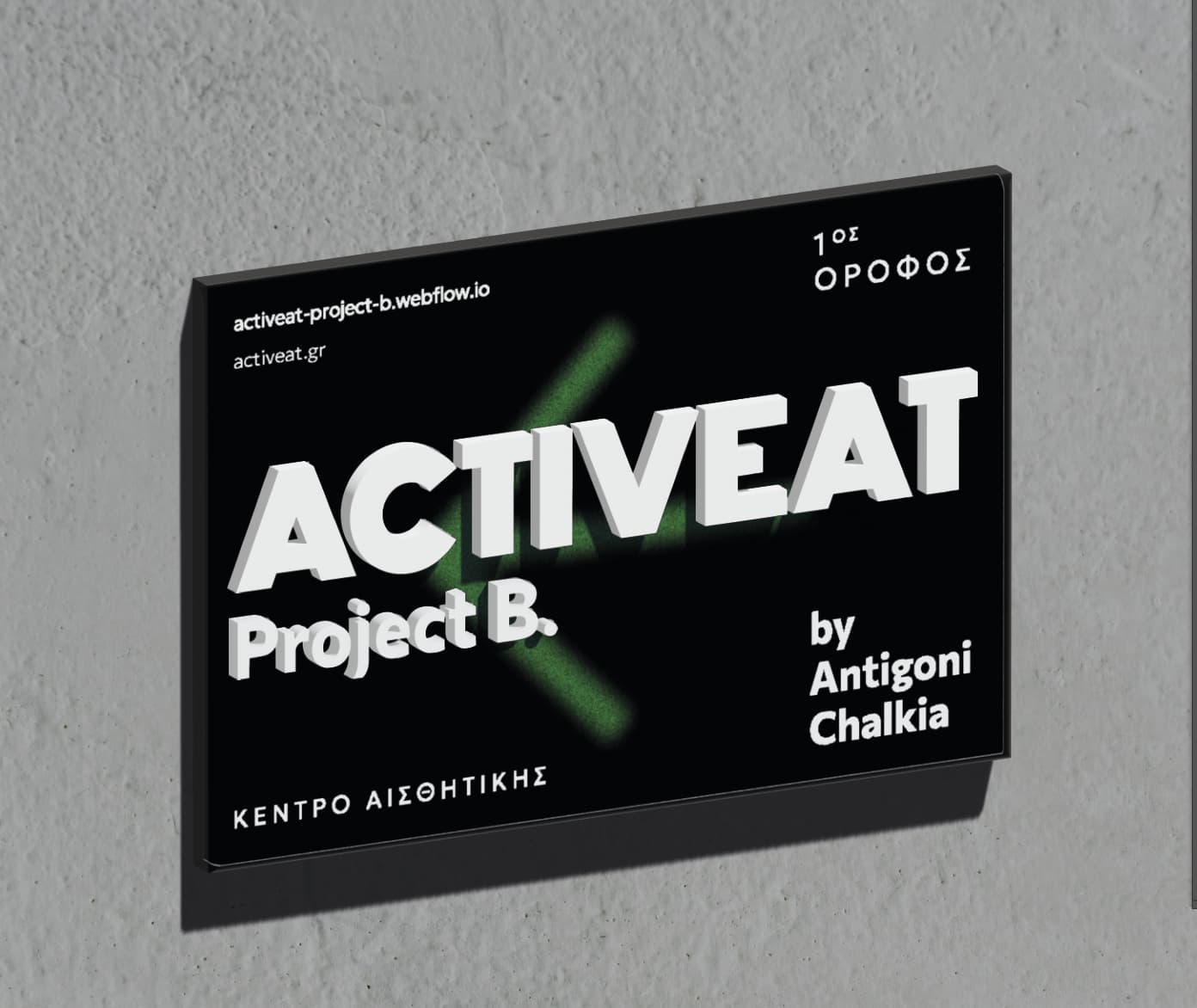
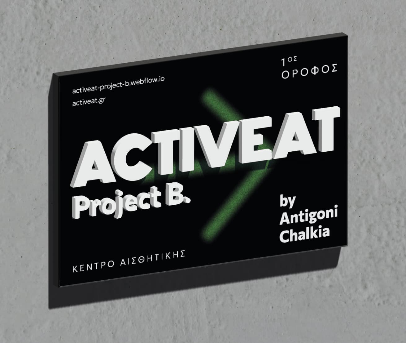
A client of mine (among many other things) asked me to design two entrance signs for her business (a beauty center/ nutritionist) I designed the labels for the external walls of the building and she was very happy with the result. ( She wanted as big as it could be). The word “ACTIVEAT” is green during the day, this is a night shot so it looks black. The rest of the letters are white.
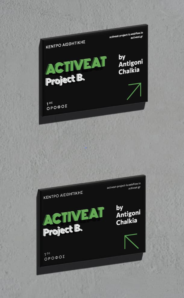
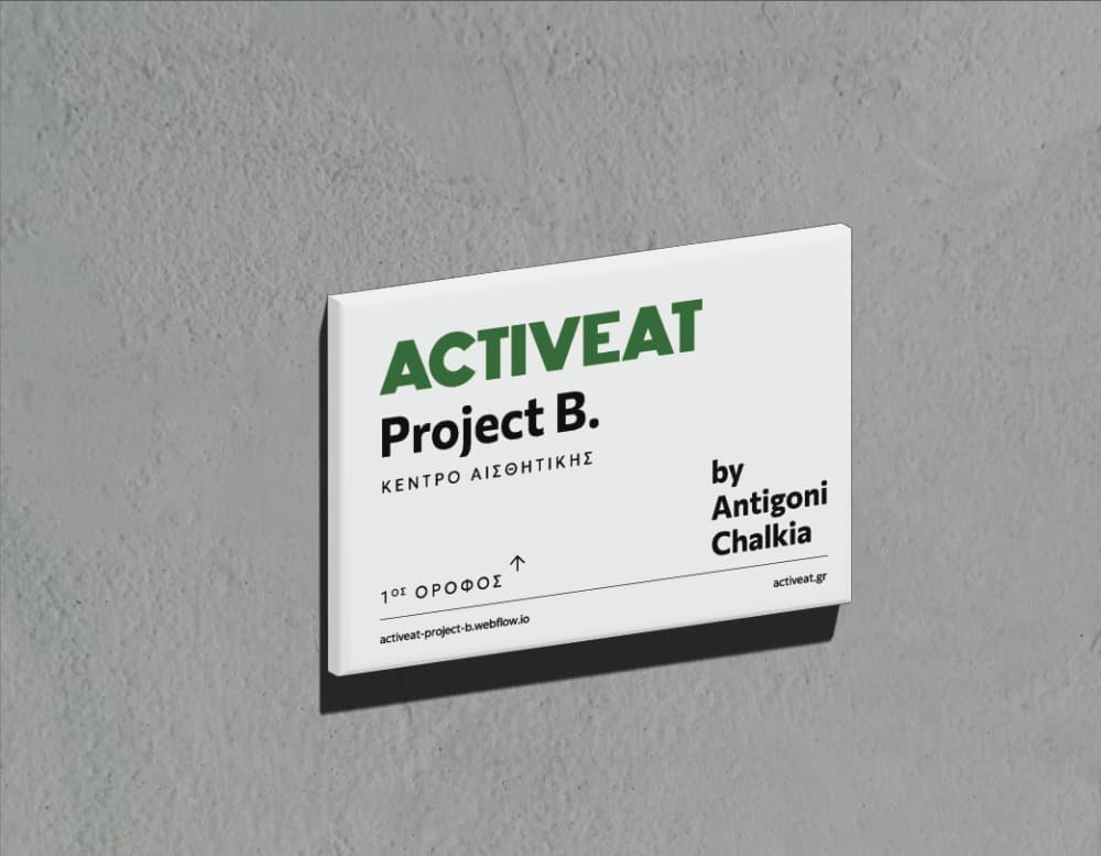
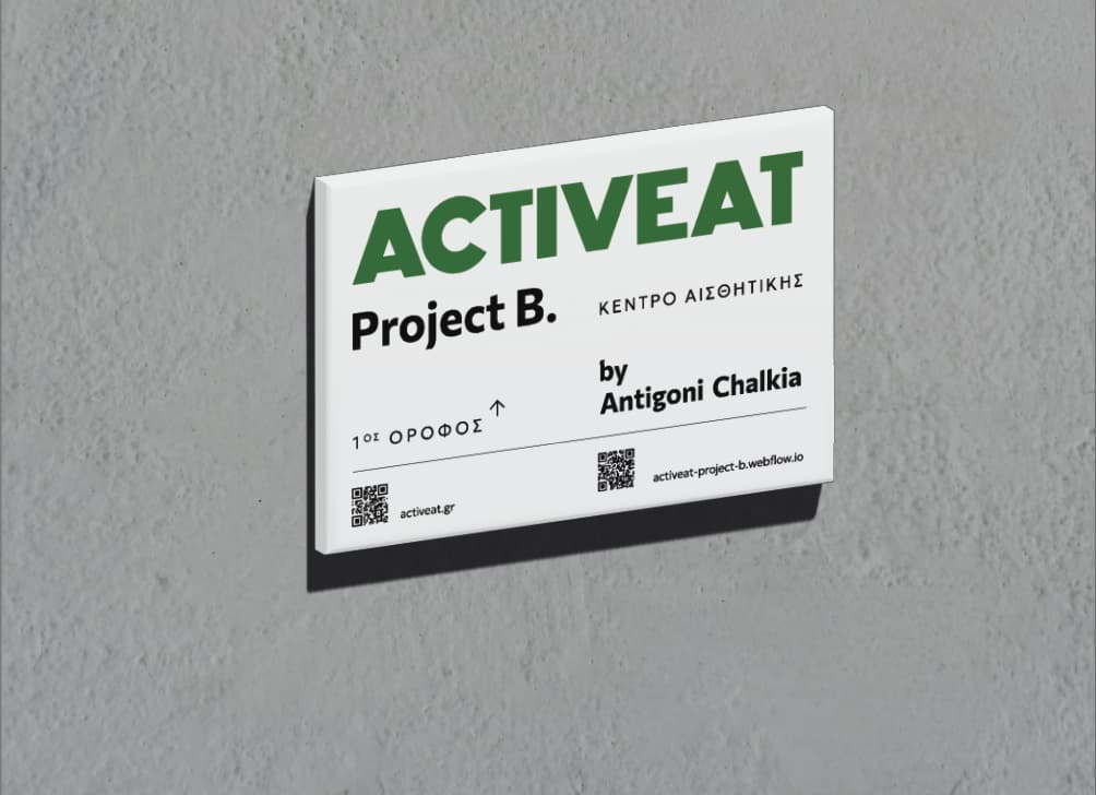
Now she wants to design the entrance labels (the business is on the first floor). But she is not very happy with what I show to her. The colors of the brand are white/black/green. The dimensions are 25 X 37cm.
None of them match the layout of the outside sign, Project B is right aligned to the ACTIVEAT on the outside.
Honestly, nothing really wrong with any of them - what don’t they like, what is the feedback?
Maybe find some options and ask them if it’s on the line of what they’re looking for, you know more about the brief than I do - but a quick look for DIBOND entrance signs or business directory dibond signs etc. brings up examples that you could potentially show and ask if it’s more in line with what they’re looking for.
Regarding “Dibond”, the brand name has become a common placeholder like “Kleenex.” If you pay for Dibond (spendy) be sure they aren’t subbing any number of other nearly comparable brands (or worse, one of the non-Class A fire-rated brands…)
Ah yes, but it’s a good search term for google and of course it might not be on that substate when finished.
Actually found it a strange one to google, and didn’t hit many results until I tried dibond - but if you have any other suggestions or keywords it would be great to hear them.