I am creating a logofolio.
The dilemma I have is about the text down left in relation with the green stripe.
Is it that bad to have the text overlapping the green stripe?
All I want is to create a second focal point down there leading the viewer to read it.
1 Like
In my opinion you should be more concerned with the readability of the tagline under the logo.
2 Likes
I’ve seen words overlapping color blocks many times. I think it boils down to personal likes. Sometimes it look ok and sometimes it doesn’t. I’m also with ES on that green font color. It’s light enough that it’s hard to read. Maybe a shade or two darker would help ![]()
2 Likes
I didn’t notice the type in the lower-left corner until I reread your post. It almost looks like the kind of small print that people skip right past — at least I did. I see no particular problem in overlapping the type with the color bar, though.
1 Like
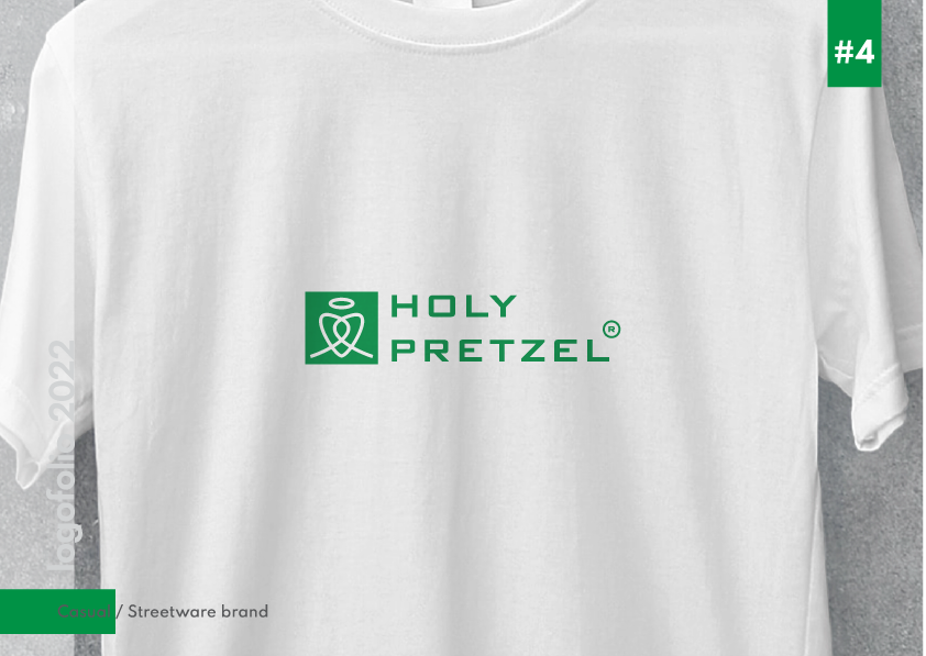
Maybe I should go for a grey tagline, or change the font to make it more readable.
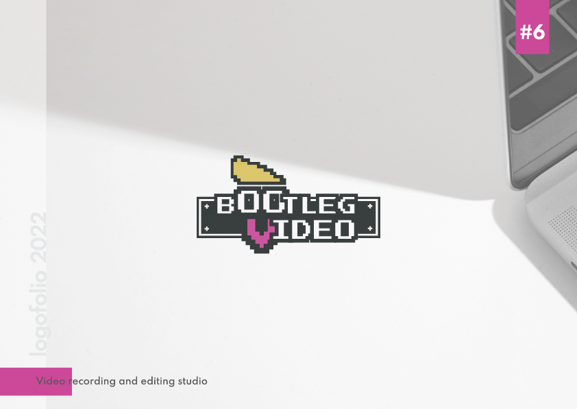
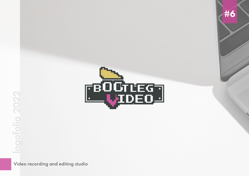
I’ll share with you the rest, to check if this overlapping text triggers any OCD (a friend of mine who is a fashion designer told me that) especially for the bootleg video case.
Keep the text off the color block. Especially if you are splitting words with it. Not a good look.
Are these logos real? Do you have any detailed Branding guides and other collateral to go with them? Or do you ‘just do logos.’
1 Like
all these are actual logos for clients.
As I mentioned in other topics, I have a simple questionaire that I ask clients and I try to understand their needs and their targets.
Unfortunatelly, most of them just want a logo and then they do whatever they want with that, as they are not willing to pay for more. The classic request is " a logo and a business card, how much does this cost?"
If I try to explain them the value of the brand indentity they think that all I want is to grab their money.
Because proper branding need a meticulous and time consuming research before even start sketching, I wouldn’t do it for 100 dollars.
An example:
I made the logo but not these. I think she made them by herself.
I agree with ER, RedKittie, and Just-B’s comments. Never, ever, forget that logos or any advertising/marketing project is all about COMMUNICATION. If anything does not communicate it is worthless. Second is to make sure all elements of the project co-ordinate and compliment each other in terms of size, font choice, and color — and ALL of these are contingent upon the creative brief and target audience.
Thank you for your answer.
So you think my logos do not communicate?
Or do you mean that a logo by itself means nothing? That someone should show the whole brand identity and all applications?
I’ll appreciate any critique.
No. You misunderstood. Good design sells something. If it doesn’t communicate it doesn’t sell. And if sells then you keep the client. And if it doesn’t sell, you lose the client—no matter how artistic and creative the design appears.
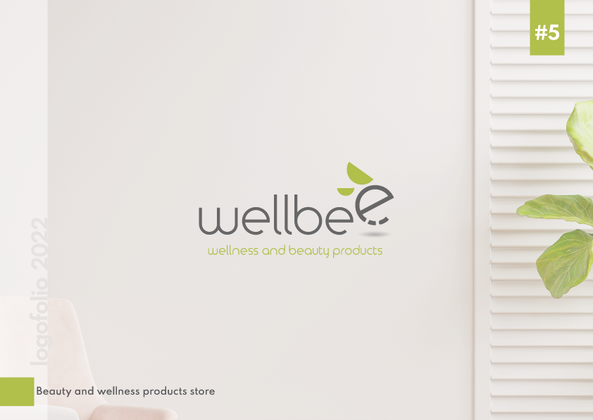
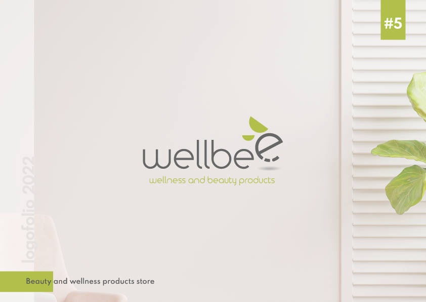
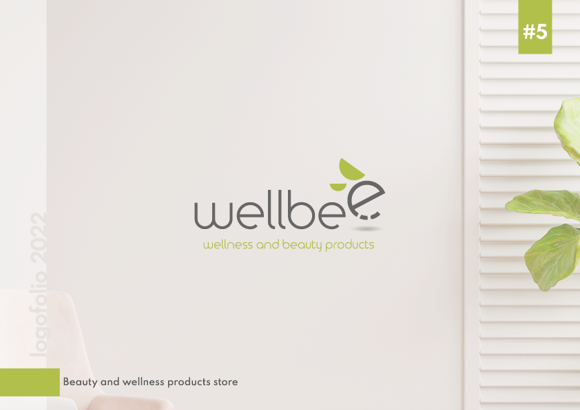
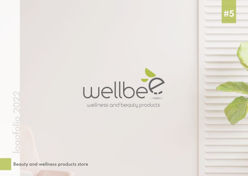
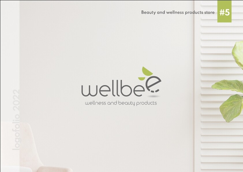
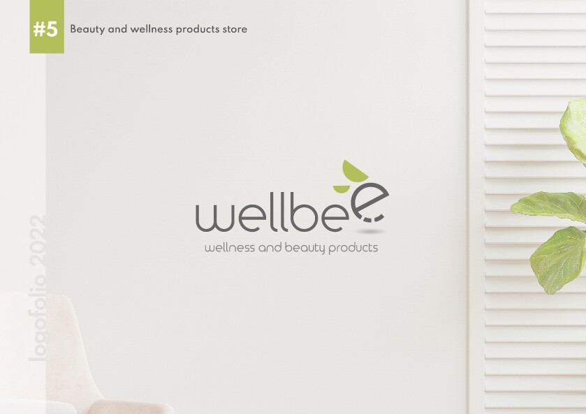
Communication in graphic design terms means that every element in the design can be easily read and easily understood. For example, the light green is difficult to read. The bottom left words are too small and too far separated from the rest of the design (in design terms, it is “orphaned.”) And so forth.
A primary communication principle is—the harder you make a person “work” to understand your message (company name, product benefits, etc.) the less likely they are to buy or even consider the product you are attempting to sell through your design.
Does this make sense to you?
1 Like
Of course it make sense.
In every design we make decisions.
For example my decision to place the text there was because I didn’t want to obstruct or draw the attention from the logo.
Therefore I made a small colored block as a secondary focal point so the viewer can notice and read it in second time.
Perhaps my decision was not correct.
As for the green tagline, of course it’s hard to read so I made it grey.
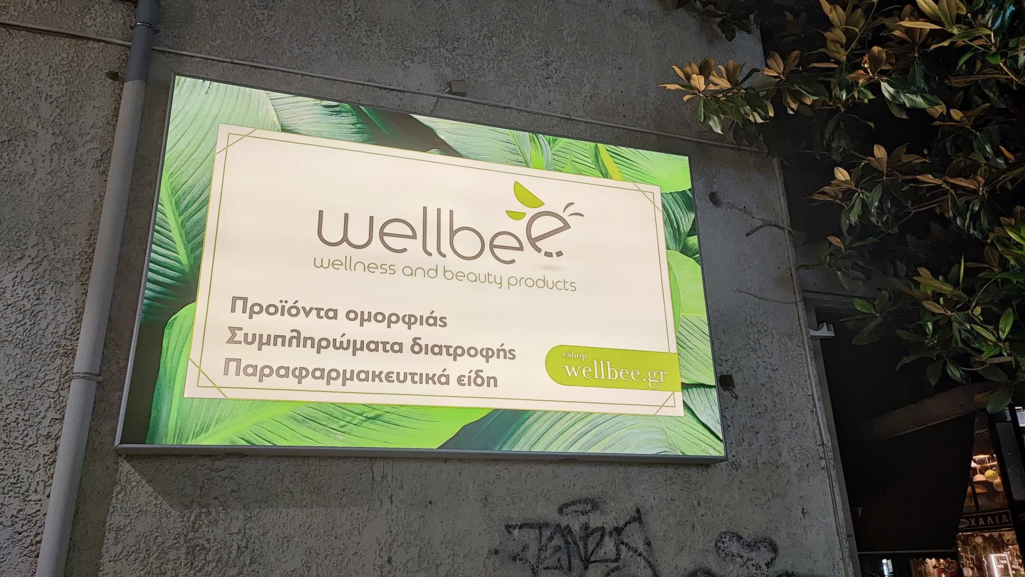
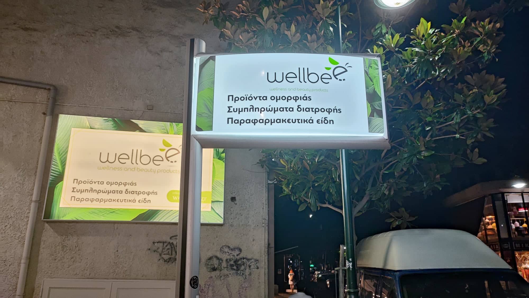
You did a great job on the “Wellbee” and I wish you the best of success.
Back to your query - text partially over a block of colour is clumsy looking.
Dark text should have a pastel light colour behind. Light text should have a dark background. Mixing both can be done, but my opinion is it looks awkward in this situation.
It’s WellBee
So why not use a honeycomb structure instead of a block? Or am I missing something there?
Instead of a horizontal line - a vertical block might draw more attention.
You could knockout the stylised ‘e’ in bee in the vertical block.
I just don’t think a block on it’s own is good - or trying to draw attention with it overlapping the box - it’s not strong enough visually.
Thank you!
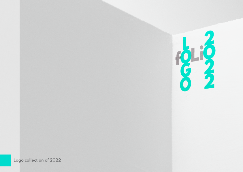
Because it’s about a logofolio I want to have consistency between the presentation.
Sorry for the wrong order it’s not my fault!
Oh yeh, forgot about that point, it’s for a portfolio… yes of course. Glad we’re back on track anyway.
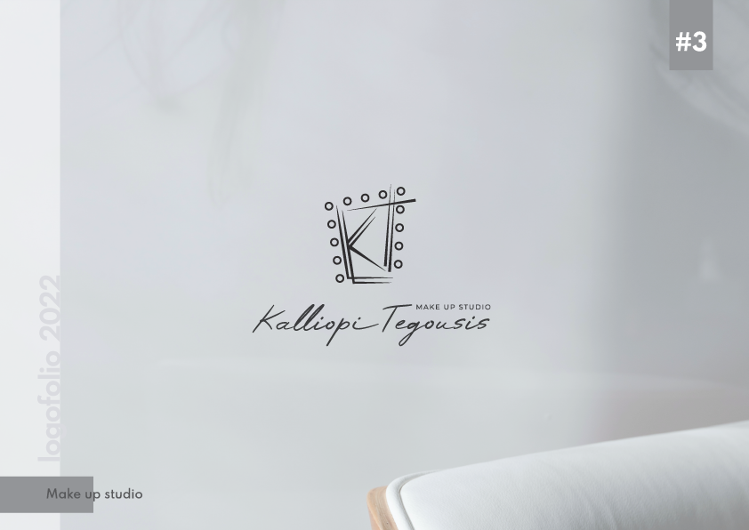
Any issue with putting the text up beside the number?
You mean something like that?
I’m not as much experienced as you, but I think that the original version looks a bit more balanced.
The lack of balance is not from the placement of headers/footers. It’s from the composition of the page.
You’re trying to create a frame for the page to house the logo - by using blocks and text. Which is quite a simplistic way of approaching page layout.
Rather try to form composition by the main focus of the page and not framing it in rudimentary ways.
The logo is small and squeezed to one side for no reason.
What’s the vertical line and the horizontal lines on the right hand side?
Thanks for your comment.
I m not very confident about my page layout skills, so I tried to be simple.
The left vertical line is to place the logofolio watermark, mimicing the border of notebooks.
I don’t understand about the horizontal lines, though.
I can’t see them!
I almost missed that the last e in bee is an actual bee flying. That’s kinda cheeky and cute. I think you could play with the sizing relationship of that aspect a tad more.
Was there a reason you selected the green that you did?
1 Like
Because it’s mostly about natural products!
You mean to make the last “e” bigger? I tried to, but I think it’s loosing connection in readablity terms with the rest “Wellbe”