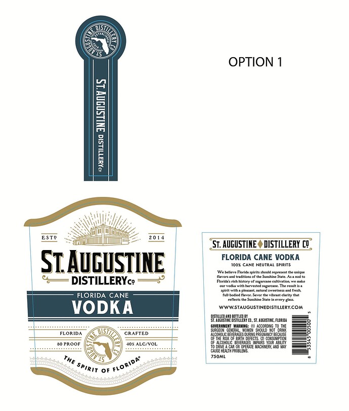
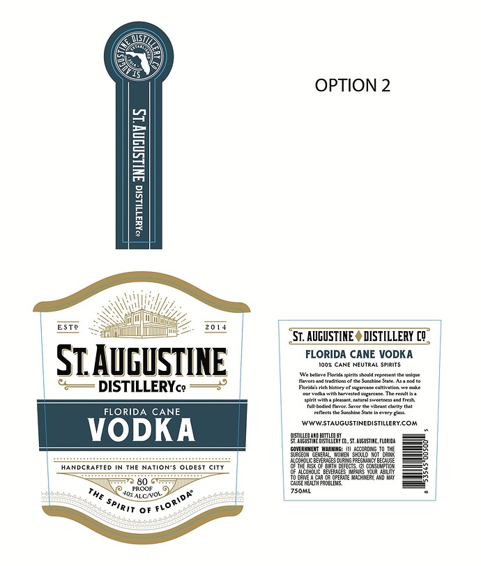
Hello, I work in-house for a distillery and we are redesigning our clear spirit labels. Spirits will be differentiated by color band, text and tamper strip. Could you please review these designs and provide your feedback? I’m interested in knowing which one you think has a clearer information hierarchy and would be more appealing to consumers. These will be sold in our distillery’s retail shop as well as in off-site retail liquor stores. Any other feedback is welcome. Thank you!
Welcome to the forum.
These are both nice. Well done. I lean towards option 2. Since the company name takes up the top half of the front, I don’t think you need to repeat the seal with the company name in the lower section.
Thank you. That was what I was thinking as well. My boss is kind of hung up on Option 1 and I’m trying to gather enough feed back to hopfully sway him away from using the circular seal on the front since it’s already on the tamper strip.
If anyone else would like to leave their thoughts, I would be most welcome. I need as much feedback as possible. ![]()
You can try to sell the boss on the “handcrafted in the nation’s oldest city.” That’s a nice line. “Hand crafted” adds something. The other says “Florida crafted,” but that’s already implied by the company name. Bottom line, though, I don’t think it will cost you sales one way or the other.
I agree with what’s been said so far. I like the look of the top one, but the redundancy of the seal tips it to the bottom one for me. Then again, I don’t know how important that seal might be to the company’s brand and history.
The word “DISILLERY co” might be moved a tiny bit to the right to visually center it, since most of the visual weight is on “DISTILERY” and not “co.”
I assume you’re intentionally giving the label an old 19th-century look, which I think is great and appropriate for “THE NATION’S OLDEST CITY.” However, the label’s intentional older look is undercut by the words “ESTD 2014” at the top. If the distillery was established many decades ago, fine; the date becomes a significant attribute, but 2014? Why point that out?
In the word “vodka”, there’s too much space between the letters “K” and “A”.
I like them both.
The 2nd one though has the tagline from the original bottle ‘Hand Crafted’ (not hand made?)
And I think that’s a nicer touch.
In terms of how it will stand out on a shelf.
I think it has enough of a difference on how the current market sits.
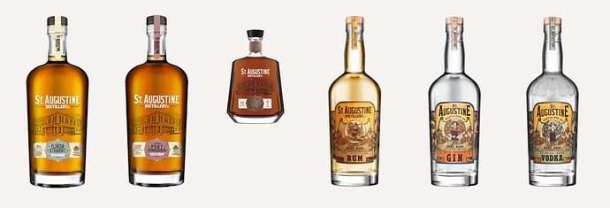
I notice the old label has the building on the side and you’ve made this front and centre and got rid of the worker on the label - I think that’s a good call - the old label was very old fashioned.
One negative is that the Florida shape looks like the shape of a ‘gun’ to me.
I don’t know how you get around that… or if it’s an issue, I don’t know.
Probably not.
I agree with the consensus. The second feels much cleaner (if that’s the right word for such an ornate designl). It definitely feels like the hierarchy works better – more efficiently.
The seal on the first option serves only to distract the eye to a third strong element which is secondary, or even tertiary, level information and not the kind of primary information that will get people to pick it up. It just acts as a distraction. As others have said, it’s on the top seal, which is where it should be. It does its job well there. The second option leads you down the levels of information nicely and is well considered. Overall, great job.
Just to pull back from this being seen as unmitigated praise – which regular visitors around here know I don’t indulge in all that often (Cynical? Who? Me?!!) – I have to agree with Jakub, but go further. I think all the kerning needs tightening up (right down to the ‘handcrafted in …’ line. It will just give the work the polish it needs and deserves.
Nice work.
I would love to see the whole line up experience with full bottles and different fluid colors and the new design with the different label colors. Will there be also a new bottle design?
I think you have to see it all working together also to see if a single label design works.
Yes, we are working on updating the entire line of products, including a new custom glass design for the Florida Straight and the Port Finished.
Thank you all for your input. It is much appreciated!


