Hi all! I’d highly appreciate feedback on this logo design & branding I made.
AgentLab is a software that trains AI on specific data (like a website or documents) to answer related questions accurately. Once trained, the AI’s language and personality can be customized, and it can be deployed on web and social channels.
Let me know your opinions on the concept, design and any suggestions!
It would be helpful to get more information about the project. Is this for a real client? Is it for a crowdsourcing or contest site? Is this a self-directed project for personal development? Are you aware there is a company called “Agentlabs” that is already in the AI space?
The icon is too detailed to work at smaller sizes, e.g. when used as a social media profile picture or a favicon. It’s also too small relative to the wordmark.
Thanks for your reply Steve, sure, it’s for a software my company is developing. It’s part of a SaaS product we are launching.
and, yeah, I’m aware there is a “company” with a similar name, tho it’s not registered or anything, plus it’s also hard to determine if they are actually a real legal entity with that name. btw, doesn’t look concerning so far to our legals.
thank you very much for your reply!
Regarding your suggestion, what would you personally fix? I’d love if you could give me some ideas on how to improve it given your good points.
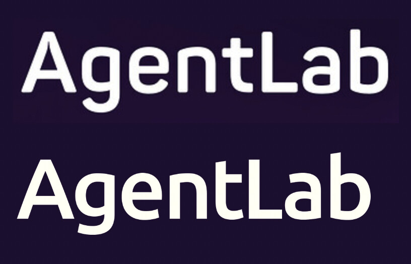
I like the font you’ve chosen, but it seems like the tracking is a little loose.
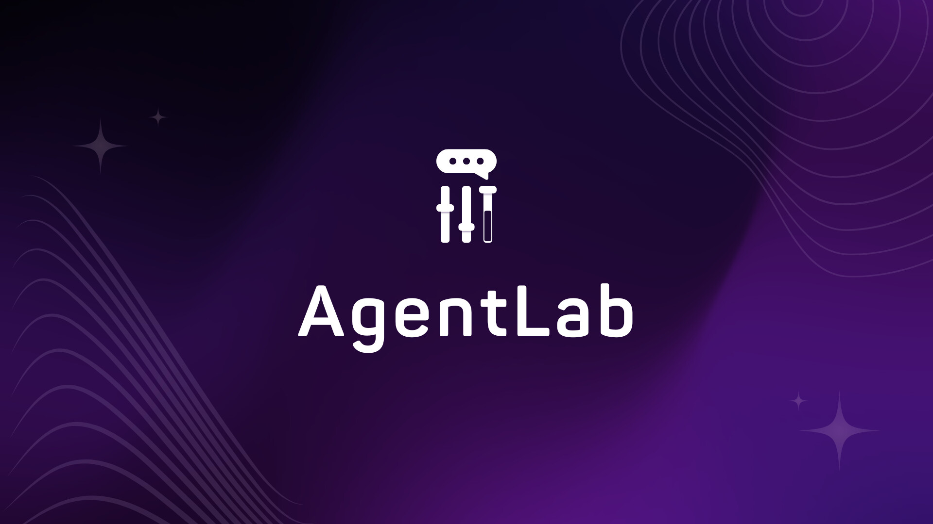
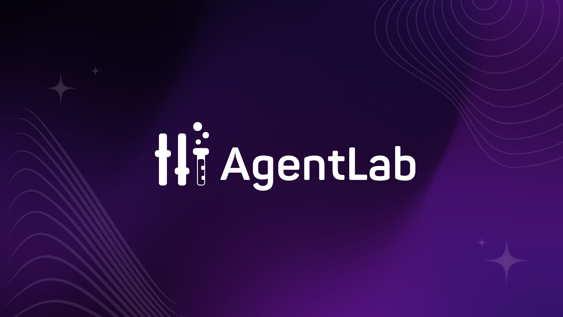
With regards to the icon, the first one looks like two sliders like you’d see on a mixing board and then a test tube with bubbles. The second one looks like two sliders and then a test tube with a speech bubble. I’m not sure if I’m reading that correctly or not, but I get the feeling you’re trying to accomplish too much with the icon.
thanks Steve! Great feedback on the tracking–I’ve adjusted it. How does it look now?
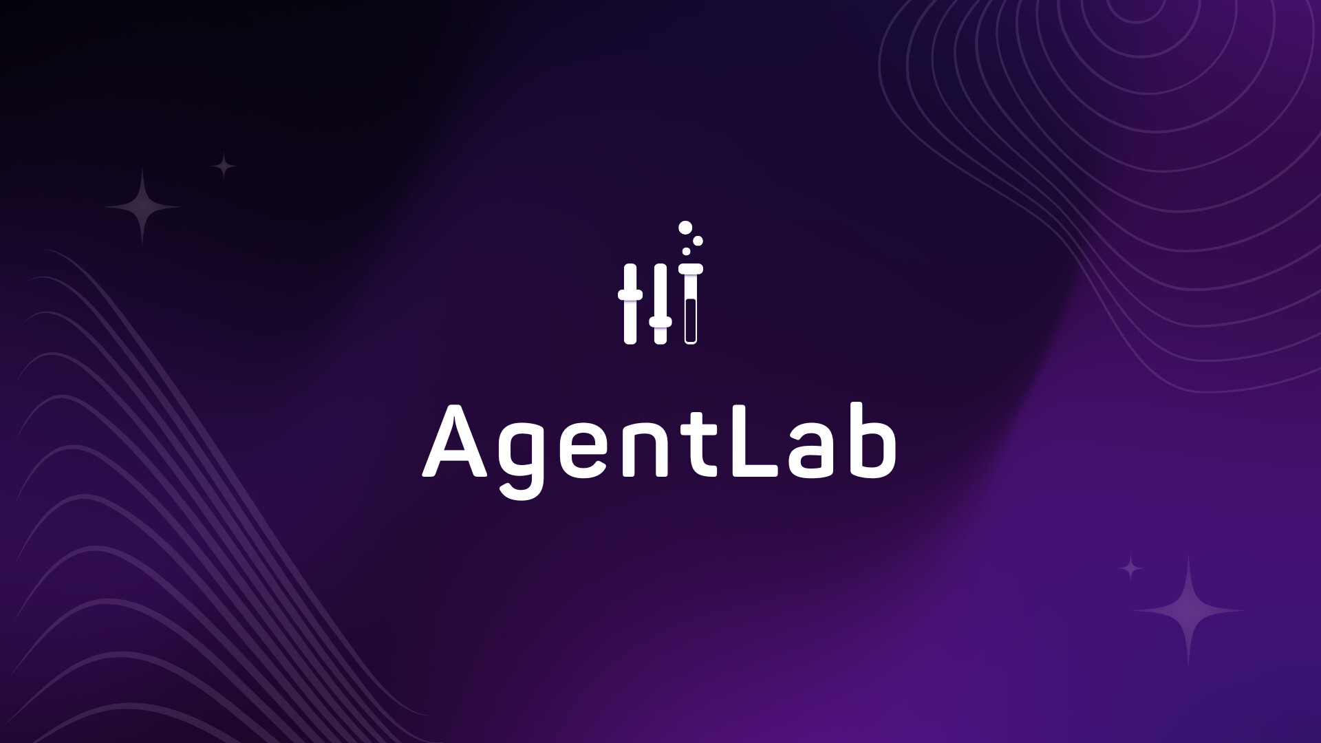
As for the icon, it’s meant to represent sliders symbolizing adjustments and edits, merging into a test tube to highlight the “Lab” aspect, suggesting a place for experimentation and creativity.
Do you think it’s too busy with these elements? Also, do you prefer them arranged in parallel like this?
When I am working on a logo project where the icon could be used above or to the side of the logotype, I will typically designate a primary layout and secondary layout and deliver assets set up for vertical and horizontal use.
The last adjustment slider doubling as a test tube is pretty clever. The sliders play into the AI customization you mentioned, and the test tube says laboratory. It’s a great combination of ideas.
However, I’d tweak it a bit by removing the details. When shown large, the shadow lines beneath the slider bars work, but at small sizes, they get lost. Likewise, the reflection on the test tube is just not needed, so I’d leave it off, as you did in your first example.
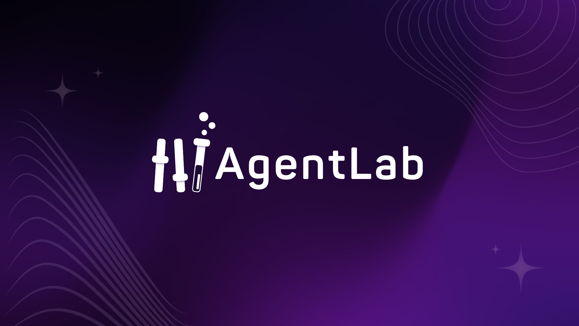
I like the new composition best, with the larger logo out to the side. I’m glad you tightened up the tracking a bit — letters-spaced lowercase rarely, if ever, works. If it were me, I’d shorten the foot on the L just a tiny bit to reduce that giant gap between the L and the a.
I like where you’re going with the typography; it has a high-tech look to it, but I’d probably choose Ubuntu over Panton (or whatever it is). The individual glyphs in Ubuntu have better and more natural-looking curves. However, even with Ubuntu, I’d shorten the foot on the L just a little bit and make the ascenders on the L and b the same height and with the same terminal angle. If you decide to stick with Panton, please remove that weird little ink trap in the crotch of the A.
Thank you so much for your precious and detailed insights!
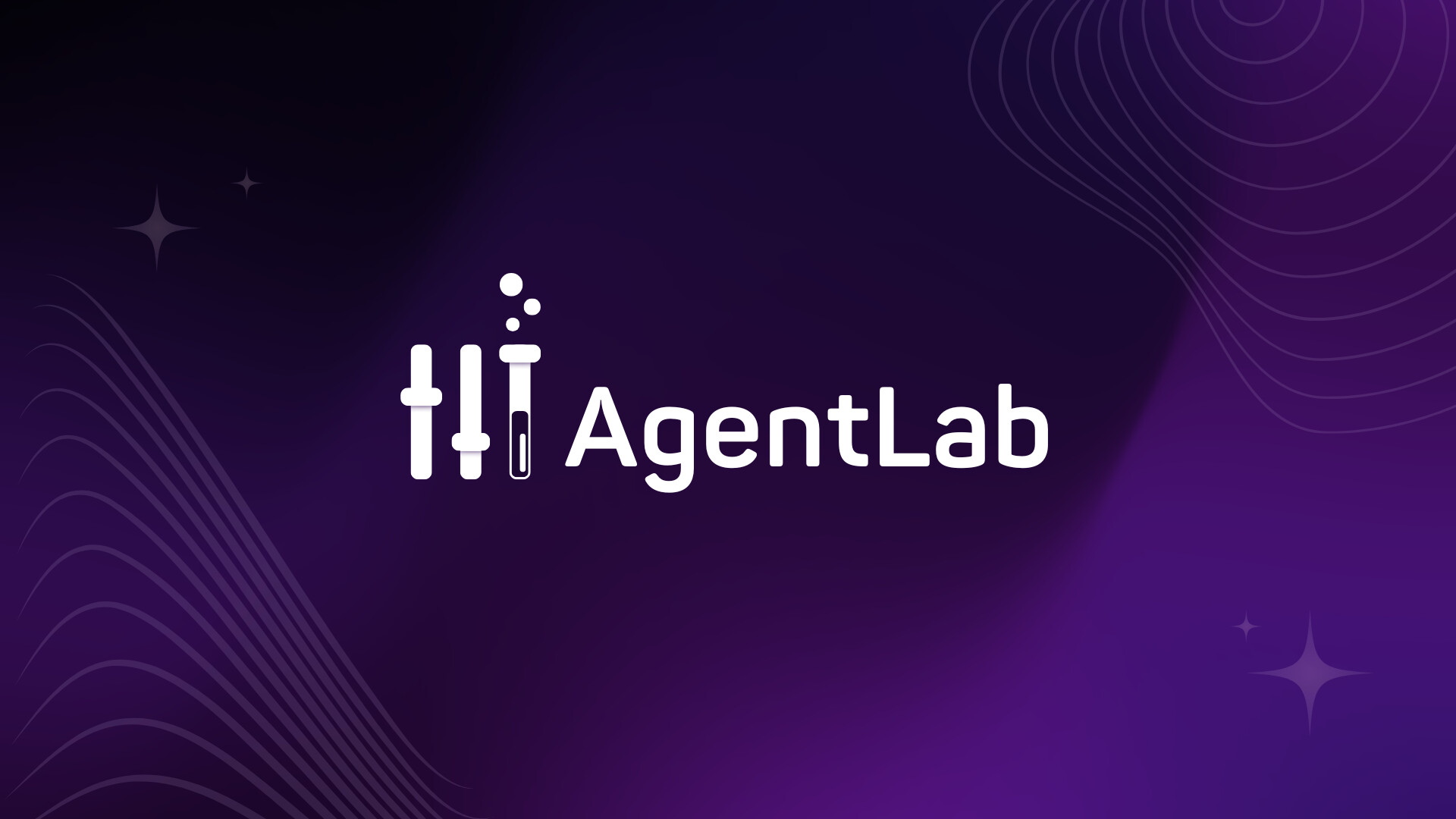
this is another version, what do you think? (I eliminated some details, framed the logo more compact and reduced the distance of the L) btw I really like the Panton font for this, I think I’ll keep it as this for now
I do like this new version better, however, as mentioned above, the small details in the test tube won’t show up on smaller print. I think you’re on the right track though.