OK. Seven hours later, another look and I see the note — it’s tipped on it’s side.
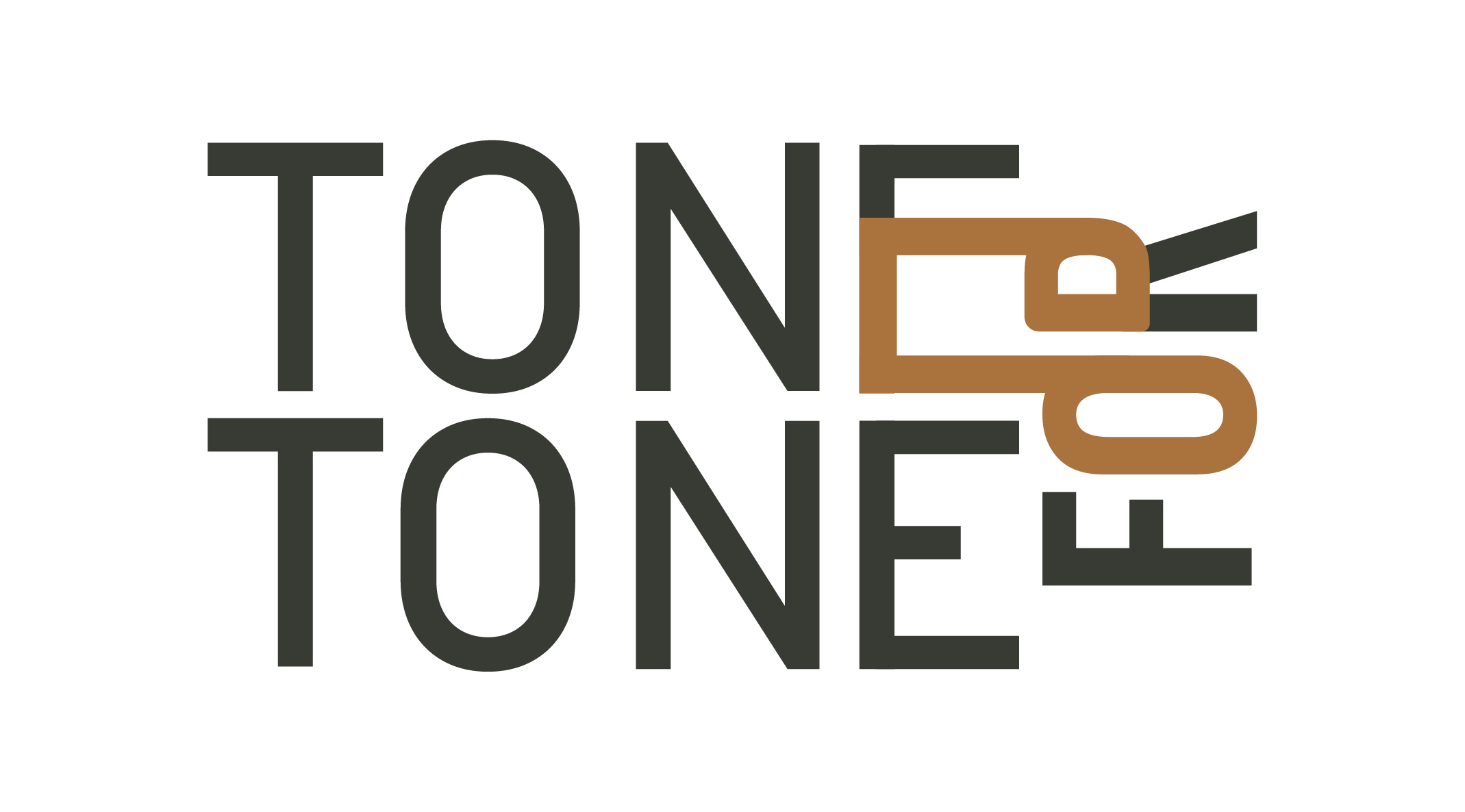
I think this is one of those ideas that seems great in principle, but in practice making it work is more difficult that anticipated. There might be some opportunities to make the idea work by using the two large Os in the two stacked TONE words.
That’s a really lame “target audience” and “brief.” You need to dig a lot deeper than that, before you even start the design. Your client is responsible for giving you this information, and if they plan to succeed, they should already know this.
How many kinds of music are there? Rock, blues, country, classical, jazz, etc.
How many types of instruments? Do they sell them all? Harmonicas, cellos, violins, guitars, drums?
Visually, it is very tenuous, even if it did work, it is a visual cliché. Up there with crosswords and jigsaw puzzles.
Also, I’d suggest that you go back to your client and suggest that they change their name, Aside from any susequent brand identity, the name itself tells the wrong story.
Story to sound like this is an assassination, but it really looks like you have just worked with the first idea you came to, Never a good plan.
You might be able to get a (forgive me, I’m NOT musically inclined) “double note” (like you have in the brown), upright and in place if the two Os. You’d have to play around with it.