I run a small business making tropical scented candles. As I am small I do not have the budget yet for a professional graphic design and have to make do with something simple that conveys I only sell tropical scented products. I’m sure it goes without saying but I am not a graphic designer by any stretch of the imagination lol. But… does this look ok? Any constructive criticism would be greatly appreciated ![]()
For not being a designer, it’s not too bad.
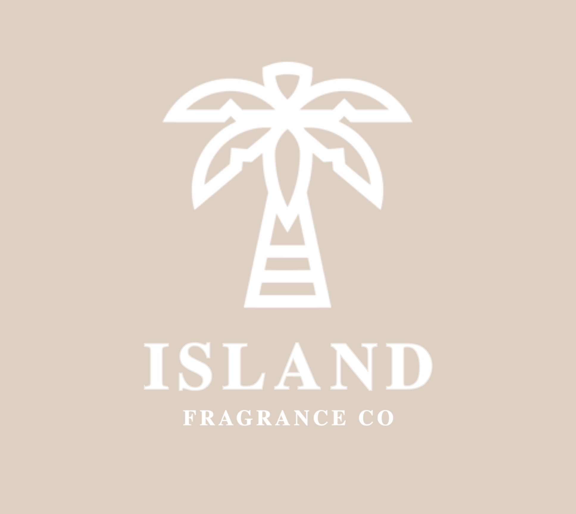
A whole lot depends on how it’s used, of course. The kerning between the L, A and D is a bit loose, but getting the spacing between an L and an A is often difficult, which bring me to my next suggestion.
I’m not entirely sure that’s the right typeface. It’s not bad, but you could pick one with a somewhat softer or tropical personality (nothing gimmicky, though).
Have you experimented around with the weight of the lines in the palm tree? They look a bit heavy, but it’s difficult to tell without seeing other variations
Honestly, though, I’ve seen a whole lot worse from some pros.
It’s a pretty good start! I would make the lines of the logo symbol a bit thinner. The text “Fragrance Co.” sans serif.
I agree with what has been said. The general aesthetic is pretty good. The colour is very muted and neutral but this could work with the health spa and wellness industry. It’s fairly clean, but I think it would be cleaner and more tidy with a different typeface. The current one is quite old fashioned and traditional.
Also, I can see that the logo is quite blurry. What software are you using? Once you decide on a logo, it’s a good idea to build a high res version of it. A blurry logo doesn’t give a good impression.
This is a nice start for design, and as initial stage this logo is alright. But here you can customize your logo by changing color of the tree or changing fonts. But looks not bad.
This looks like a nice concept. Just some more font variants can be tried and as mentioned by iraszi thinner lines will make it more relevant and appealing.
It looks nice, but it doesn’t say “candle” to me.
Reading “Island Fragrance” sounds like perfumes to me.
Also, the color choices are very low contrast. Perhaps consider a darker background.
I see form this other forum that the palm tree was purchased from a logo site. Since others might be using it, I’d be hesitant. Just my 2 cents.
Good find Craig!
This being the case, Louiseey, I wouldn’t even consider it. Use this artwork (or something derived from it) and there’s no telling where else you will see it. Instead of it being a unique logo that belongs to you, it becomes nothing but a piece of clipart for your packaging.