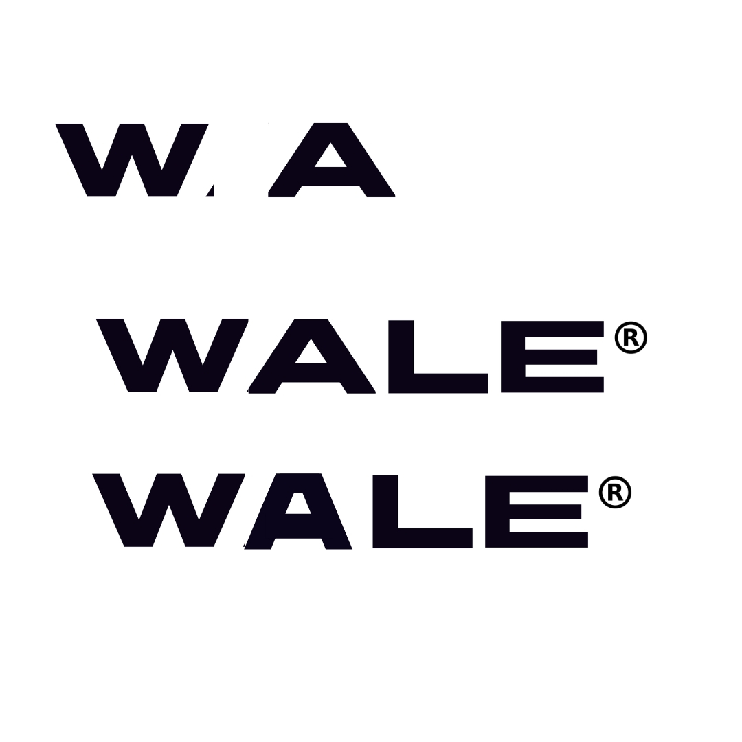
I’m unsure if the logo is too drab…
Give opinions please
Also please forgive the kerning
The kerning is a big part of the overall problem.
Work on it some more and post back.
Some background information would be helpful. What does the company do? Who is the target market? How will the logo be used?
I don’t get it.
What are the missing pieces about? Why is there a register mark when it’s not a registered trademark? What is this logotype for? Why are you doing it. There’s no context.
Aside from that, the bottom stroke on the L is too long, and the horizontal strokes on the E are too thin and too long.
Judging by your username I’m gonna guess this is a personal logo, and if that’s the case keeping it simple, like you have, is a good idea. Too often I see people over design they’re personal brands and they always look terrible. The best logo’s for graphic designers are ones that take a back seat and let the work shine (Pentagram and Sagmeister and Walsh are two really good examples).
I think that the last logo looks the most promising. That being said you have a few issues here:
Be sure to post the final and let us know if it is a personal logo
![]()