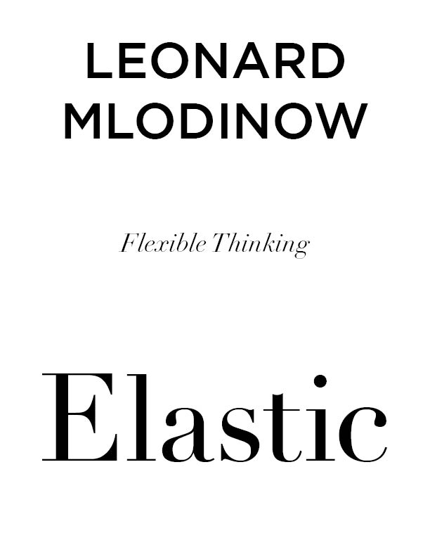
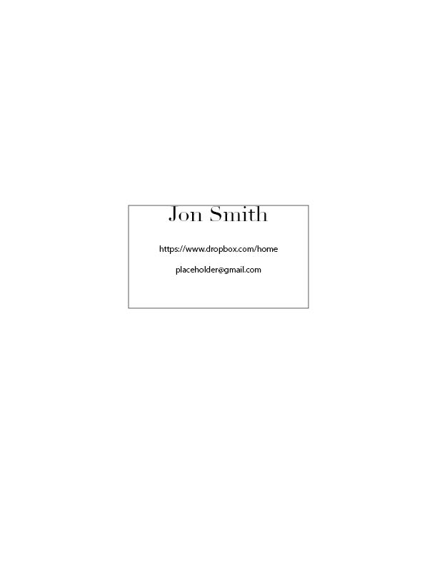
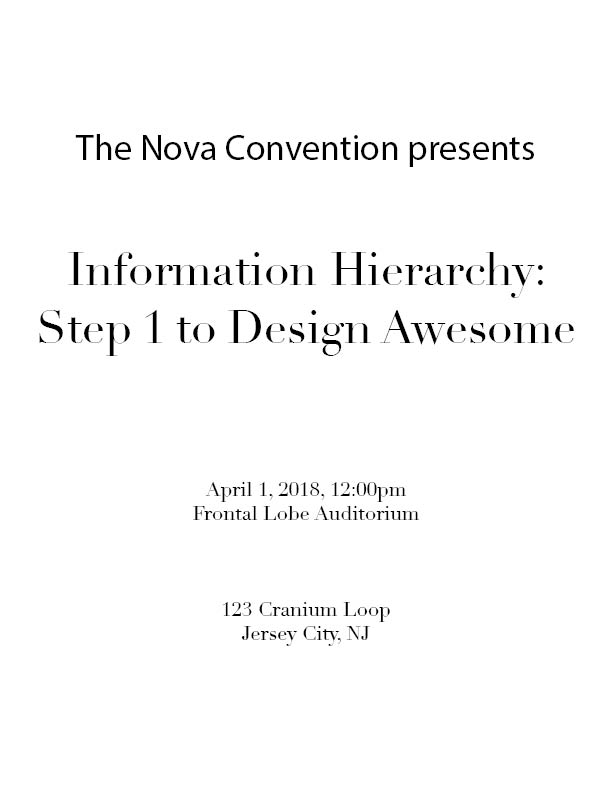
Hello I have some pages that I am doing and would like some opinions on how I can improve each one,thanks.
Are these book covers or just an exercise in hierarchy? What is the brief? Are we just looking at size and stacking order? Or also font choices? Have you (can you) try options where the text isn’t just stacked and centred?
The first one with the name at the top suggests the author has some recognition, but I find the sizes of the Flexible Thinking and Elastic to be awkward – Too small and too big.


