I have five years of experience working in the e-commerce industry, where I mainly focused on creating listing designs for products and packaging. Recently, I started my own business on an online marketplace. However, I’ve noticed that I’m not as strict with myself when creating listings for my own products, since in the past I always received a lot of feedback from my employer. Now, I’m the one who has to decide whether something is good enough or not.
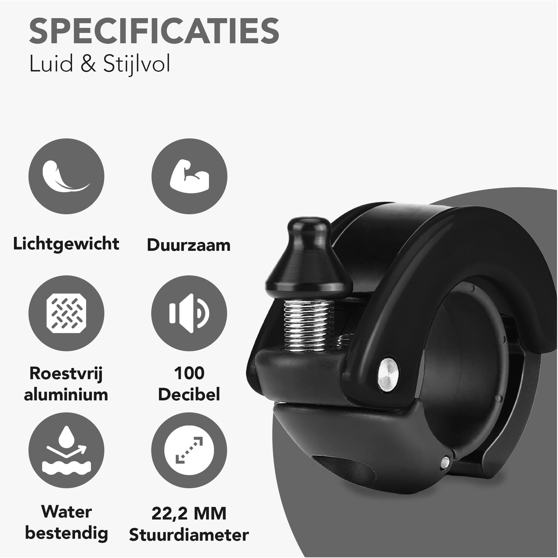
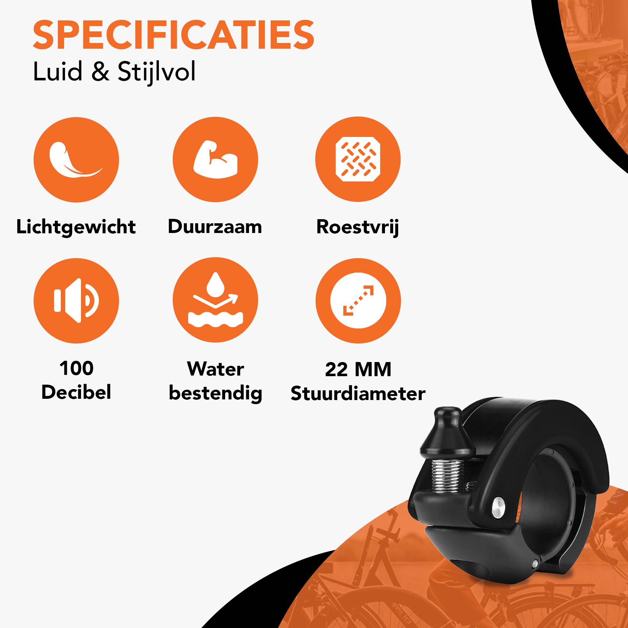
At the moment, I’m working on optimizing a listing. I’ve prepared two versions: the one with gray colors is my first draft, and I later adjusted the colors and layout. I’m curious to hear which version you think works better for the bicycle niche. Second version is the orange one
I prefer the first composition, but I like the incorporation of orange into the second one.
Let me explain. The first layout is more straightforward, whereas the second layout causes me to focus on what images the orange circles are covering rather than the product itself. If I had these two choices, I’d choose the top layout, but I would use the orange symbols. I might even color the circle behind the large clamp (if that’s what it is) with a grayer (lower value) version of the orange, but that’s just an off-the-top-of-my-head idea.
Is that a fancy cheeseborough?
Wouldn’t buy it with a smooth round screw head like that. We buy the ones with wingnuts to allow for ease of applying torque when tightening.
(ya, I know, you didn’t ask for comment on the piece itself. )
Thank you very much for your feedback, I really appreciate it. I’ll start working on the improvements right away.
Here is my current listing:
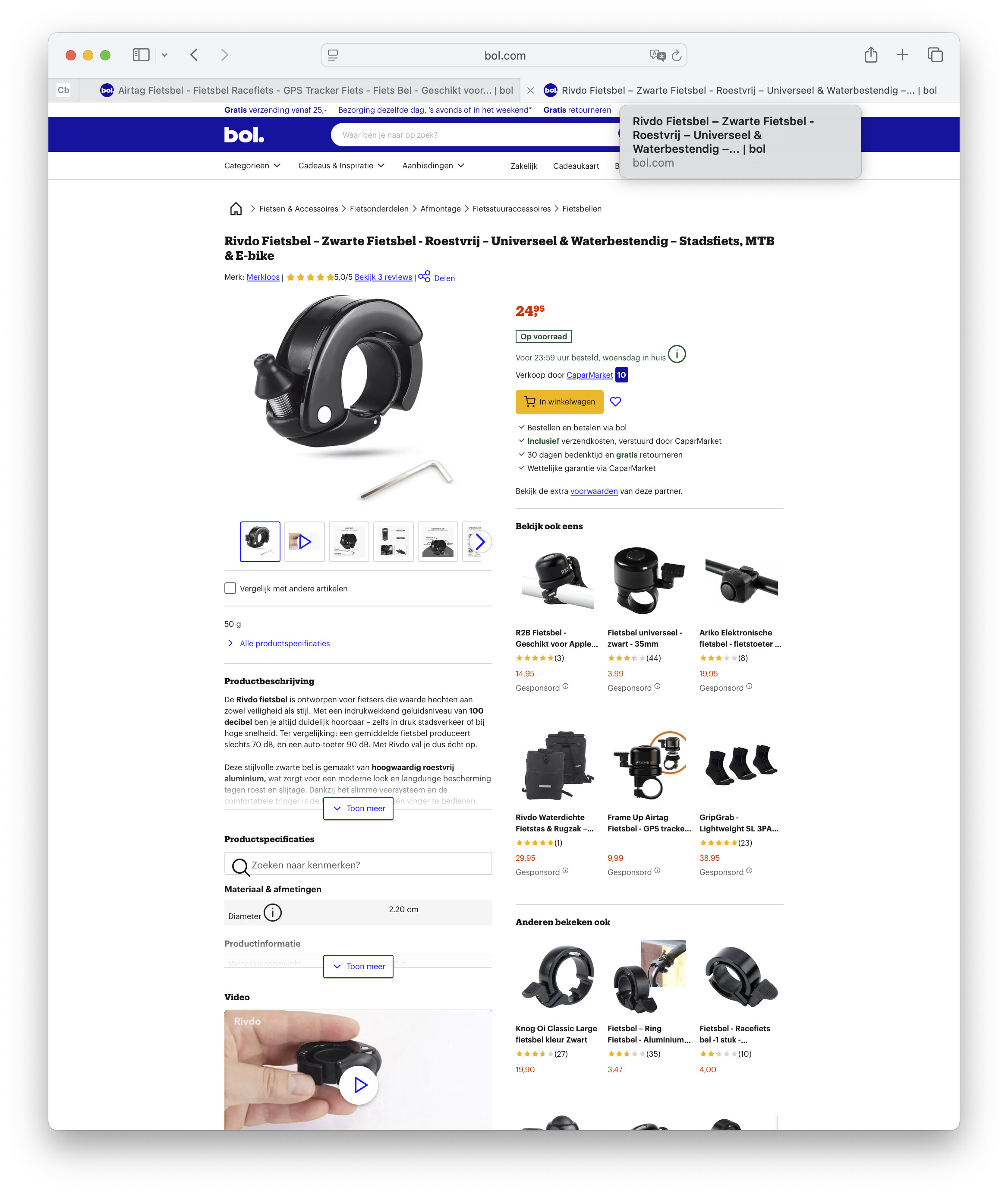
[type or paste code here](https://www.bol.com/nl/nl/p/rivdo-fietsbel-zwarte-fietsbel-roestvrij-universeel-waterbestendig-stadsfiets-mtb-e-bike/9300000232450197/)
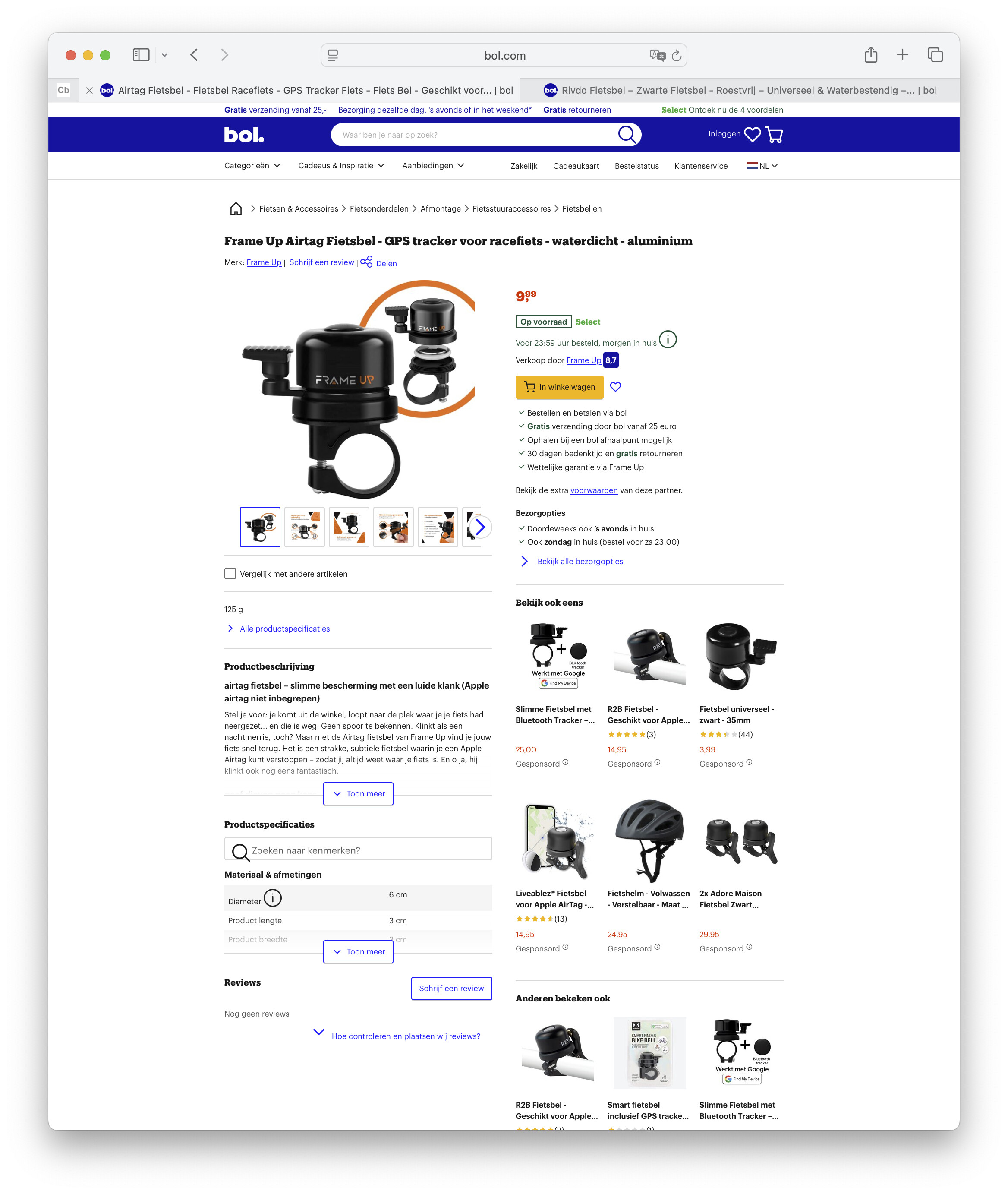
And here is one of my competitors:
[type or paste code here](https://www.bol.com/nl/nl/p/airtag-fietsbel-fietsbel-racefiets-gps-tracker-fiets-fiets-bel-geschikt-voor-apple-airtag/9300000231008346/?cid=1758997126269-7438185463481&bltgh=094bdc83-d66e-4bdf-86f5-e02af63a2af1.ProductList_Middle.3.ProductTitle)
When I look at this competitor’s listing, I notice that the use of color makes the product stand out really well. My own listing looks a bit calm and dull in comparison. Maybe, just as you suggested, I should adjust the colors while keeping the same layout for most of the images. However, I also think that for a few of the pictures, I may need to adjust the layout itself to make them more eye-catching.
As someone who is 100% your target market, I have to say: this is a cool bell. It’s been a while since I have shopped for a bicycle bell, but I have never seen one like that where the bell design wraps around the handlebar. The bell on my mountain bike is a traditional, dome-style bell similar to the one shown on the competition’s page. I don’t have a bell on my road bike or gravel bike, but I’d put one of these on either bike.
Like @Just-B, I prefer the layout of the first option but having some color like the second option. It looks like your competitor is using orange, so maybe go with another color.
Thank you so much for your kind words about my product. My brand is focused on the bicycle niche.
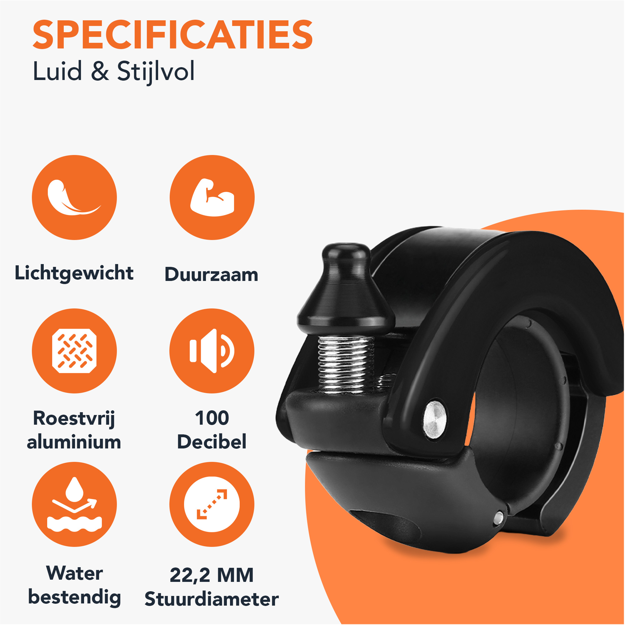
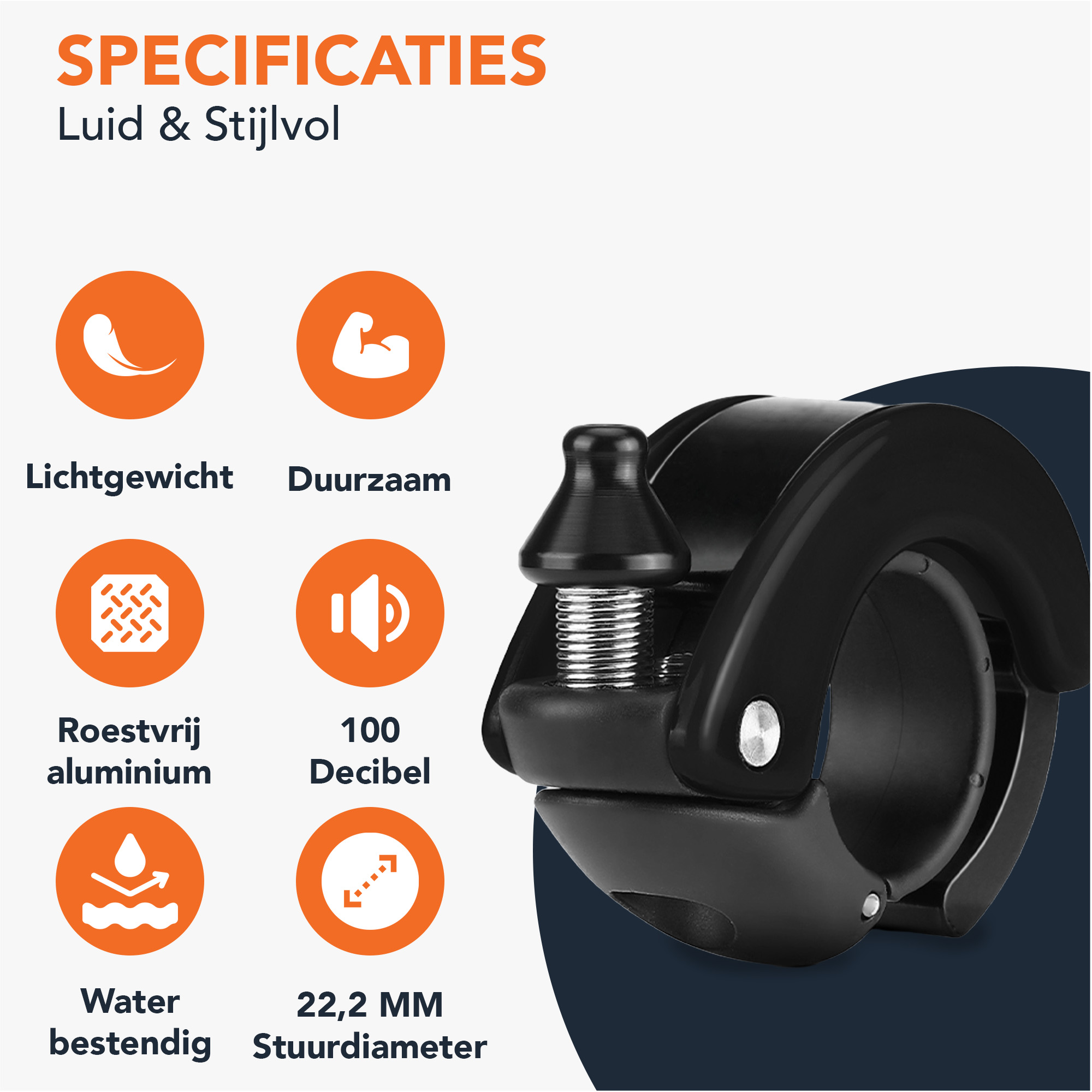
For this version, I used the original layout but tried it in three different colors. Personally, I think the one with the deep blue has something special. What do you think about the combination?
As some couldn’t figure out what it was is a bit concerning for me.
Maybe adding a bicycle image using the bell, perhaps approaching other walkers or something.
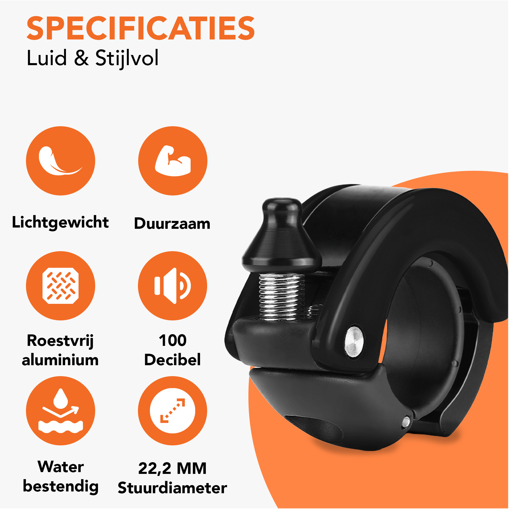
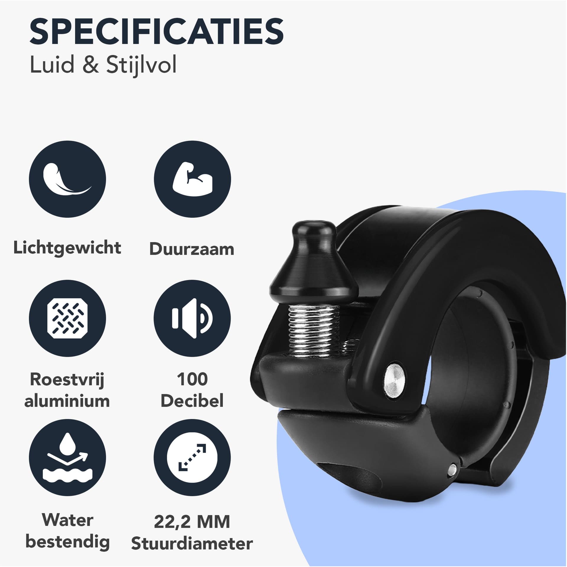
The only icon I can’t figure out is the Roestvrij aluminium - and translating Roestrvrij it says ‘stainless’ but I’ve never heard of stainless aluminium.
@Smurf2 What you are looking at is one asset in the product posting. If you look at the whole posting, it’s clear what the product is.
@Baris_CH The black bell does not contrast as nicely with the dark blue background as it does with the orange. That said, the competitor you linked to uses orange, so maybe a color that contrasts with black that’s not orange.
The context of product listings seems kind of important here because it provides additional information outside the above design. For example it has a headline which says what it is.
In the context of aluminum, I think it means non-rusting or rust-free.
I had no idea it was a bell. Call me naive, but I’ve never seen a bell like that and had no idea how it could ring until I looked it up. Now, I want one. Very cool.
I don’t mind the idea of a second color behind the item, but that second color should provide lots of contrast with the product. The black bell on the dark blue background lacks contrast. As a consumer, I always want clear, large, and unambiguous photos of what I’m considering, as they help me make an informed decision. Black on dark blue blurs the distinction between the product and the background. On the other hand, a silver or copper bell color on a dark blue background might aid in the distinction.
Thank you very much for your kind compliments about the product itself.
I’ve carefully considered your valuable feedback regarding the colors, and I agree that using the same orange as my competitor might not be the best idea
especially since my price point is positioned a bit more premium. That’s why I decided to go with a deep dark blue. The subtitles I kept in grey/black, and the circles with the icons are also in the same dark blue. I struggled a little with the background of the bicycle bell, so I chose a lighter shade of blue there. I’m curious to hear your thoughts on this.
This time, I applied the changes to two photos. For your reference:
“Specificaties” = “Specifications”
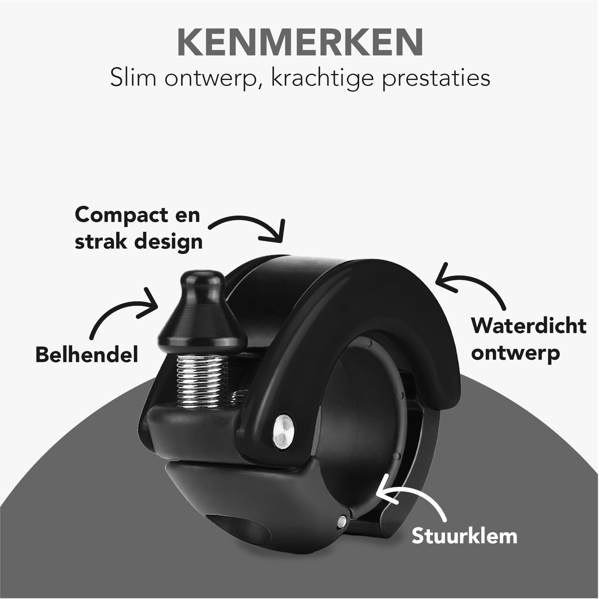
“Kenmerken” = “Features”
I also understand that the aluminum details can be a bit confusing, which is why I asked my dedicated copywriter to come up with the texts for the photos as well. He also usually writes my titles and descriptions.
By the way, I’ve included the old photo with the “Features” as well.
I’m looking forward to your feedback.