Origami logo: confusing vs. clear?

First of all, I’m going through a really sh*tty time right now with surgical complications, so please be as gentle as you can be. Not looking to be coddled, but there’s a way to give constructive advice without tearing me to shreds. :face_with_peeking_eye:

I’m actually re-branding my own business; I dabble with creative work on the side. I switched careers but still do local work and was so busy getting my education in another field that I’ve used a super :poop: “logo” for years (cringe). One of my favorite birds are the family Meropidae, and I wanted to potentially design a European Bee-eater. Worked on the geometry for a week and got the proportions and tail right. Showed it to a family member and BOOM, she immediately mistook the back wing for the head.

The other I’m dabbling with is an iteration of an icon I use on my site. It’s a little less “cookie cutter origami” but I honestly am not opposed to either.

Hitting “Create Topic” now. :expressionless:

A more clear brief would be helpful.

Honestly, I’m a little confused by what you’ve told us. Maybe it’s just me.

You’re rebranding your own business. You dabble with creative work on the side. And you’ve switched careers. So is the logo for the main business? If so, what is the main business? Or is the logo for the creative work you dabble in? It seems like it is for your side hustle, but please clarify. Also, what type of work do you do? Who is your target market? What does the “c” stand for in “pbc”?

My general take is that you’ve posted some nice work.

I was totally unclear. :expressionless:

I have 3+ years college education in graphic design. Enough to get enough experience in the core Adobe programs and typography to dabble creatively. I then switched over to early childhood education (surprise to me!), but in a niche way in which I design curriculum and keep my skills relatively in use. As part of my entrepreneurship minor, my capstone project was to “launch” a mock business. A year later I simply used my business plan to form a sole proprietorship and bootstrapped my way up.

Since 2017, my business has been a hybrid of creative services and environmental education. The latter has grown enough now that I’m splitting my LLC, and Paper Bird Creative will be its own entity (still working on the typeface for “Creative” — hence the missing “C”).

I primarily offer creative services to local clients, especially those with an environmental bend, because I have working relationships with other environmental educators in my region. I’ve done work for Shaver’s Creek Environmental Center, Penn State entomology, The Arboretum at Penn State, students needing logos, a local massage therapist, etc. Recently I completed a full marketing package for a client that included rebranding, logo and website design, photography services, social media restructuring, and LLC incorporation. Really I take what comes my way as side work that I enjoy, and make a little extra income doing it.

I realize that the two designs above are not award-winning or groundbreaking, but I wanted something light and whimsical that reflects my own passion for ornithology (birds) in a creative way. Something that I enjoy having as a visual representation of my business.

Does that help? I’m taking a handful of drowsy surgery meds right now. But wanting to wrap up this project before grad school starts up again in three weeks. A family member threw me for a real loop with the “head or wing” feedback today so I wanted to jump over here today.

The more I look at them, the more I’m leaning to the second option. It’s cleaner and more unique. I just need to refine it a little.

I thought the back wing was its head too — a head with a long, pointed beak. Perhaps placing an eye on the actual head could help eliminate the confusion. I like the idea of the Paperbird logo being folded paper, but it does need to more easily resolve into a bird with all its parts in the right location.

I like the second set quite a bit too. The paper connection is missing but it’s a nice-looking mark. The weight of the typography (thickness of the strokes) matches better in the second set too.

I’m not quite sure about the typeface. It’s interesting and different in a good way, but I can’t help but think there’s something off about the relationship between the horizontal stroke and vertical strokes and how they curve into each other. When I enlarge the type, it looks good, but at small sizes, my concerns become obvious — at least to me. I’d probably redraw the letters so the strokes were the same width all the way around with the same weight of the lines in the bird.

All that said, I like where you’re going with this

1 Like

I like the origami versoin of the bird.
Lose the internal lines on the wings and the light colour in the background.

I think it’s clear. All you have to add to do is add a filled in circle where the eye goes.

1 Like

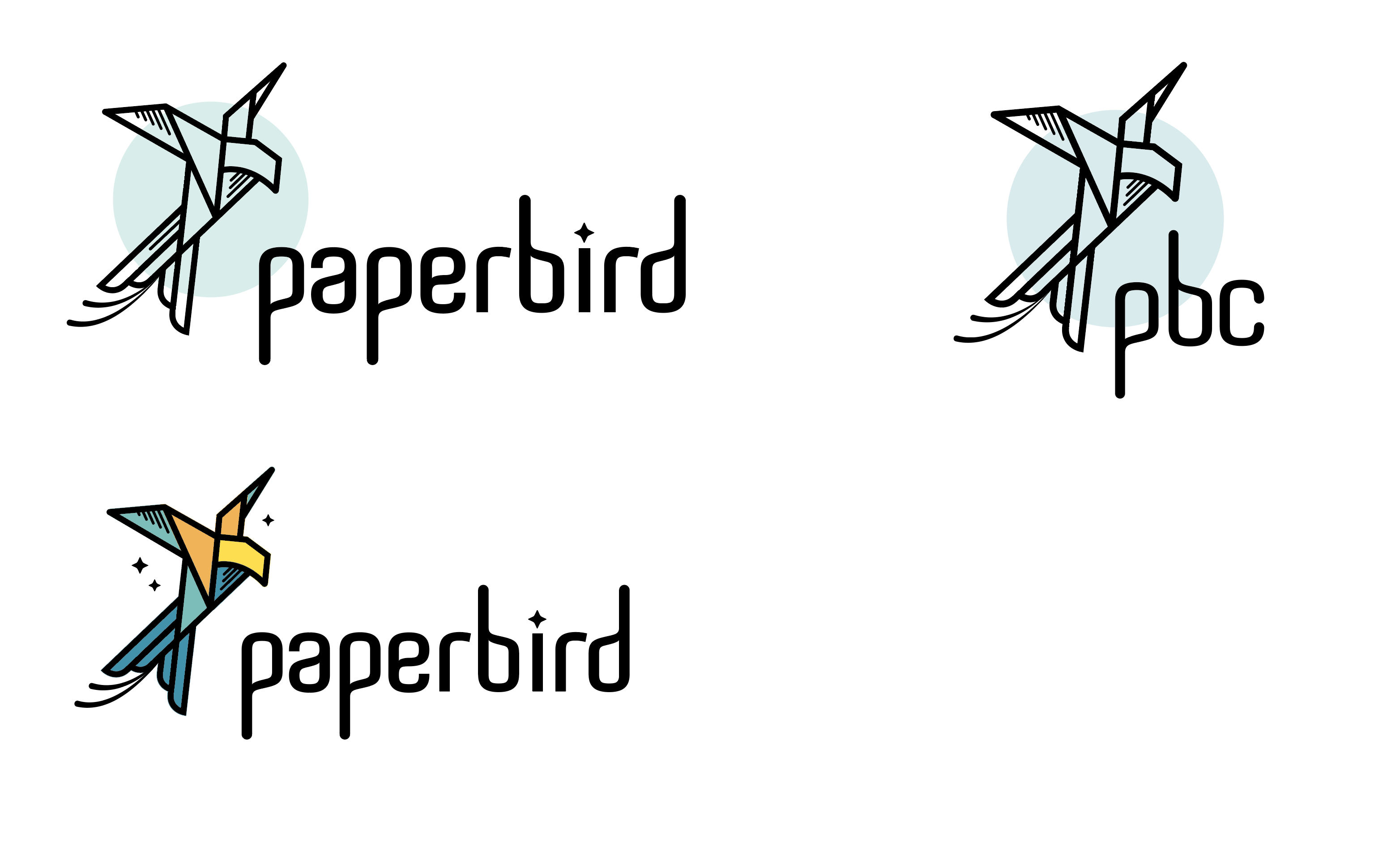
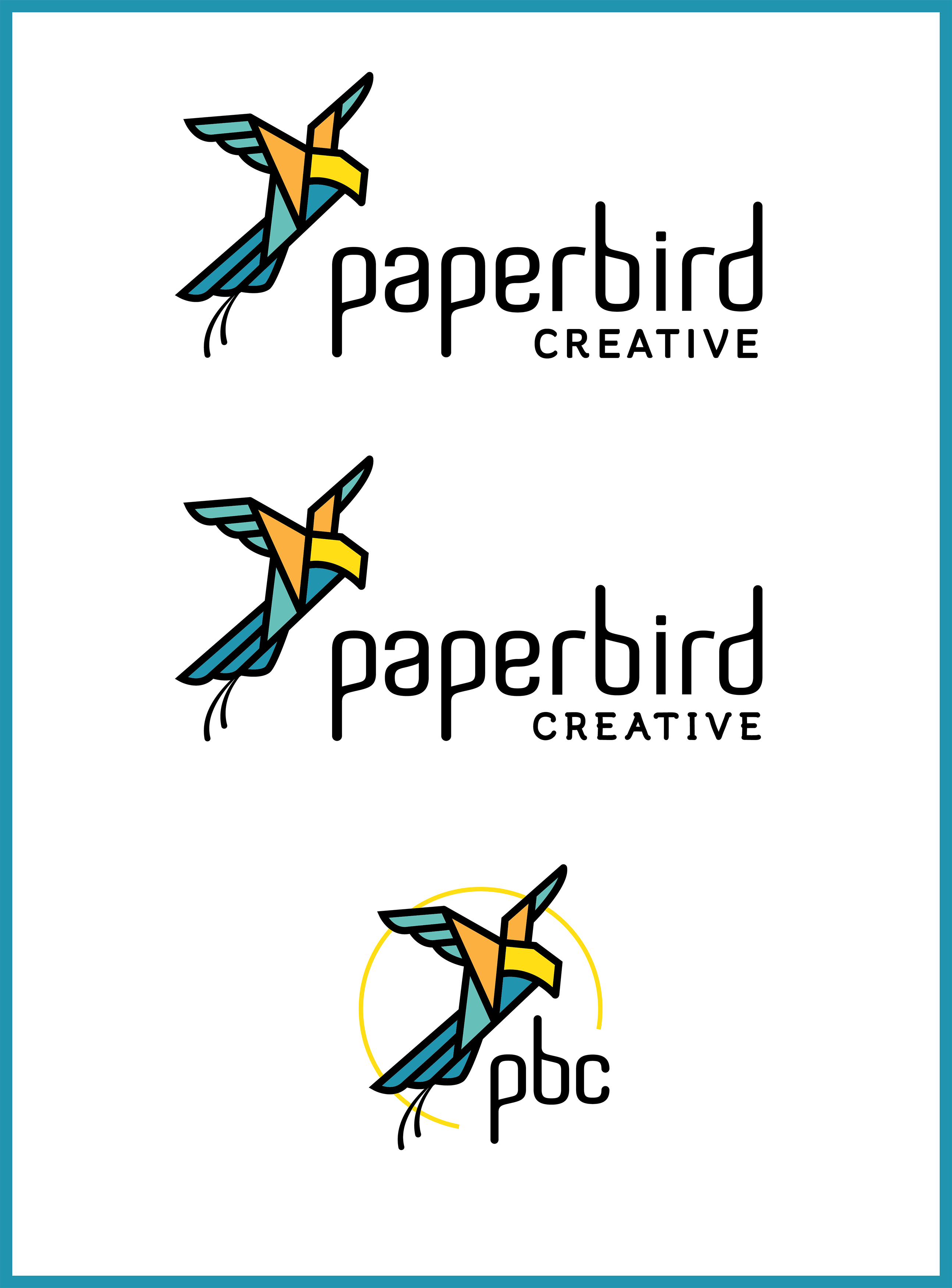
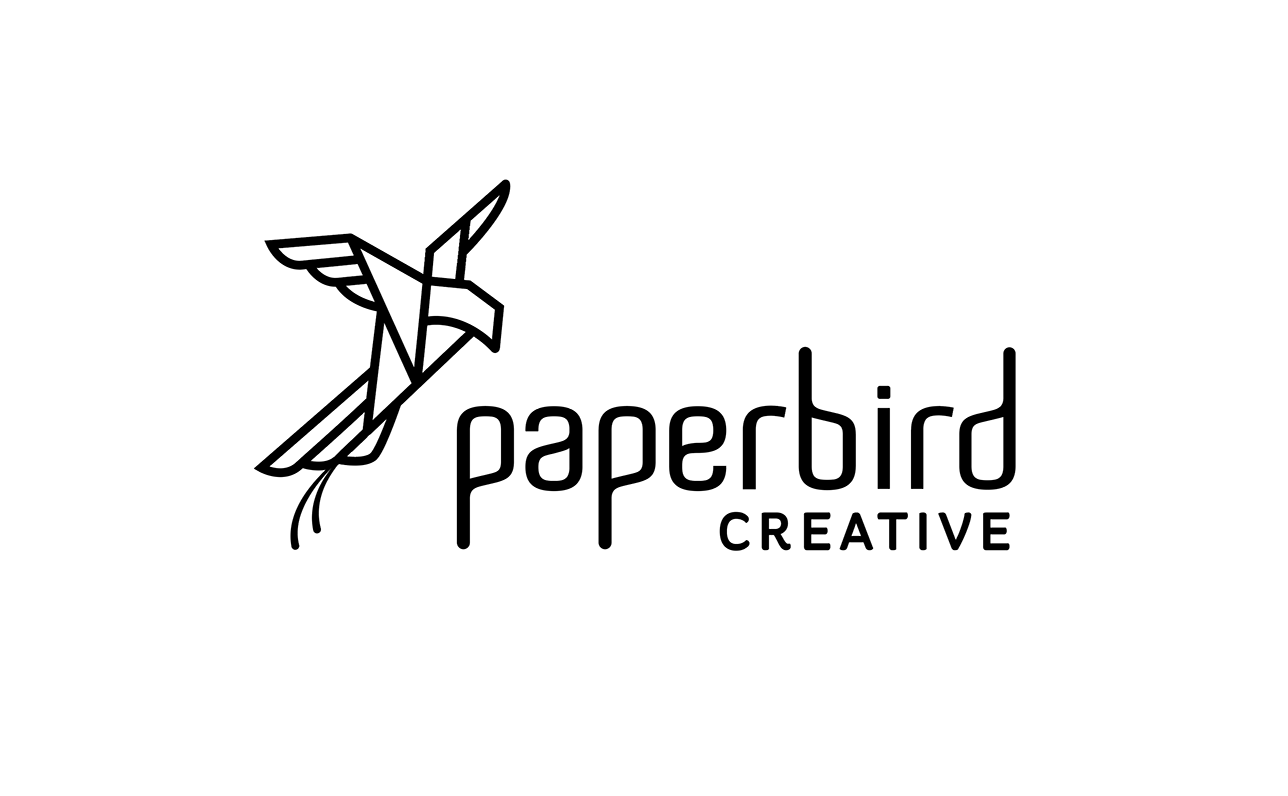
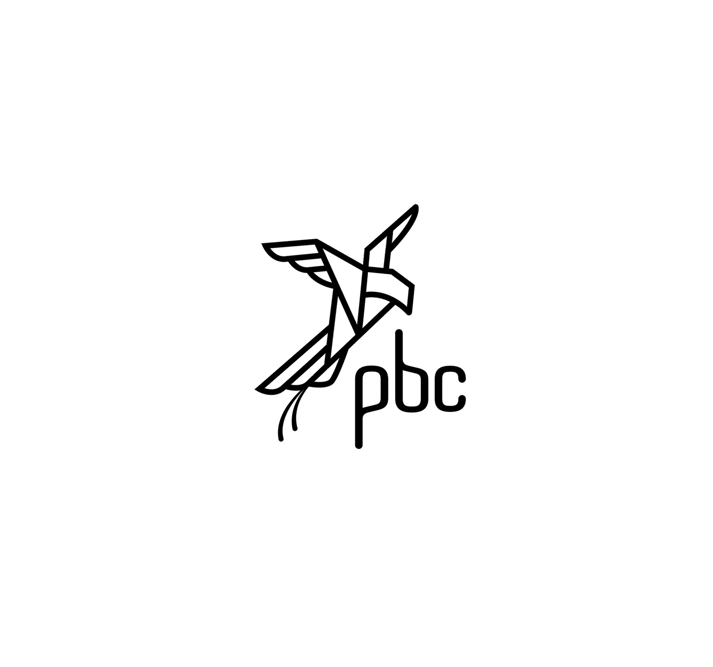
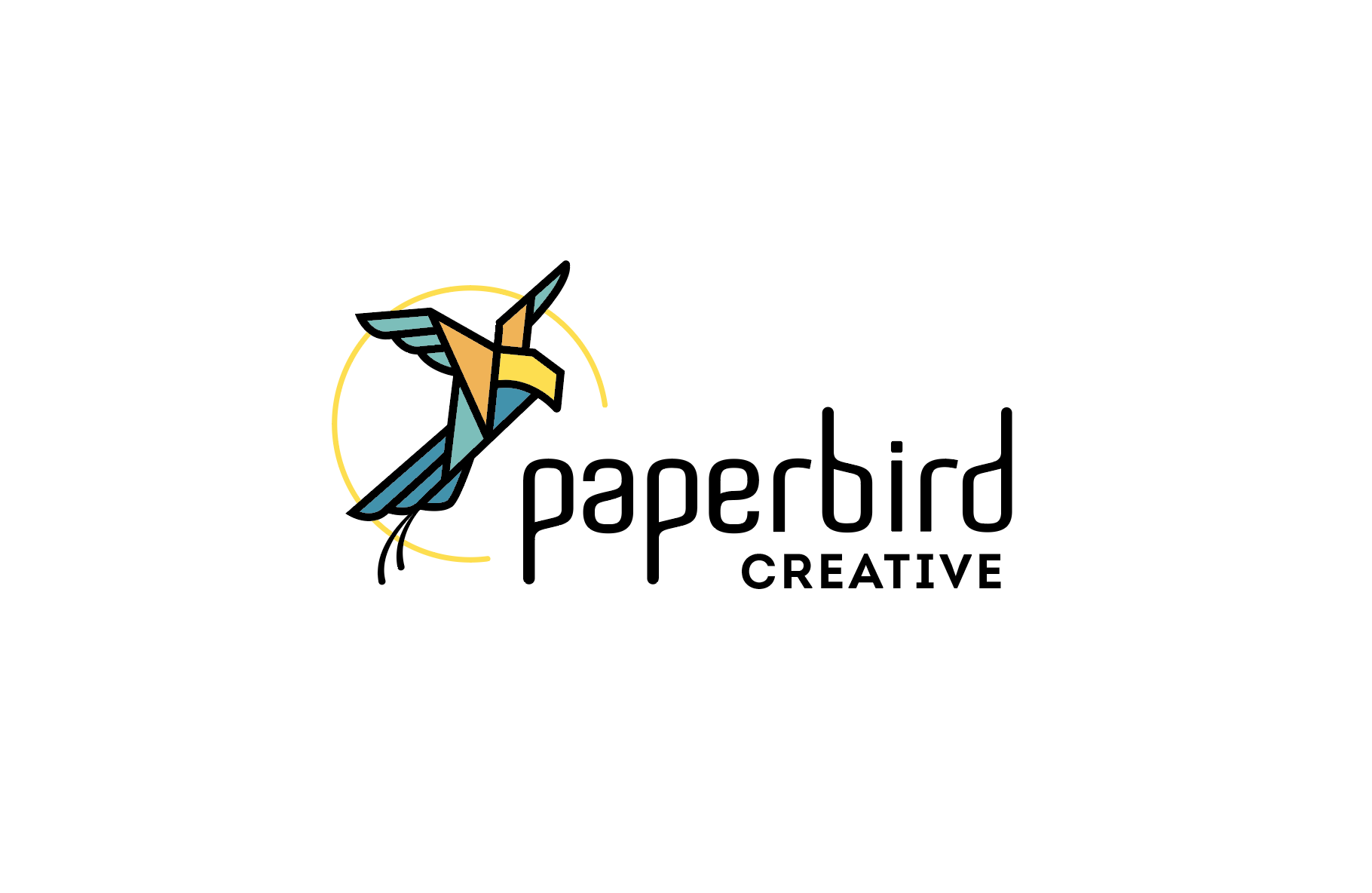
I do quite like the very first one, but with some tweaking, such as the relationship between type and icon. I think the icon could do with simplifying, by removing the hash lines and those two lines off the bottom of the tail feathers and as others have said, perhaps add an eye for clarity. I’d also get rid of the blue circle. It adds nothing.

As to the font; I feel the ascenders and descenders are a bit too long and become a little distracting. However, the thing that jars the most for me though, is the tittle on the i. It is very out of step with the rest of the glyphs and just looks a little gimmicky, to my mind.

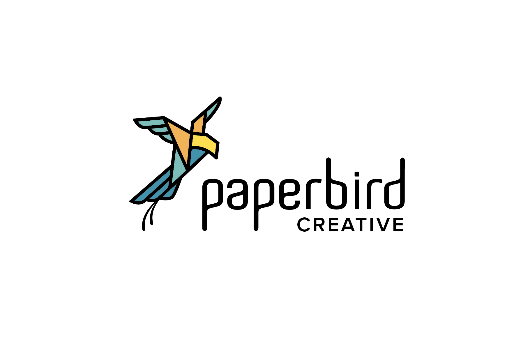
This first version as more substance than the second, as it does have some relevance, in that it does say paper and it does have a real sense of a small raptor hovering over prey, thus giving a sense of acuity and accuracy.

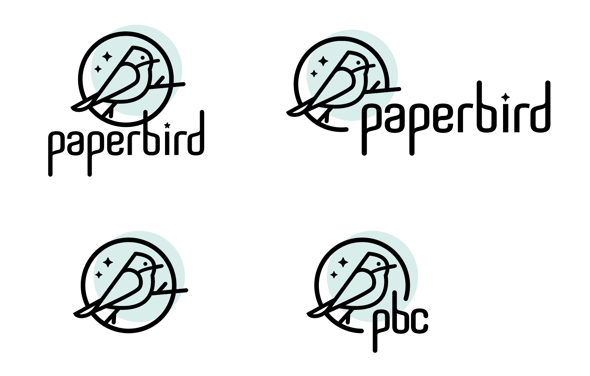
The illustration in the second option, for me, is a little too cliche and borders on Christmas card saccharine. Because of this, there is a greater disconnect between its style and the style of the type. I feel the first has more milage.

However, a slight red flag is when people weave their own personal likes and hobbies into this sort of thing. Why? There has to be a justifiable reason for doing so.

The most successful design, is the exact opposite, whereby the self and ego should be removed as much as possible. It should be about the people you are trying to talk to and the services and ethos of the client. This is a little different in that the client is you.

I still think, you need to tread a fine line to avoid making it too much about your personal hobbies (no pun intended on the raptor front) and make sure it communicates your business services.

Not a million miles away to my mind, but does need some refining.

Keep us abreast of how it develops. I’d be interested to see where you go from here. Good luck.

4 Likes

PBC. Please do not use abbreviations if at all possible. Almost no one can remember them. And almost always they have many other meanings as well. Some of them unattractive.

What Smurf said.
(I didn’t confuse the wing for the head and actually had a hard time figuring out what you all were talking about… LOL)

I think the problem with the head is perspective of the tail. While entire bird body is turned to the observer’s right, the tail is pointed directly at the observer in front. Two stripes of the tail in the right should be shorter to gain perspective.
Besides what already have been said (sprout made many good points), the typeface is a bit too bold in some variants of the logo and outshines the logomark.
Personally I like the first option as it is way more unique and less cliche.

1 Like

My two cents, some of which will be redundant to what others have said.

Overall, I’d say good job on this. I like what I see.

Of the two approaches, I much prefer the origami bird. Not only because it’s a nice illustration and ties in with the name, but the cardinal illustration really looks like a winter / seasonal / Christmas illustration with the two stars representing snowflakes. I did not have a problem with the wings reading as wings. It looks like a bird coming in for a landing looking down at the branch where he’ll be landing.

I don’t mind the hash marks. You can see how it would look without them, and maybe consider dropping them if they clog up for small reproductions, but I think they add some nice shading. I also like the depth the colored circle adds.

The one thing I’m not crazy about is the font. I like the idea of a modern sans serif font, but this particular one is not doing it for me. With the unusual shape of the bottom of the p and a, it almost looks like the type is set on a wavy line. Spend some more time exploring the type, and I would make sure you include “creative” spelled out along with paperbird.

1 Like

As they are now, none of the bird icons is going to work well at smaller sizes (foe example, when used as a favicon), due to thin lines and too many small details.

The wordmark’s legibility could be significantly improved by using a more tradittional font, without those diagonal lines.

Thank you all so much for the valuable feedback. I spent a few hours playing and have revised the origami bird. I’m quite pleased with it, although and on the fence about the typeface for “creative” (Ryde St Medium on top / Shirin Bold on bottom).

Critique always welcomed.

It is getting there.

This first has the most milage to my mind. ‘Creative’ font in the second, fights with the Paperbird font. Even in the first one, I think the point is too ‘soft’. I think it needs to be more neutral, without being cold. Otherwise you have two different decorative fonts fighting. Something more understated; maybe something like Proxima Nova. All caps and letterspaced, and perhaps look at the size relationship between the two words (perhaps upping the size of CREATIVE).

I think the Black lines are now too thick on the illustration. They were a better weight before I’d still get rid of the two lines off the tail. They will just cause trouble at smaller sizes. I’d like to see it with no colour, ie just black and white. If you are using colors, I would reduce the amount. Black and one other, that gives good contrast with the black lines, perhaps just the yellow for impact. If you ever need to spec that with spot colours, that is going to be very expensive to reproduce. Four spots plus black!

The circle on the third one is still a distraction and I the pbc needs to be a shade larger so as not to be swamped by the bird.

Hope this helps.

This first has the most milage to my mind. ‘Creative’ font in the second, fights with the Paperbird font. Even in the first one, I think the point is too ‘soft’. I think it needs to be more neutral, without being cold. Otherwise you have two different decorative fonts fighting. Something more understated; maybe something like Proxima Nova. All caps and letterspaced, and perhaps look at the size relationship between the two words (perhaps upping the size of CREATIVE).

The issue I’ve found is that wide typefaces are difficult to come by, so upsizing “creative” brings it beyond the decenders of “paperbird”, which makes it look (to my eye) unbalanced. I agree the Ryde is a better fit. I do have Proxima Nova and will test it out.

I think the Black lines are now too thick on the illustration.

Easily fixable.

I’d still get rid of the two lines off the tail.

Fully expected to hear that, LOL. However…the long tailfeathers are a hallmark of Bee-eater species so I may consider keeping them against advice. :thinking:

If you ever need to spec that with spot colours, that is going to be very expensive to reproduce. Four spots plus black!

Understood. I don’t think my business will ever be large enough to print in offset, however.

Black and white…

Proxima…I think it’s a bit cold. :face_with_diagonal_mouth:

Proxima too wide and a bit too thin, but I prefer more minimalistic sans serif instead of your previous choice. Looks more professional rather than cold.
By the way, the overall upgrade is great.

1 Like

I’m thinking Intro kinda works, actually.