Hello guys!
My first post here!
I just want to ask for your feedback!
Thanks a lot!
Aesthetically, what you’ve done is nice, clean, simple and elegant.
However, it’s all Photoshopped promotional odds and ends for what seems to be a hypothetical company with no actual work to show. The text also seems a bit hyperbolic and disingenuous given that it’s implying a large staff and capabilities that aren’t demonstrated by the work. And speaking of words, a full-service agency should have copywriting expertise, which, judging from the text, it lacks.
I suppose the bottom line is that it looks nice, but there seems to be no substance behind it.
I’d agree that the logo design itself may have potential for success in the right market (I’d need a lot more information before I could opine further about that). But as for the mock-up-fest that the link sent me into, that stuff always leaves me cold. More often than not, it ends up implying a whole lot that really only amounts to the pointless make-believe of designers putting in a bunch of work to indulge themselves, and just as often does as much to expose the weaknesses in a design as it does to demonstrate strengths.
I agree with Just-B’s and HotButton’s comments. Overall, it has a nice appearance, and I am assuming this is an exercise rather than an actual, paying work.
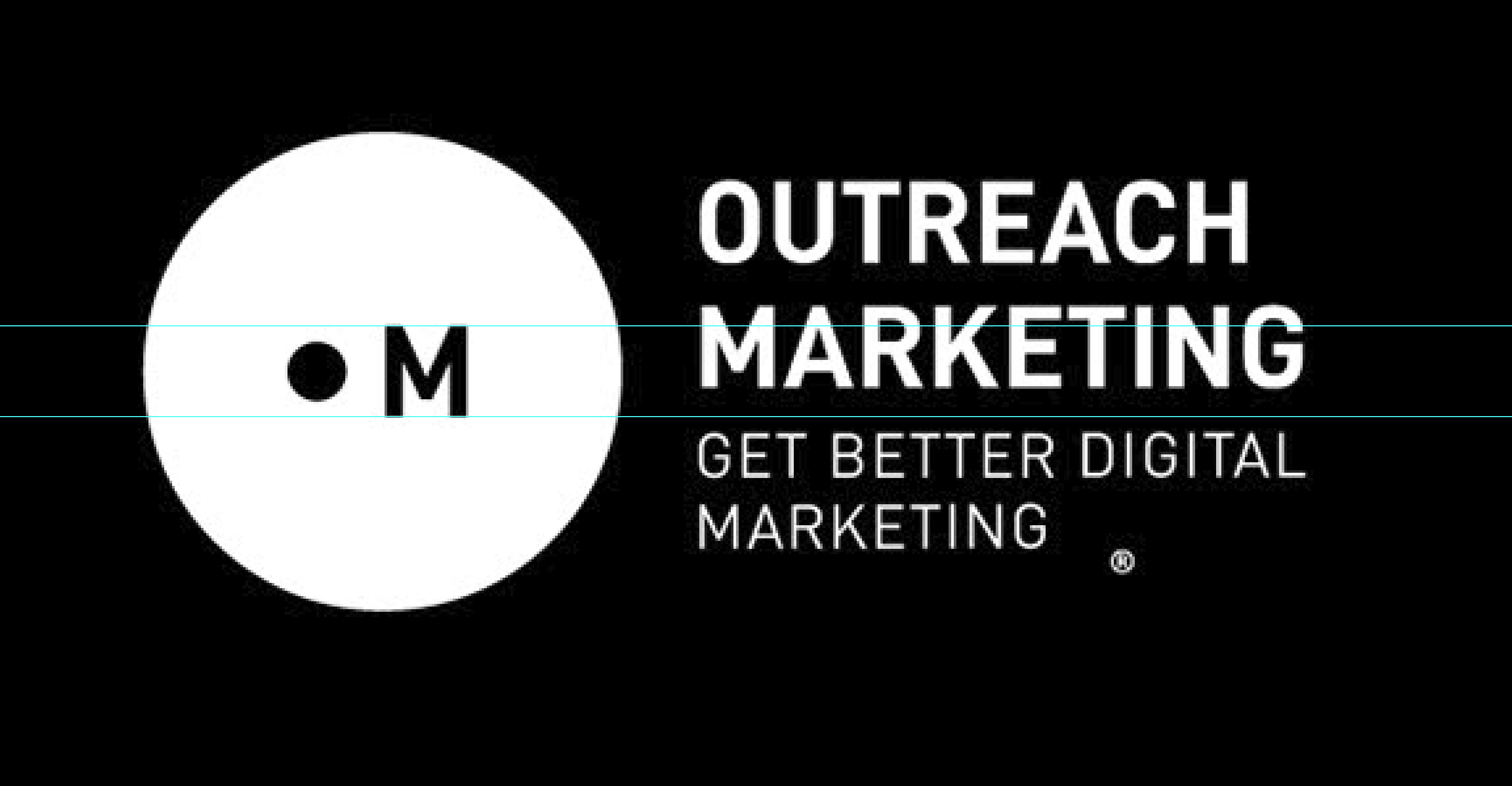
The one major gripe that I have is that the baseline of the copy does not line up with the baseline of the M in the mark. I think you need to spend more time tightening your grid and really consider how the type – both with and without the tagline – relates to the mark.
Also, the registration mark off floating by itself seems to be an error.
I missed the part about this only being about the logo and interpreted the Behance site as being an attempt at imitating a company’s promotional efforts. Even so, why are you creating a presence on Behance dressed up as a pretend company? Were you trying to provide context in which to judge the logo?
Despite all that, I agree with HotButton and Steve. The logo has potential, but is unusual — which isn’t necessarily a bad thing for the right company.
It’s not a registered trademark, is it? Assuming it’s not, that little misplaced ® you’ve added just heightens the impression that you’re only messing around with some pretend stuff.
As for the name and, especially, the tagline, well, it’s awfully bland and generic. A tagline that reads, “Get Better Digital Marketing” is a rough equivalent of General Motors or Nissan coming up with a new slogan that says, “Get better cars.”
yeaa ur right .. Thanks