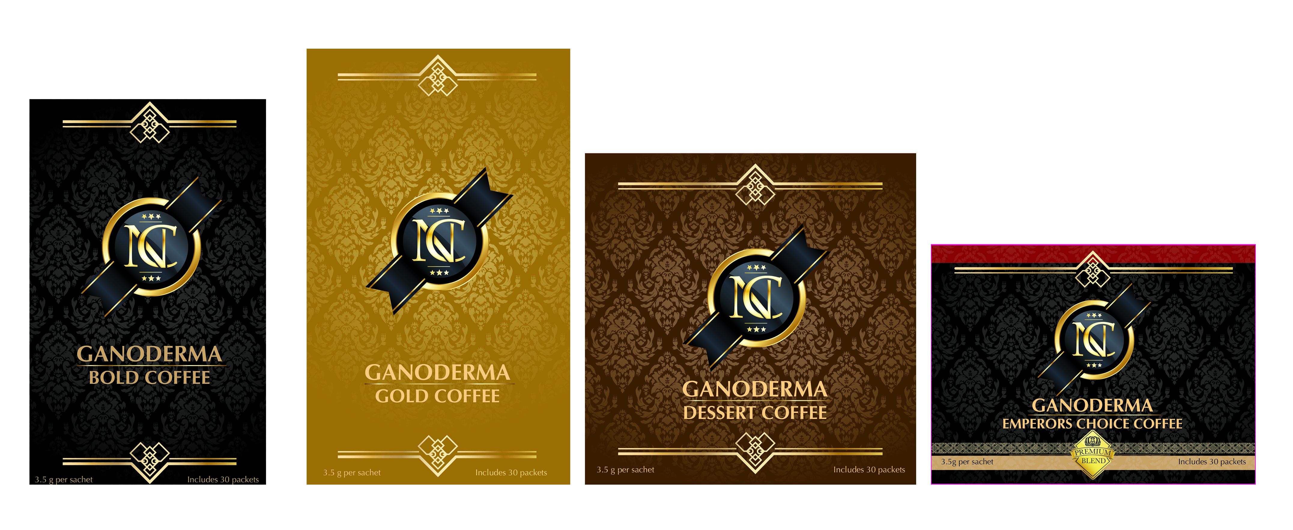
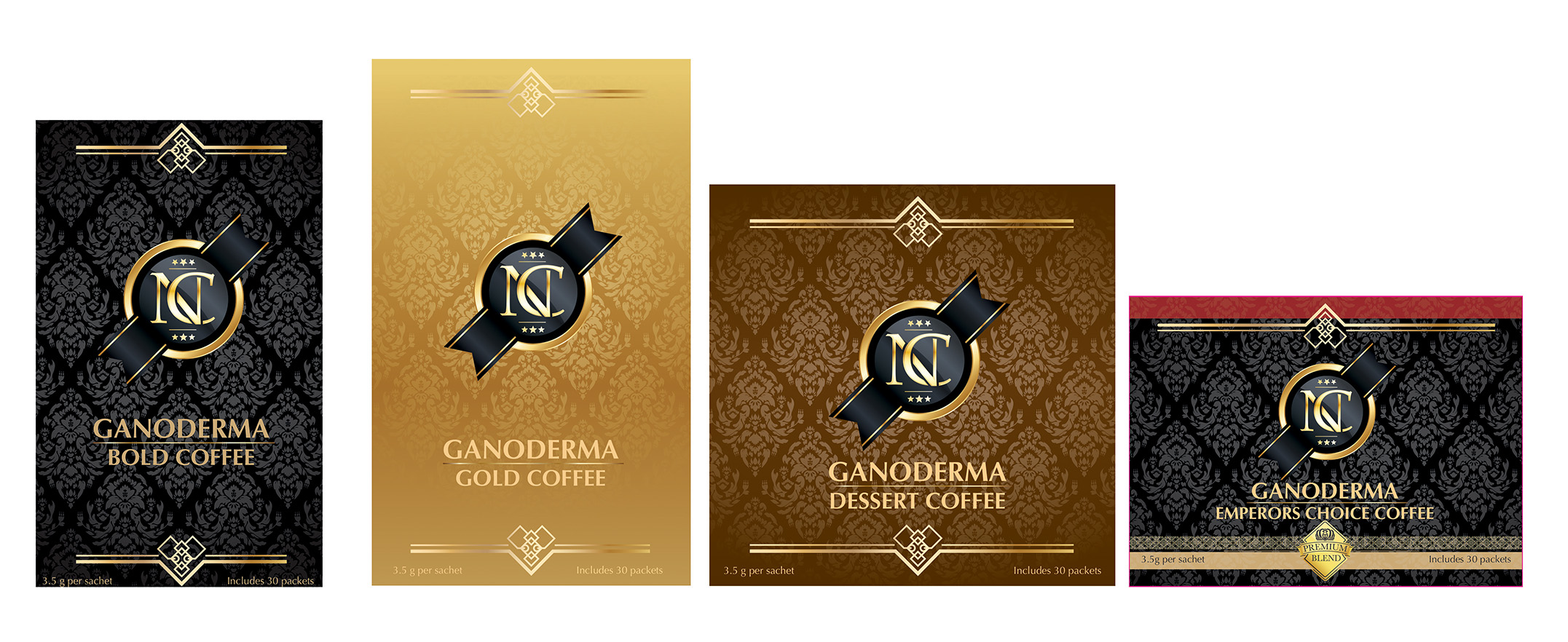
Hi Everyone, I am in the finishing stage of creating package designs for a line of elegant coffee’s the problem is that everyone is torn between the looks of the Gold, Dessert and Emperor’s Choice (everyone loves the tall black box).
I wanted to get everyone’s vote. Set 1, 2 or 3? Please let me know as this will be the deciding factor on which to go with.
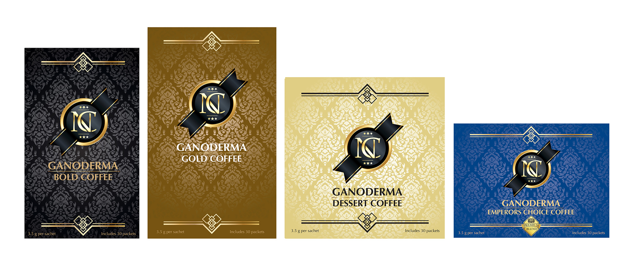
I prefer the set that has blue in the mix, as it seems to brighten up the range to be more inclusive to people’s color preferences. I know the coffee space is very competitive and it’s probably a better idea to widen your range than be too niche with a lot of black/gold.
One thing that is concerning is what seems to be simulated printing effects. Looks like there is a gradient that is supposed to be simulating foil, shading around the embellishments that appear to be simulating emboss, a pattern in the background that seems like a simulation of spot varnish.
Is the plan to use the actual printing processes to achieve these effects? If not, I’d fear these simulations might have the opposite effect of “elegance” when printed.
In regards to your concerns on the printing. The plan is for the gold gradients to be foil stamped on a velvet touch card stock with the background pattern to be raised spot uv. The design that simulates a gold gradient is just that. The client wanted to see an additional option over #1 and #2 that just have solid gold backgrounds.
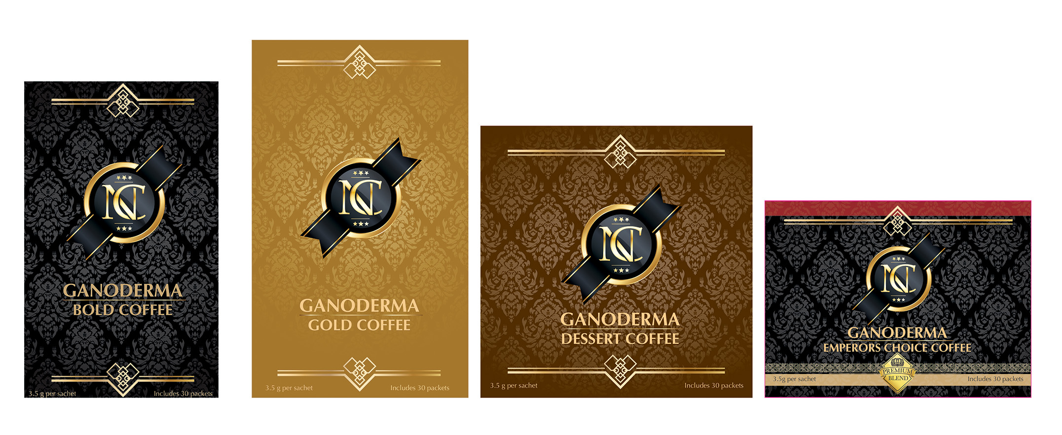
They’re all nice, which makes choosing more difficult than if you had clear winners or losers.
I agree with Silence04’s reasoning, but I still like the top row best.
The bottom rows might stand out a bit more on the shelf and differentiate themselves a little better from the other gourmet coffees, but they also seem a little off to me. The blue packaging is much brighter than the brownish packaging, which interferes with the brand consistency of the product line. I’m not sure how you’re planning on achieving that RGB aqua color bar on the last package or, for that matter, why it’s even there. I also can’t read some of the typography on the packages — especially when there’s dark type over a dark, busy background.
Even though all the packages are different in the first row, those differences are uniform differences which helps unify them into a cohesive line of coffees. The top row just has a more finished look to it where everything’s been thought through. The bottom two rows could work, but they look more experimental and in need of a lot more refinement before they’re viable alternatives.
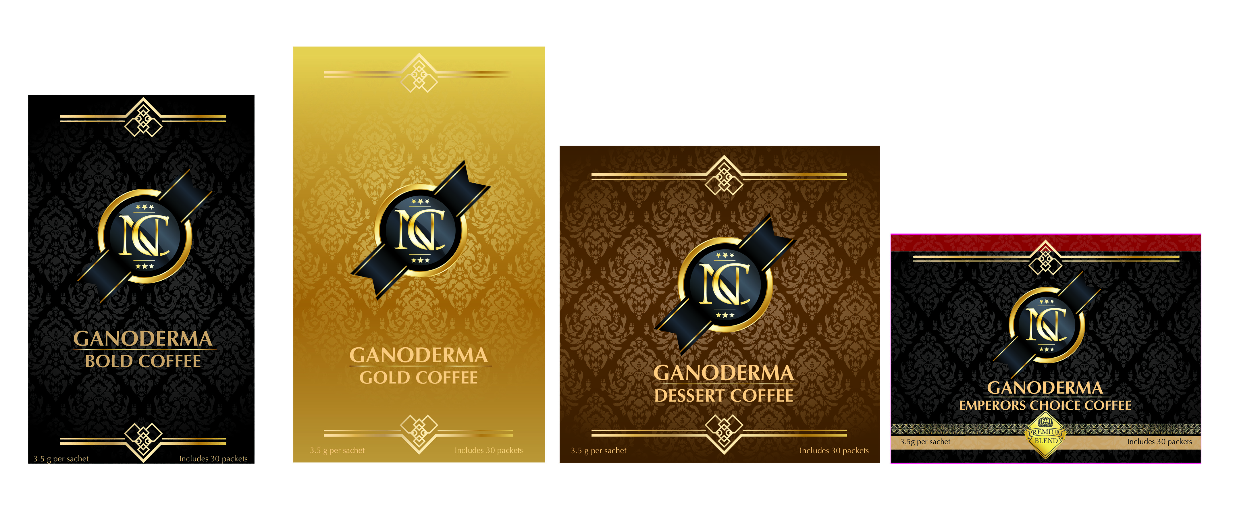
Hi Just-B, thank you for all the great feed back but I think that their was a issue with the jpeg uploads. I will review your feedback but please look at these new uploads and then let me know what you think. Thanks! Rick
Well, that certainly changed things for the better and made all my comments irrelevant.
With the changes, it’s even more of a toss-up, but I’m finding myself liking the second row just slightly more than the others. It really does boil down to personal preference, though, which is sort of meaningless.
I do, however, like the small blue package color on the top row. I’m not sure of your reasoning for the two black packages on each of the two bottom rows or why there’s the red bar on the top of the small package. If there’s a reason for the red bar, the black color and the wider gold band at the bottom, great. If not, why is the small package design different from the others? Again, unless there’s a reason for the small package being black, I’d be inclined to make it blue, like the top row.
I’m not sure, but at this point, I’d leave it since changing it would make all the following comments misleading given that they’d all be referring to an image that’s been replaced by another.
I’ve bumped up your access level by a notch, which might allow you to edit things if you really want to. I’m not sure which access level grants that ability, however.
I am leaning towards the second row for all the designs. I do like the blue box from the first row but my concern is that the client really wants to see a nice deep royal blue but these keep seeing this blue on websites and I keep telling them that this would be very hard to achieve.
The idea on the last small black box using the red bar at the top and gold on the bottom is that the flavor for that box is called “Emperor’s Choice”. My thought was if the client likes the first black box (they actually love it) and I can’t achieve the rich royal blue then why not do a similar black box that has more embellishments. What do you think?
I like the blue but unless someone can recommend an option to make the printing look something like this:
My biggest concern with the two black packages is that consumers might mistake the small one as being just a smaller quantity/size of the large one when, I’m assuming, they’re two different products.
As for the blue needing to “POP like the client wants,” the other colors don’t exactly pop either — it’s the box’s overall designs that pop and makes them stand out, which I think would be true of the blue box as well. Having the blue box POP without the browns, tans and black popping might make it inconsistent with the others. Anyway, it’s difficult to discern these kinds of color and reflectivity qualities from website images — actual samples are needed.
That was my concern also is that people may see 2 boxes and think same product but different size which is why I tried to make the smaller box that will be the high quality product have more “enhancements” to it with the red and gold bands.
I totally agree with you on the “POP” and nothing else really “POPS” either! I also agree that physical samples needs to be made!! Thanks!!
I am a student just learning about design, but from my unlearned opinion, I prefer the set on the first line. I like having the blue as part of the mix, and I also like the greater contrast between the two medium browns.
Hi Deborah, thank you for your feedback and good luck with your studies. You opinion was correct as we did go with the first row. There were some slight color modifications but those were the winners! Keep trusting your opinion!