Instilling calm, confidence, and connection, this enduring blue hue highlights our desire for a dependable and stable foundation on which to build as we cross the threshold into a new era.
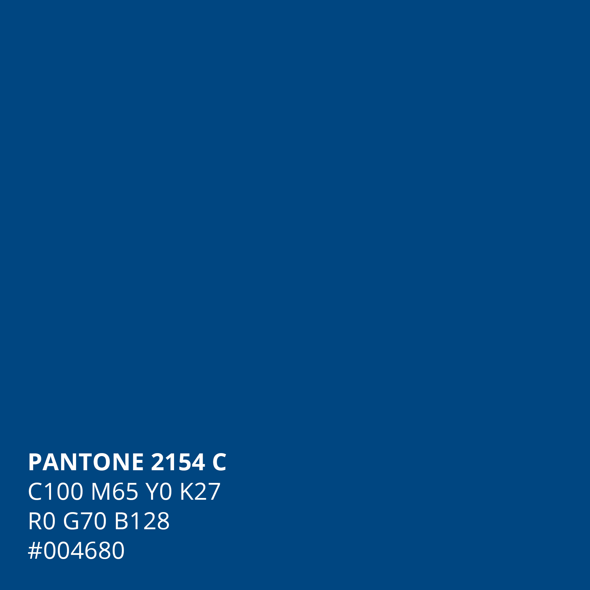
A timeless and enduring blue hue, PANTONE 19-4052 Classic Blue (PANTONE MATCHING SYSTEM™ – Best Cross-Reference PANTONE 2154 C) is elegant in its simplicity. Suggestive of the sky at dusk, the reassuring qualities of the thought-provoking PANTONE 19-4052 Classic Blue highlight our desire for a dependable and stable foundation on which to build as we cross the threshold into a new era.
Imprinted in our psyches as a restful color, PANTONE 19-4052 Classic Blue brings a sense of peace and tranquility to the human spirit, offering refuge. Aiding concentration and bringing laser like clarity, PANTONE 19-4052 Classic Blue re-centers our thoughts. A reflective blue tone, Classic Blue fosters resilience.
As technology continues to race ahead of the human ability to process it all, it is easy to understand why we gravitate to colors that are honest and offer the promise of protection. Non-aggressive and easily relatable, the trusted PANTONE 19-4052 Classic Blue lends itself to relaxed interaction. Associated with the return of another day, this universal favorite is comfortably embraced.
I found myself using it a few times, but with RGB and CMYK equivalents — not the Pantone color Ha! I just realized I’m wearing a shirt today that’s pretty much that color and that I bought last year.
Admittedly, that coral pinkish, orangish color was sort of trendy. This year’s color, though, is just a conservative medium-dark blue — nothing trendy about it.
Maybe I’m just tired of the rhetoric, but this blue and that verbiage appear entirely political on Pantone’s part.
Geesh, ya can’t even look at a color swatch book any more without choosing sides.
Give it a freakin’ rest!
i think i tossed my pantone color book swatch last year or hid that in a great place, i must have moved that 29 times a year, never using the book for a reference. i hope i acquired that for free in 1997.
If I remember right, there was also a message in last year’s coral color — an environmental message about global warming and how rising temperatures and changing water conditions are bleaching and killing the ocean’s coral.
What does “color of the year” even mean? It doesn’t seem to be a retroactively granted award, as if this color was the most used in 2019, therefore it stands out. It’s as if Pantone is prophesying this color can and will lead design trends within the coming year.