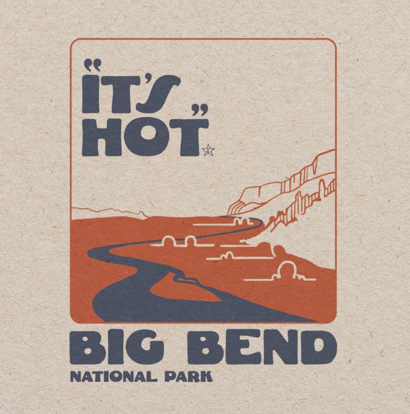
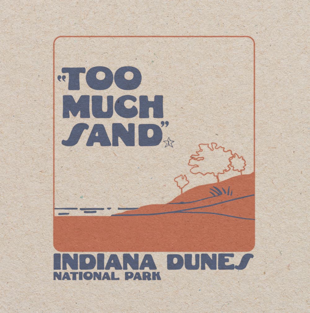
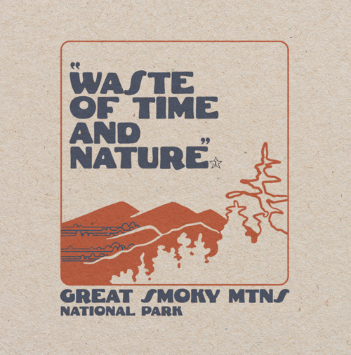
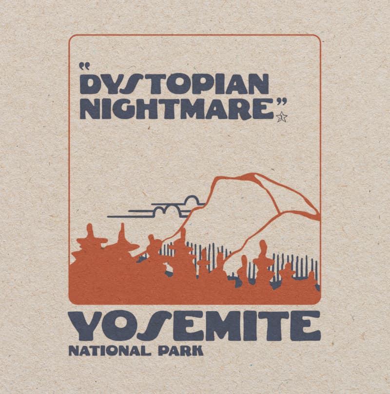
I started making National Park designs using minimal artwork, ample negative space, a retro semi-hand made font, and people’s 1 star reviews of the parks to add humor. The artwork is relegated to 2 colors and the background. The whole thing is suppose to look like vintage.
Because of their screen print look, Ive been putting them on shirts. If you want to see all of the designs I’ve made you can find them on my website HomeTownRiot.com
I’ve been playing around with the quotations and text placement. I would be interested to hear other’s thoughts.
I like the type, the retro look, and the one star reviews are actually pretty funny.
The one thing that bugs me is the inconsistent placement of the quotation marks. I’d like to see what they’d look like if you moved the text to the right so the opening quote mark could be to the left of the first word and have the closing quote mark be consistently to the right of the last word. One alternative would be to leave the review copy where it is, move the opening quote to the left of the first word, and have the opening quote break the rust-colored keyline.
First, I like the old-time spot color letterpress or screen print look and what you’ve done with it. They look great.
However, I agree with Steve about the quotation marks.
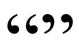
Speaking of quotation marks, I assume you’re using a free font because the opening quote marks are the wrong kind. This is a common mistake made by amateur type designers. It’s become so common, that it’s almost become acceptable.
Opening quotation marks should be flopped horizontally and vertically from the closing quotation marks, not just flopped along the vertical axis, as in the font you used. See below for the standard orientation.
Gotto say I love it! The quotation marks do hurt my eyes though. And maybe have like the 5 stars outlined as with a normal review and then just have one coloured? If you didn’t explain it I would have not realised that’s what it was - even with the quotes. You gotta look after the slow people as well…
Other than that, it’s brilliant! The artwork and colouring is spot on, easy to read and great for a tshirt!
Yea, I did not know this. The font I’m using didn’t have quotation marks with it so I used another similar fonts. Apparently that font has the quote marks backwards!