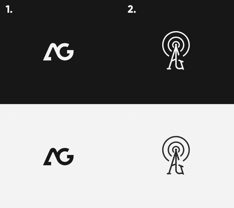
Hi all, I am working on developing a personal brand and would like some feedback on two of my logos. My initials are AG.
#1 is the one I currently have, but I am not necessarily tied to it; I wanted to explore something more old-school, so I came up with #2, which uses a radio tower as if I am ‘broadcasting’ my ideas as a designer.
I can’t decide what to go with; there are pros and cons to both but would like advice on how to improve them.
Thanks!!!
Your logic on the second one about broadcasting your ideas seems a little stretched unless you are working in broadcast (or at least podcasting).
Using that same logic, you could use a lightning bolt because your work is electrifying. Or the sun because your ideas are enlightening. Or a star for your stellar ideas. I’m not too sure that line of reasoning is solid.
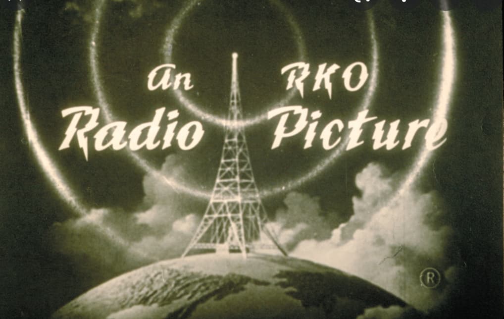
On the other hand, a retro-looking approach is fine if you do retro-looking work for clients who want that kind of look. As for the old RKO logo — if that factored into your thoughts — they really were involved in broadcasting, and at the time, the look was futuristic.
Reading back through what I wrote, it comes across too negative. I suppose what I’m getting at is that I’m unsure of your thought processes and how they relate to old broadcast transmitters. Maybe there’s a great idea there, and maybe I’m not quite seeing it.
No I get it. I appreciate your reply. It was a concern of mine as well.
I am inspired by old-school tech from the 50s/60s. I felt that a radio tower was a great visual for communicating ideas. That’s it. Maybe I need to think about it a whole lot more. I wanted to repurpose it for a designers mark but it could be seen as for someone working in audio.
Additionally, the mark starts to break down on small screens, so I am losing faith in it.
The first one is what I have used for a year, I think its solid, but it doesn’t really reflect my work as well.
#1 – The hook on the A is really unnecessary. It only serves to weigh the whole logo down on the left side. Joining the A and G this way looks a little forced, but not unpleasant.
Same thoughts as Just-B - the radio tower is non-sensical for a designer.
Although it could be a target, or a wifi broadcast - but the angling of the letters suggest a tower. Either way, a radio tower, target or wifi is not relevant.
I of course then prefer the other one. but it just doesn’t say anything either. It’s quite generic.
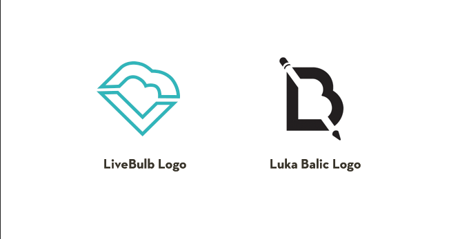
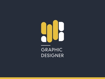
At least you steered away from the generic pencil/ruler type images
Here’s some examples where I find them a bit clever
I was about to say pretty much the same thing. Why is personal branding any different to branding for a clients? Apart from the fact, it’s a whole lot more difficult to be as objective.
Determine what you want to say, who you want to say it to, why you want to say it. Then you work out the how. Doing something to look pretty is fairly pointless.