I’m working on a personal re-brand. I’ve joined the forum recently because I’ve heard way too often recently “You can do better”. As a freelancer, I design in a bit of a vacuum, alone in my home. So what a great way to learn and grow than going back to good ol’ critiques.
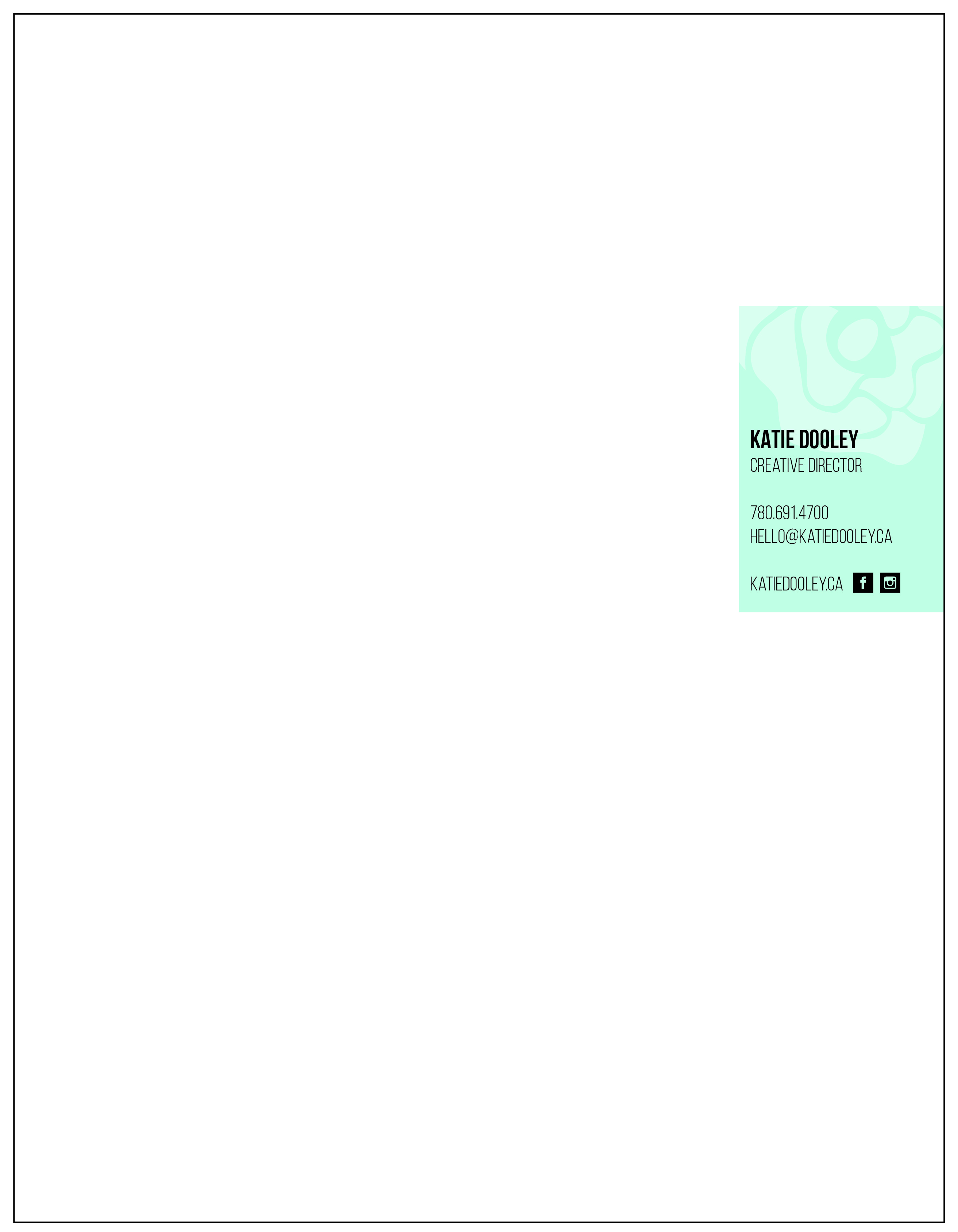
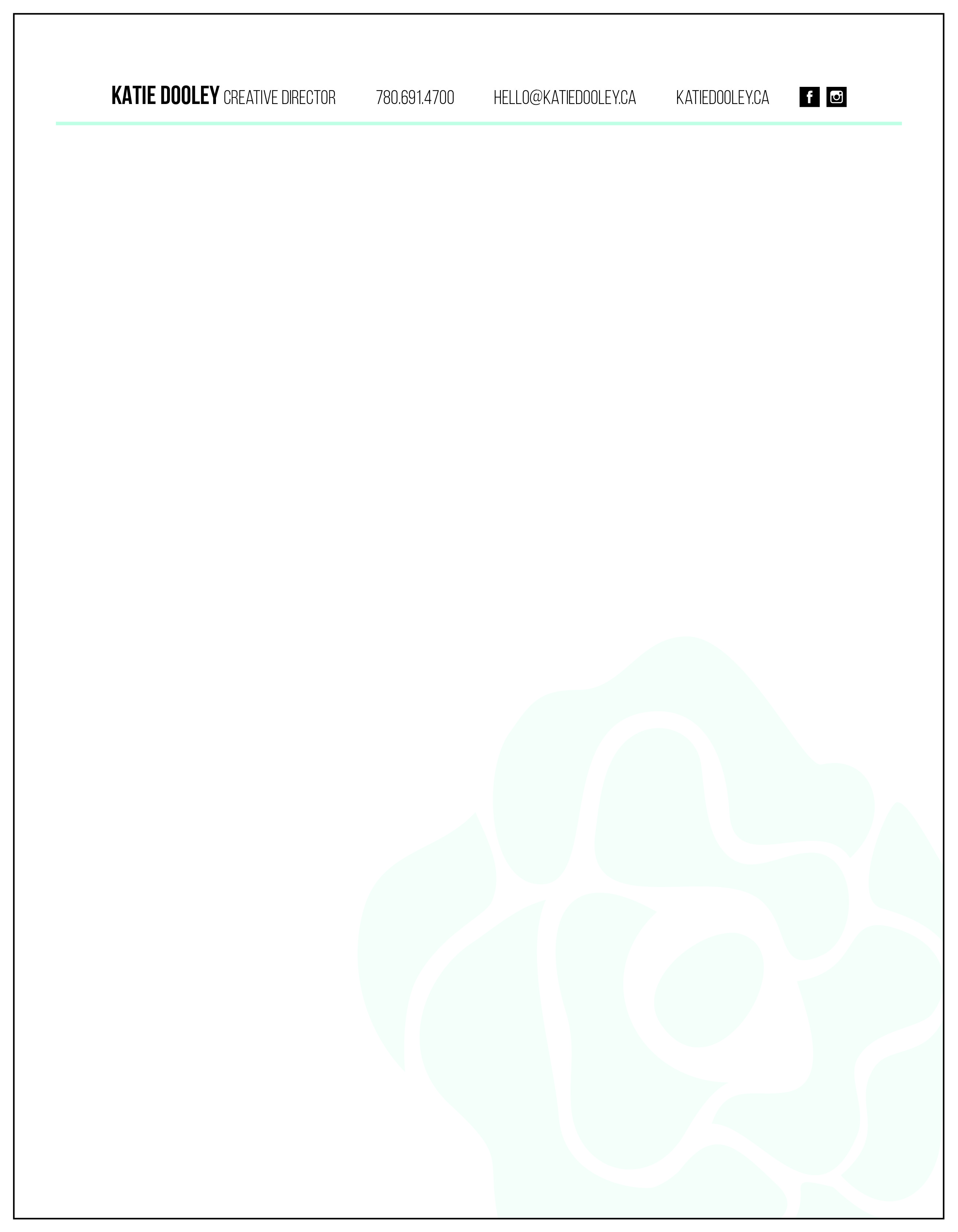
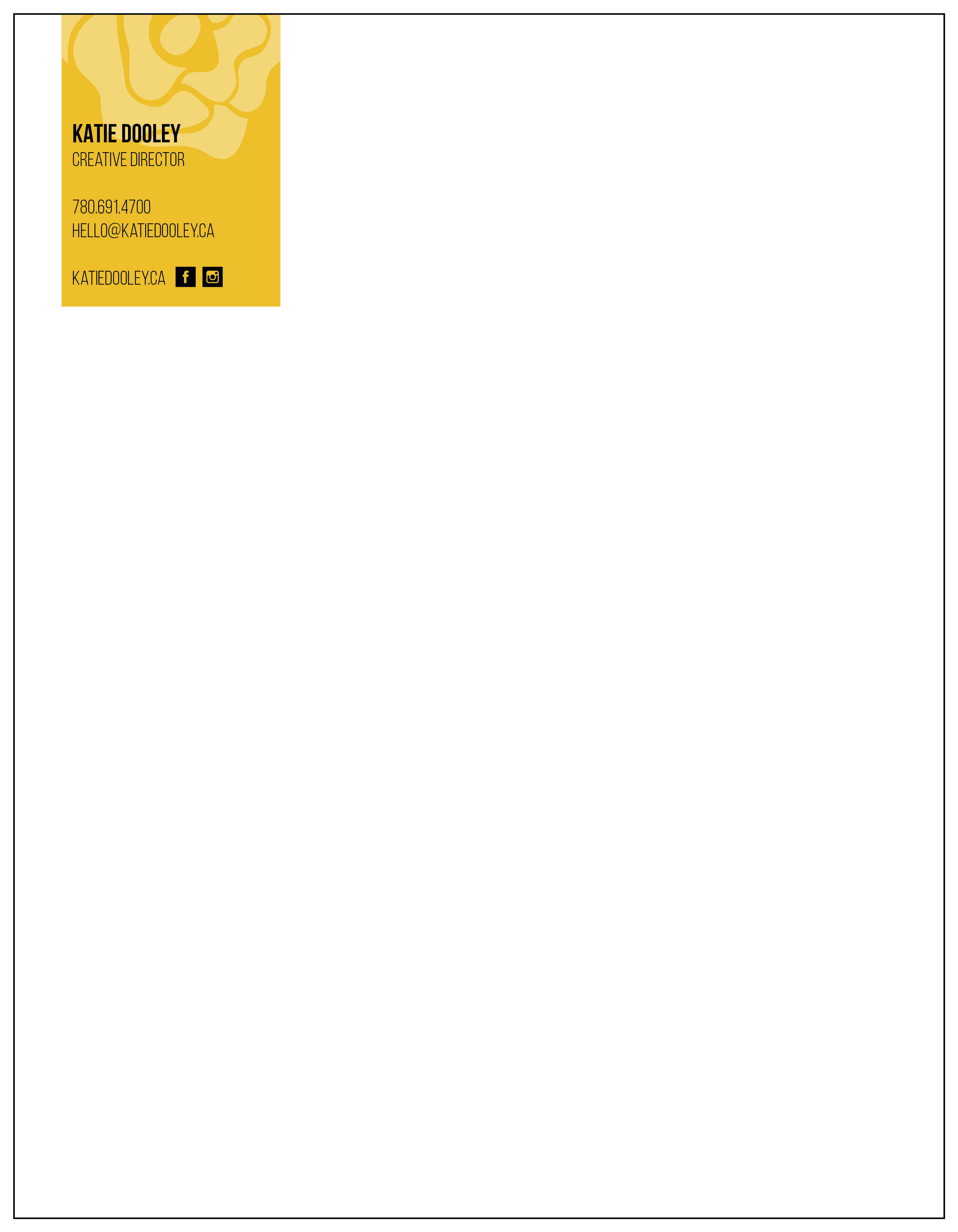
This is my letterhead, which got the feedback “you can do better” and “it’s boring”. Three different options and would love to hear from you.
I really like the top and bottom ones. I don’t think they’re boring at all. Instead, I think they’re a nice balance between creative and business-like, which is a pretty good place to land if you’re trying to appeal to clients who might regard “artists” as a little suspect.
I might letterspace the condensed caps just a bit more, though. The letters look just a little crowded. Hard to tell at the size I’m seeing them, though.
I rather like the first option. Although I would say the letter spacing could be loosened up a bit. The only other thing I’d say is that you should at least consider making the Facebook f and Instagram camera white. Maybe you tried it and it didn’t work, but I’d like to at least see what that looks like.
I think they’re almost there. At the moment they feel halfway between a business card and a letterhead. I like the impact of the coloured box in the corner but it also looks a little large. You could try leaving your name and logo in the corner, and then running the other contact details along the bottom.
The layout of the first could cause issues as you’d need to set your right margin quite far in. I would avoid the watermark in the second one as they can cause issues with scanning or photocopying.
But letterheads are meant to be mailed inside envelopes, and the postal service likes to see a return address on the envelope. By not having an address on the letterhead, you run the risk of subtly implying to the recipient that something is amiss.
As a freelancer, I don’t write any letters, but my letterheads are used for quotes, invoices and contracts. The letterhead require for those things is usually different to a typical “letter” letterhead.
I like the last design you have posted but you may find that your actual needs when in use may differ.
Yes that’s exactly what I use it for, quotes, invoices, contracts as well as any digital proofs I send on my letterhead. So I don’t want my letterhead to distract from a potential design, but I use it as a type of watermark.
You need a return address of some kind.
Not sure what kind of work you do, but in the print work I do, we send out a LOT of physical proofs and color checks directly to designers. Not only do we need to be able to Fedex/UPS to an address, we need the telephone number and information on whether it is a residence or a business, and if a residence, if are you ok with them just leaving it (most things are time sensitive and shipped priority overnight. If they don’t leave it, being a residence, you see it the next day.)
I really like the option that you have on the bottom I think that the color choice is really interesting.
Nevertheless it could be really interesting if you would play a little bit more with the typography, for example, you could try to interchange it with uppercase and lowercase. Also, you could put the flower at the bottom and the text at the top. This way people would focus on text that talks about you.