Personal Logo Critique

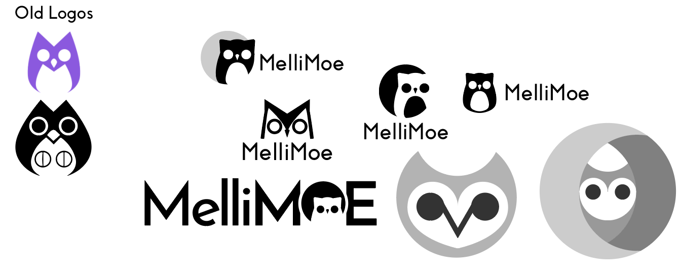
Hello! I am an illustrator looking to create a more clean, modern logo I can use both for my freelance illustration work, but won’t look embarrassing if it’s included on a professional page (I work in marketing).

The two leftmost logos are my old logos, one combining an owl and an “M” and the other adding a cat in the negative space since my art tends to be cute/witchy and features those animals. I made a pass at another “M” owl, as well as a few plain owls and moon+owl logo marks, but I’m not a graphic designer so I could really use some pointers. Kinda modern and cute but not too cutesy is my goal. Any feedback is much appreciated!

Though I think the idea is an owl, a
couple of these struck me as a cat with a really big mouth.

What is the purpose of the logo? Is it for a animal product you’re selling? By the way logos are nice!

The upper and lower logos in the center look good.Maybe I’d reduce the font size of the bottom one.

The two with the owl reversed out of the black circle remind me of Nancy.

Sorry I’m not sure which you mean! Is there one you think is strongest of the lot?

Oh, no I mentioned it’s for my illustration work :slight_smile: thank you!

The upper logo in the center looks the best for me.
As for the lower logo in the center, I’d reduce the size of the letters…