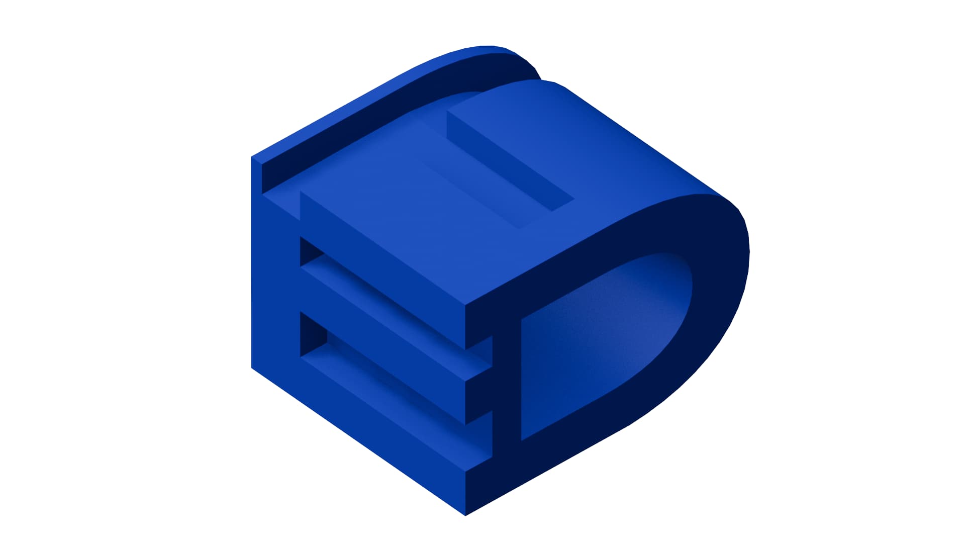
I’m working on rethinking my personal brand with new colors, fonts, messaging, and a logo. The image above showcases my idea for something in 3D. It’s supposed to showcase my initials (E.T.D.) across each plan on the object. Does this read correctly for anyone else? If not, I need to rethink how I’m planning this out
Maybe you could first explain why a dark blue 3D model meets your needs or satisfies the practical requirement of a good functional logo.
2 Likes
Says “TED”
I’m looking to build a logo that conveys that I think about design with unique perspectives. I used a wide font like Anisette to convey my wide array of experiences and a cube-like presentation to show how those experiences can be concentrated in one, tight package.
There are a few logos out there that achieve this sort of look, and yours has a strong foundation with its solid 3D presence and bold structure.
For me it needs a more polished feel for that reason I’d consider adding metallic, glass-like, or textured surfaces to move away from the plastic-like appearance. Incorporating gradients or reflections can create a greater sense of depth, which could accentuate the 3D effect will help the design really stand out.
Refining the curves and edges is another important step. Smoother transitions or sharper details, depending on the tone you’re aiming for, can make a big difference. Introducing a slight tilt or rotation to the letters might also add a sense of dynamism to the design.
The colour scheme is a bit weak, maybe incorporating a complementary or gradient palette, such as a blue-to-teal transition might raise the visual appeal. Or even a secondary colour to accents might increase the overall effect.
That logo, I can print it all day long.
If you want to do anything else with it, Cha Ching.
Do you have the 3D file for that or did you just create it flat in Photoshop or Illustrator? (using Bevel and Extrude are still flat.)
Do you have a non-gradient version?
1 Like
It’s more of an illustration / 3D model than it is a logo. The 3D adds nothing, unless, of course, your job is 3D modelling. If not, then it feels very gimmicky to me,
Some of your rationale feels a bit flakey too. Wide font does noting to explain wide field of experience. The emotive capital of fonts does not work like that. Extended sans serif fonts with large open counters and bowls may convey expressive openness, clean, modern, etc. but broad experience, it going to be a very unlikely take from that.
As I say, if you are a 3D artist, then consider my head well and truly pulled in.
That said, practically there are many considerations: Not enough contrast to be clearly legible. How will it reproduce small. How would you embroider this on a cap – or any other application where you need flat colour.
Sorry to be so negative, but, for me, it doesn’t work as a logo.
2 Likes
I held off giving a critique until you spelled out your logic, but I need to agree with @sprout: This isn’t a logo and meets none of the usual requirements of a logo. I’m certainly open to new approaches to branding, but I don’t think you’ve hit on the right formula.
The dark blue doesn’t have enough contrast, which makes it look like a dark and hard-to-decipher shape. I can barely make out the letter T. When I first saw the 3d model, I thought it was a practice attempt at modeling a rubber component for a piece of machinery.
Logos must be versatile enough for all occasions — online, in print, cut from vinyl, embroidered on hats, screen printed on t-shirts. They need to print in color, grayscale, and black and white. They must be easily resolved from a distance or quickly catch a person’s eye.
As Sprout said, if your primary career choice is 3d modeling, I suppose a 3d logo could be appropriate, but even then, this one isn’t it for the reasons already mentioned.
2 Likes
You’ve touched on some points I already aluded to by saying to improve colours and secondary colours etc.
I think 3d logos have a place - when executed well, but I have to agree the execution is a bit on the poor side and needs to be improved.
I looked up 3d initial logos and found some really good versions out there.
If they’re hell-bent on having a 3D logo I’m not going to argue, maybe it’s the new Jaguar.
Or like marmite, either love it or hate it.
If it works and legible then fine.
Not really worried these days about application on garments or other substrates, technology has moved on and what used to be impossible is now possible.
You have things like this now
Yeah, I had a feeling that this wasn’t going to work once I finished up the modeling process. I’m looking at other options on how I can build out this personal identity more. Thanks for the tips!
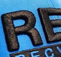
Smurf, is that 3D printing on fabric? We’ve been playing with that a bit, but just doing silly things like fishscale armor on mesh fabric.![]()
It’s called puff embroidery as far as I know, haven’t seen it first hand.
I think puff embroidery is regular embroidery in which a thin sheet of foam is placed over the fabric before embroidering. The foam is trapped between the thread and the fabric, and the excess foam is weeded once the embroidering is done. There’s also puff ink that gives a slight fuzzy 3D effect, but if I’m not mistaken, it’s a screen printing ink of some kind.
The puffy black printing of the R and E looks different — like actual foam. Maybe it’s done with a 3D printer, as @PrintDriver suggested. I wonder how well it adheres to the fabric.
It’s getting to the point where there are too many techniques and specialized processes to keep track of.
As far as 3D ink sticking to fabric, that’s why we’ve been using mesh, or rather, netting. You have to print a base layer first, then lay down the netting then print over it so the top fuses to the back. Haven’t had much luck yet with just fabric. But we also don’t have a wide assortment of stickiness with our 3D printing materials. The machine is mostly used for prototyping of solid pieces, not signwork. ![]()
It has the bones of something, but I don’t think it’s there yet. It could be interesting to explore a different treatment of the idea, using positive/negative space and bolder lines, to make it more legible at smaller sizes and on printed material as PrintDriver has said.
I think some elements could be tightened up too. The spaces formed by the crossbars of the E are of different sizes, which should be made uniform. The protruding part above the top of the T feels too thin, and where it meets the E it’s inconsistent with the thicknesses that are used elsewhere.
Keep at it though, would be good to see some other explorations.