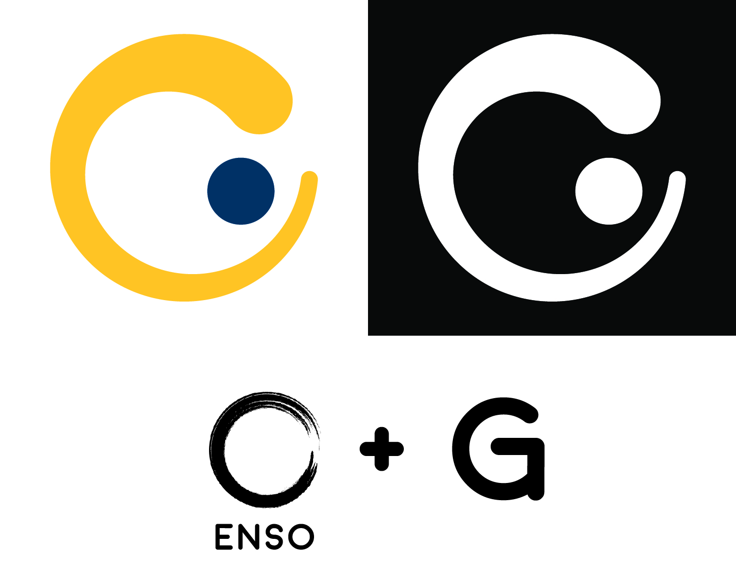
I’m not too sure most people would see a G in the logo. It looks a bit more like a C with a dot in the counter.
2 Likes
I would not have picked up on the G if it wasn’t in the post. My thoughts? Back to the drawing board.
Doesn’t work for me. Not a pleasant shape. Start over. Get at least a dozen more ideas on paper before starting anything on the computer. Just a suggestion! Good luck.
Try using a lowercase “g” instead of uppercase for more options. It can lead to a new direction of thought.
2 Likes
I agree, the fluidity of a lowercase “g” compared to uppercase (in most typefaces) allows it to be more malleable.
1 Like
I immediately see a masculine letter C growling with his eye.
Well said!