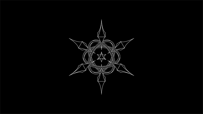
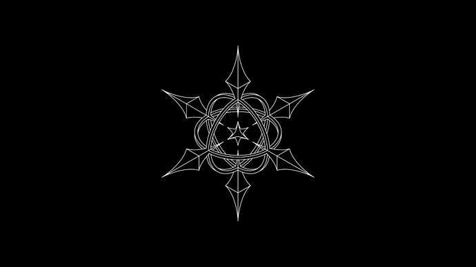
Hi, I’ve been working in this personal project. It´s about my personal viewpoint on detachment (as in letting go of emotions, events and obsessions). It’s an isometric projection of “spikes” (the things I’m letting go), rings (the remaining of that wich existed in the beginning) and the center (what I shouldn’t let go yet). I’m trying to decide between the two following designs. I also have doubts about the spacing. Any extra feedback you wish to give will be much appreciated.
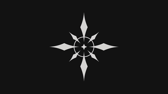
This concept is based in the 2D version below.
I would like to clarify I’m not a professional neither am I studying graphic design. But I wanted advice, and I felt like this was the right place (sorry if I’m wrong). I mainly plan to use this in digital format. I used CAD software and the final retouches were done in illustrator.


