Yeah. I seem to grow backwards.
Only my brain grows backwards. Definitely beginning to work on the 2nd childhood already.
Everything else is falling apart.
@Just-B @sprout @PrintDriver @Eriskay
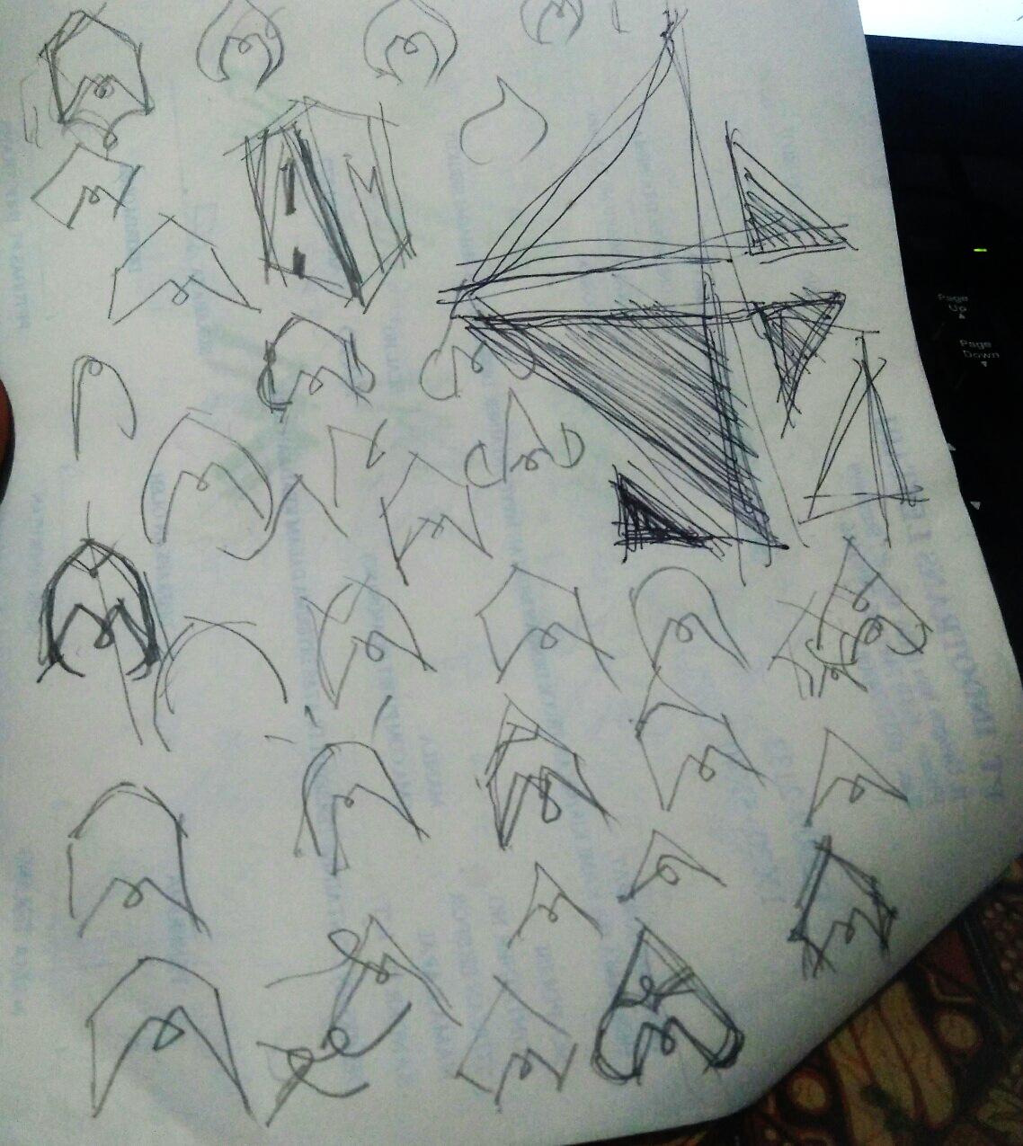
so for the marks at the top, you’ve seen:
- B-2 stealth bomber
- a mountain
- teepees
- cartoon noses
But actually I want the whole unit to resemble a heart shape ![]() and in the top right shape, it looks like a pencil tip, don’t you think?
and in the top right shape, it looks like a pencil tip, don’t you think? ![]()
I like them as they’re looking cute and fun ![]()
I created a Twitter Poll and most votes go to the version at the bottom, which I don’t like it much ![]()
For me it looks like a senseless wiring, or a confuse cable rather than looking artistic. A friend even wonder why I put it as one of the options if I don’t like it at the beginning. Well, again, it’s important to hear others opinion about it nevertheless. I could use some feedbacks and apply them to the other options (that I like) for instance ![]()
I probably going to develop the top right version, I feel very very good about it even maybe my initials won’t be too obvious.
Oh you guys are not 12 yo anymore but I hope you would stay young, playful and fresh with your ideas and creativity ![]()
Thanks and have a great weekend!
I hate to break it to you but I saw an “Indian sitting criss-cross applesauce” and a stealth Bomber.
For the design, you propose using I’m not seeing a pencil. I understand why its a pencil but it will never come across as a pencil. It is too wide to be perceived as a pencil to me.
As you stated previously, you jumped into Adobe illustrator without making any sketches of your logo first. What I’m seeing here is the first of what should be a beginning process to develop a logo.
It appears as if users still don’t understand your logo which would be the main identifying mark of your brand and that would be a fundamental communication problem.
1 Like
If you put that Twitter poll out to the general population, you gotta understand most people are 12yo inside and likely went with that bottom one out of humor rather than any kind of professional decision. Don’t rely on polls unless they are focused.
I never even made it that far. Inside, I’m so 11.
Oh I didn’t miss the fun with the sketches.
my pencil maybe coming from the cartoon world ![]()
I think I will develop that version to not to look like a tent too much and will do something to make it more like a pencil or heart shape.
Thanks for your constructive feedback @Billyjeanplxiv ![]()
@PrintDriver I got a few votes for the A version too for its simplicity
I think I feel younger than 11 ![]() I speak like Elmo
I speak like Elmo ![]() @HotButton
@HotButton
Come on, Guys—I think you’re being a little too hard on Audee. Personally, I like the bottom one. I saw the letter “A” and the curly cue small “M” right off. I didn’t catch the “heart” idea though. Probably because it would be upside down.
Probably so. One of the problems I’ve noticed with critiques on this forum is that the really bad stuff is largely ignored, while the better work gets analyzed inside and out.
I think this is because people are reluctant to say how terrible something is and that it needs a complete redo. However, when something with potential comes along, everyone has suggestions on how to tweak it and make it better.
The unfortunate consequence is that bad work seemingly gets a pass, while the better work gets shredded via numerous suggestions and comments. It’s a whole lot easier to comment on what doesn’t work than what does, but I think a balanced critique needs to focus on both.
So with that said, Audee’s logo ideas are clean, simple, well-crafted and, I think, headed in the right direction. I really like the typeface — all the letters fit together very nicely and it complements the overall style that Audee seems to be pursuing.
The bomber, mountains, teepee logos, I think, really are headed in the right direction if they can just be pulled together in a way that eliminates the confusion with symbols that suggest things not really intended. I do like the looks of the bottom one in that group since it flows better and is a bit more fun, but again, it’s open to being interpreted as something different from what it is supposed to be.
It seems to me the challenge is to keep what is working and build upon it. The go-to solution for many designers is to make an attempt at morphing initials into a logo. When this monogram approach works, it can work great. More often than not, though, it leads to lots of dead ends with awkward, forced solutions. Instead of focusing on the A & M, how about something more abstract or something that suggests the personality of the designer’s work in a way that doesn’t make the outcome contingent upon morphing together two letters?
3 Likes
It is easy to see why you are the Leader on this forum. Your advice is always positive and right on target. Good Job!
2 Likes
I really love the very bottom design! it reminds me of a mountain and it’s really pretty. I can make out the A and M is implied, though the mountain imagery is really strong for me. The other three designs on top remind me of upside down hearts or maybe birds with their wings behind them as they fly upward or something.
1 Like
@Just-B @PopsD and @revitalizerealty
First of all, thank you for participating in this logo discussion ![]()
Sorry for my slow response, I got caught with works again.
When I posted the design drafts, I really need the feedback and your honest opinion, so I am completely fine reading all of your comments ![]()
@PopsD now I realized that the heart is upside down lol. Perhaps the shape sticks to my mind after I designed this logo with ‘ace’ as the idea or concept.
@Just-B well at first I was so determined to put my initials in the logo or to make a monogram logo. But after I play around with the letters, and the shapes begin to visualize some (random) objects, this process excites me more lol. Maybe after these exploration steps, I’d think that the monogram would rather coming as the bonus than the main reason why I rebrand ![]()
I feel good with the created shapes and this connection is precious apart of the monogram itself. The logo can be anything that represents my design service and how people remember ‘me’ through it. A pictorial mark that sticks to the customers mind.
@revitalizerealty It’s interesting how you described what you’ve seen on the three designs on top ![]()
I used to be part of a branding company which required me to be creative with words, and even to invent new word for a new brand. I think as we are all know, creating logo can also mean to invent fresh pictorial mark that stands out in the crowd of similar shapes which surely also represent a business or a service.
Thank you so much for your comments guys. I can not thank enough really!!! ![]()
![]() Happy weekend!
Happy weekend!
1 Like
Audee—Please don’t be intimidated. Sure, there can be some posters on any forum that tend to be more negative than positive, but I believe most are genuinely trying to help. And sure, sometimes you may need someone to be honest enough to tell you it might be best to start all over. That isn’t necessarily cruel, it’s just reality.
Just-B makes a great suggestion here. Take a look at a typeface like Futura. The angles of the capital “A” and “M” could be overlapped nicely and you could add a heart (if you like) in one of the negative spaces above one of the letters. Possibly combined with a brush (line art) through the heart might be nice as well, but I’m just thinking off the top of my head. You would need to work out the design in thumbnail sketches first before going to Illustrator.
I wish you the best of success with this project!
1 Like