I am thinking to rebrand. My name is Audee Mirza
Would love to hear your comment on my initial rebrand idea.
Do you see my initials pretty quick or does it look obvious enough?
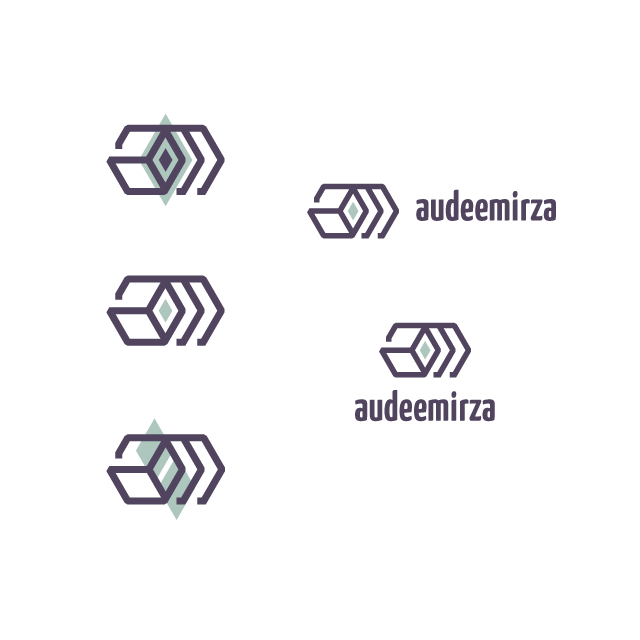
Still not so sure if I would go with this, But it’s been playful to create sort of geometric monogram using two linear hexagons that intersect to each other.
Its a great idea to use geometrical shapes. I just love this such themes. I would also suggest you to add a little pinch of some vibrant color to make it look more interesting and exciting.
@Naheed good idea on the color accent @Decker Yes the ‘a’ is lowercase.
I think the overall diamond shape (as a whole) becomes not in good balance and that the proportion of the shape is around 2:1, and now I am thinking to make it more compact with 1:1 proportion. I see the ‘a’ creates a visualization of a rotated box rather than a diamond shape to unite with the ‘m’.
Maybe I will come up with a new concept later lol. I need to feel good with this re-brand. Nevertheless, thank you for your feedback and for having a look on this version
@Billyjeanplxiv thank you for your comment
I didn’t make any sketch and simply used Adobe Illustrator to experiment with the outlined hexagonal shapes. I only realized that the ‘a’ resembles rotated box later on
Ridged hooks for the ‘m’ was to make it consistent with what I did on the ‘a’ terminal. Would that make sense?
I feel that I need to re-brand because my logo is too old school lol, I have had it since 2008. I have been too busy designing logos for companies and forget to update mine. The old one is not too good in two colors for print purpose and for smaller size.
Short story: It’s time for me to re-brand.
Well I’d like my brand to be able to represent my design service also to be easy to remember for all area, local and international. I like it to be seen as geometric as possible since I like the simplicity concept applied into a design.
To answer your question about the legibility of your initials (am), I don’t really see them to be honest. When I initally look at this mark I instantly notice the box, but I never would have spotted the “a” and “m” if you hadn’t mentioned it.
The 3D box is pretty cool.
The repetitive lines of the M look very busy and I think the confuse the mark.
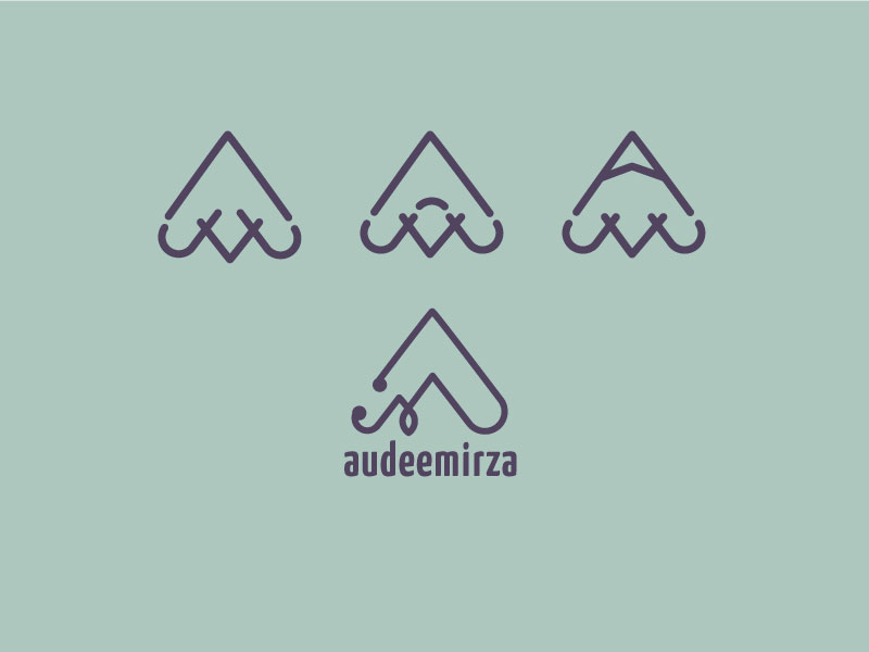
If I were you, I’d try to include the AM on the box somehow, rather than position them around it, maybe something like the H and A in this mark:
I’m having a hard time with the “A” also. I actually like the color scheme. No problems there.
My second concern would be it reminds of a logo for a shipping company, or public storage facility. Maybe even a moving or logistics company. But, maybe it’s just me.
Hi everyone sorry for my late response. Hope you’re all doing fine
@pluto
Thank you for your suggestion. It’s a very smart logo design but I want to try something more like a simple line-art monogram instead of a bulky and solid shape look.
@Biggs
Thank you for sharing your comment on this logo draft impression. I think the box shape got noticed easily rather than my initial letters So I kindda agree with you
@Eriskay
I will remember to put the name text part in the correct way so there will be no confusion to spell my name
Thank you for checking out this design draft
Pluto and Audeemira —Pluto’s negative space inside a positive one is a good idea, however this only works if the word(s) are automatically readable and easily understandable—otherwise, it would not communicate. Audeemirza is not an ordinary name. Using a shadow would only make it less understandable. Audee could, however, use the shadowed (negative space inside a positive space) in a “a+m” letter logo with the lower case “a” nested inside the geographic element of the “m” perhaps.
@PopsD
Thank you for your comment
I created different version (audeemirza 2.0)
Another designer friend gave me very surprising comment or his perception on the shapes when I intentionally didn’t describe that it’s actually my initials. So by showing this, I actually a bit timid but I really need to know, so it will be helpful and I will appreciate if you can give me your very honest feedback
Either a B-2 stealth bomber or a mountain with two teepees in front of it. I likely would not notice the A and M that you’re intending. It might help if you capitalized the A and M in your name. That would signal those two letters as being more important than the others, which might lead to some noticing them repeated in the logo.