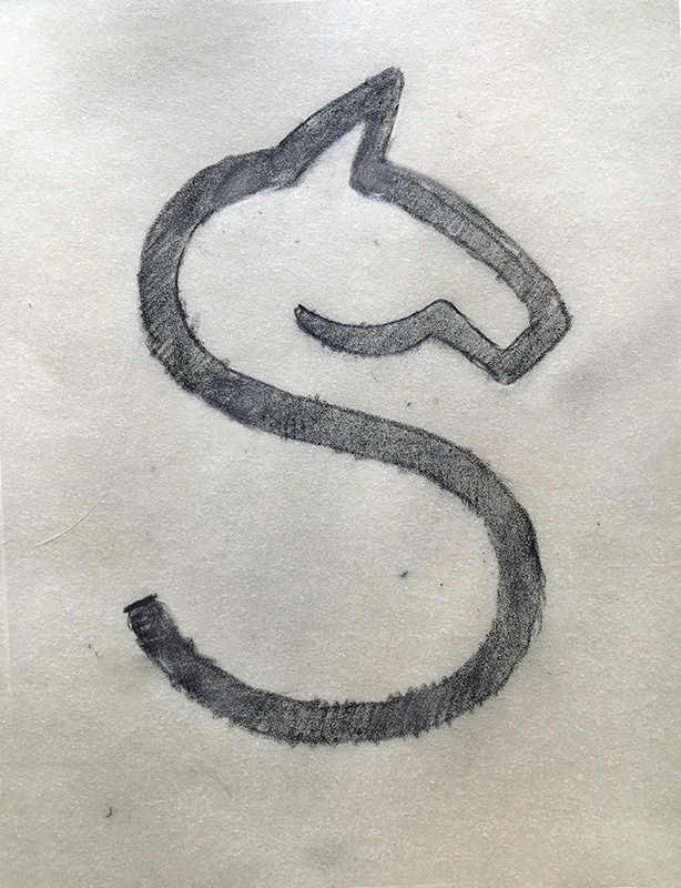
It might help to walk away from the computer and begin sketching ideas by hand on tracing paper. Moving objects around in Illustrator puts definite constraints on what one can do.
1 Like
There probably is no formal name, but Daniel Carlmatz stuff is what my goal is.
I Really liked this one…at first you don’t see it (atleast I didn’t) but when you do, it’s really awesome. For me its the same clever design as Basken Robins current logo. I initially didnt like it but then when I saw the clever hidden 31, it sold me on their logo.

1 Like
What I am working todo is stylize each letter, refine them and see which one works best to convey the idea for the whole word.
To me the strongest one is still to me, the E. but i’m gonna keep pushing on the H and S.
Another idea is to have 2 adjacent letter be stylized, for example the E and S and have the S laying 90 degrees, sort of the rook capturing the knight.