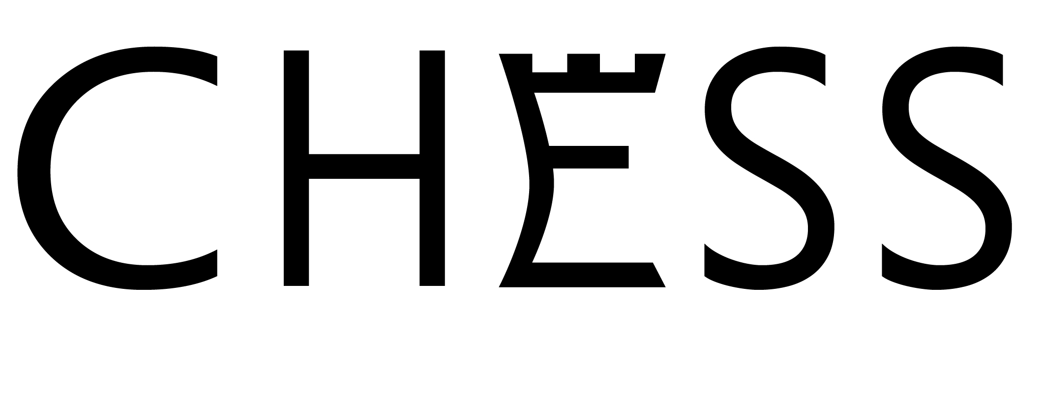
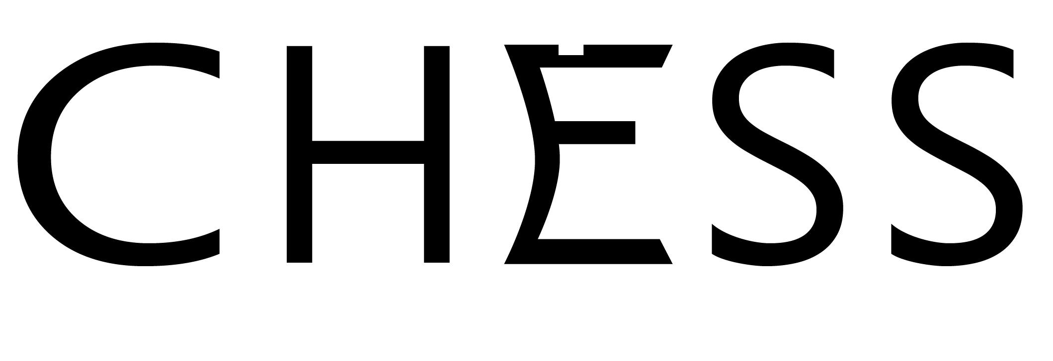
I always found visual elements in type that convey the word cool. Heres my attempt at it. Is there a terminology for this type of stylizing?
I’m working on a few more.
I always found visual elements in type that convey the word cool. Heres my attempt at it. Is there a terminology for this type of stylizing?
I’m working on a few more.
Nope. That does not do anything for me at all. Whatever you tried to convey is not conveying. My guess is the letterform of “E” does not lend itself to your intention.
Is the E supposed to look like a rook? If so, it needs a few more notches in the top.
I don’t know of any name for this kind of thing.
I think it’s called futility.
The closest I can come up with is letterform design.
Sergio Aragones did a whole book of those back in the late 60s. Wish to heck I could remember the name of the book. Probably describes what you are looking for. Will look at home later to see if I still have it, but doubt it.
Sergio Aragones! One of my three heroes. The other two are Mort Drucker and Don Martin, of course.
I was trying to do something more like this…https://mymodernmet.com/typographic-designs-common-words/
I ment to keep the design on the E deliberately simple. Having more parapets on the E looks too obvious.
But it needs to look obvious enough to enable people to tell what it is.
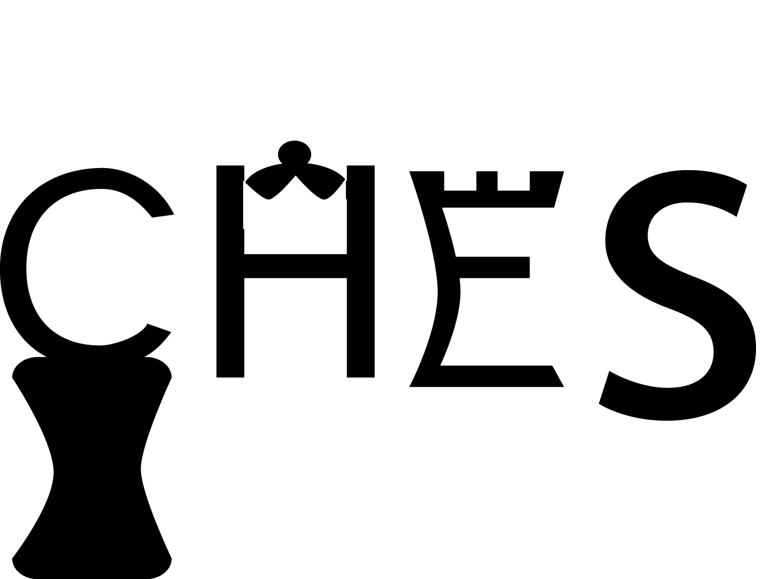
For what it’s worth, the S could styled into something suggesting a knight. The H could be a king or queen. The C, well, I don’t know — there aren’t any round chess pieces.
“Sergio Aragones! One of my three heroes. The other two are Mort Drucker and Don Martin, of course.”
and me
you forgot to include me
![]()
If it’s the book I’m thinking of there are a lot of these sorts of things, but it goes a lot deeper into optical illusions?
I think another name worth mentioning is Chuck Close. But he doesn’t consider himself a designer lol.
Of course I can include you. Just send for the media kit. My price list is there. You can choose First Like, Second Like or Third Like.
I was looking keep it minimal. As shown on the link, many of the examples dont use all the letter to covey the meaning of the word. I’ll take the advice and see if adding more makes it better. The C can be a pawn, similar to how I did the E as the Rook.
The mailman would not take your submission payment
I even paper cut my tongue on the envelope, OUCH!
Sorry Misteree, but your original design is way off the mark. I play chess but never made the connection between your design and the game. Visual elements like this should be obvious to most everyone, exactly what you are trying to communicate without the viewer having to work to make the connection between the design and the subject matter. With that being said, I do like your second version much better (where the “E” looks like a rook.)
so “checkmate” end game on the design, eh?
Thanks for the opinions everyone. @eb-comix why stop if not to improve or go back and rework it?
@PopsD Do you think every element needs to be stylized or keeping it minimal would still put the message across?
I do not like the C and still working out how to make the H look more like a Queen piece and the plan is as suggested by @Just-B to look something close to the Knight.
Its challenging to convey a meaning and keeping with minimal visual cues.
Misteree—Every element does NOT need to be stylized. Minimalizm is a good word choice, but I prefer “simplicity.” And never forget to spell the word correctly (“CHESS” not “CHES”). Correct spelling shows your intelligence. Misspelling (even on purpose) is usually perceived as just “cute.”
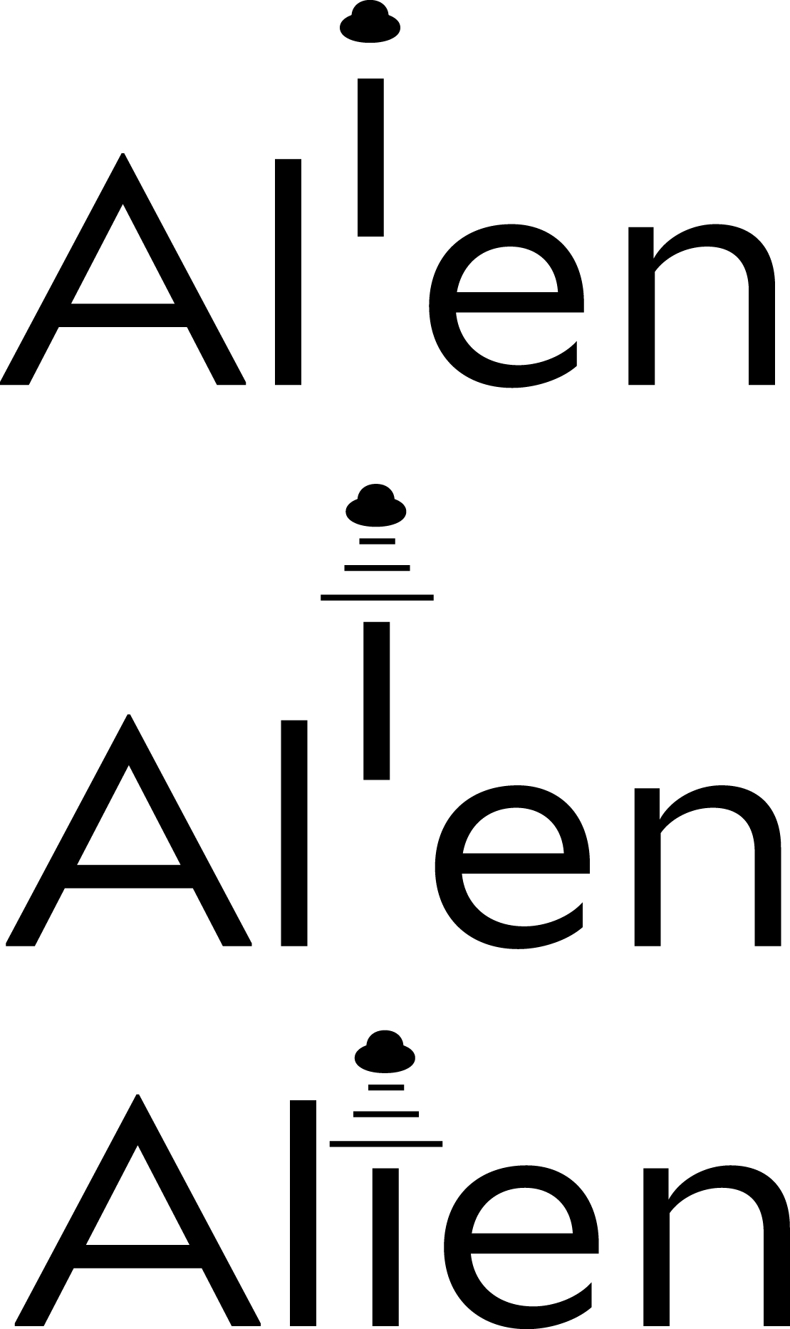
I got a kick out of your Alien work! Nice! Much better than your Chess graphic.Make the letter “I” in green (little green men) and you’ve got a winner!
You might find this interesting:
Still can’t define a name for you.