Got your heavy sweater on?
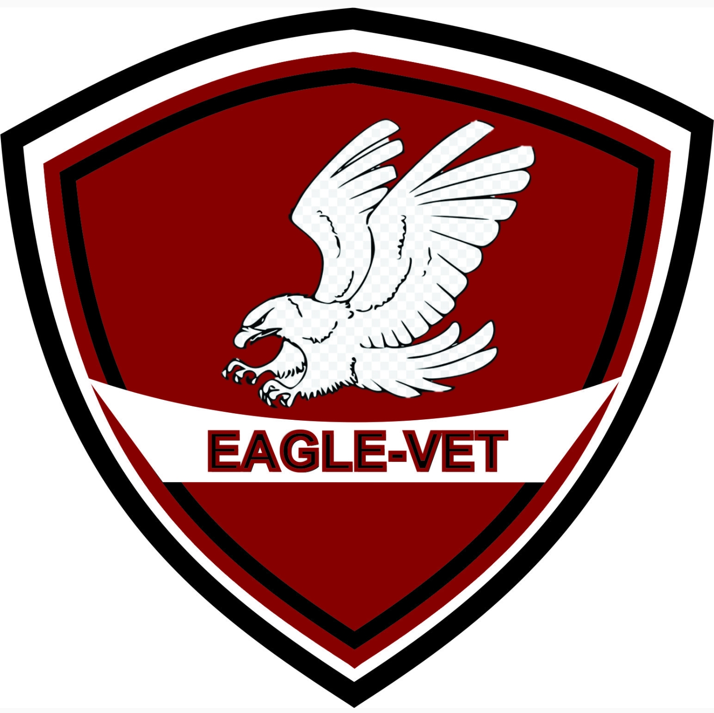
Did you create it in photoshop and intentionally leave the transparent area in the eagle?
Or is that a pattern?
Gray, especially at less than 10% opacity is problematic.
Also problematic are the tiny red outlines on Eagle-vet. They muddy the text. Consider dropping them.
At the top of the shield, make a decision, or not, to actually have a point there. There appears to be a bobble in the execution that is making it appear unstable and out of alignment.
Tiny details like the eagle paws are too tiny. You also have infills where you maybe shouldn’t have them, like between the leg feathers and upper wing feathers.
Why clip the top of the left wing?
Without knowing the context behind the design, ie who is the client, who are their clients, what do they do, what does their competition look like…etc, it’s really hard to critique appropriateness of purpose.
BTW,
Clipart, especially where the license says Personal Use Only is very problematic.
If this is for your personal use only, that may be fine. Once you attach it to a business though, even your own personal business, it’s a no-go, for all kinds of legal reasons. I didn’t check if this art is a rampant repost on various sites with no clear originator. That’s also something to be aware of with free sites.
https://www.clipartkey.com/view/ioxTbi_eagle-black-and-white-clipart-black-and-white/
Yup, rampant.
Eagle sketch image | Public domain vectors
http://clipart-library.com/clipart/1273092.htm
vippng.com - vippng Resources and Information.
Eagle Black And White Drawing at GetDrawings | Free download
https://premiumbpthemes.com/clipart/get
Plus 20 more google pages of direct hits on this image.
and the eagle looks rabid!
just kidding, dog post refencing.
btw
is this company healing sick or ill eagles?
Can’t be ill eagles. That would be against the law. Boom-boom-tish!