I needed a personal logo, but there’s something I don’t get here. Looks a bit unbalanced. What do you think?

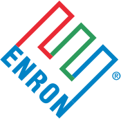
My intention was it resembles the letters “E” and “M”.
Was not intentional, but now that you show me… “Enron”, yes. ![]()
Thanks!
Hmmm. I see how you were trying to get an E and an M out of that, but I never would have seen it without being told. It’s a stretch.
I know that the norm for most people when doing freelance is to just use their name and initials in some way for their “company name”, but (and this is just my personal opinion), it’s very, very common and it seems everyone does that. I’d love to see people actually name it something. Anything. But something that can have a playful brand and something that communicates more about who you might be.
A quick google search turned up this article about agency names If you scroll down a bit, there are some fun examples. Some might be better than others. But the list includes such names as:
- 2 And Sunny
- Strawberry Frog
- Big Spaceship
- Pocket Hercules
- Omelet
- David & Goliath
- Walrus
Which, IMO, have personality and are memorable. Just my 2 cents. (and as a I said earlier, the branding around them would also be more memorable and could lead to some playful branding opportunities.)
1 Like
CraigB, I really appreciate your advice, that gives me more stuff to think about.
I always felt that adopting a “company name” is a “solution too large to the problem”. Maybe I will change my mind.
I would not have seen the E and M without you telling us they were there.
Agreed, I saw 4^ after deciding it was not a broken swastika.
4up might be a good business name for print business though…
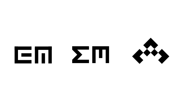
Why not try a lowercase m on its side? You’d get the e for free
At first glance, it looked like Enron was making a comeback with a rebranding effort. I would steer far clear of the 45º CCW E for that reason.
Also, it looks like the numeral 4 at 45º CW when the E is broken up like that.
You could make the E upright (0º) next another E rotated 90º CW to form a similar looking M.
E can be represented by three horizontal strokes, and M three vertical. Play on that.
Unreadable. Also, initials are rather meaningless. If conveying meaning isn’t important for your business or brand then I guess there’s no problem.
If graphic design is your business then it would probably at least be a good idea to show that you can convey meaning in you mark/brand, and in that case you may not need to stand for anything besides the sheer ability.
Enough reason to give up this logo idea. Thanks.
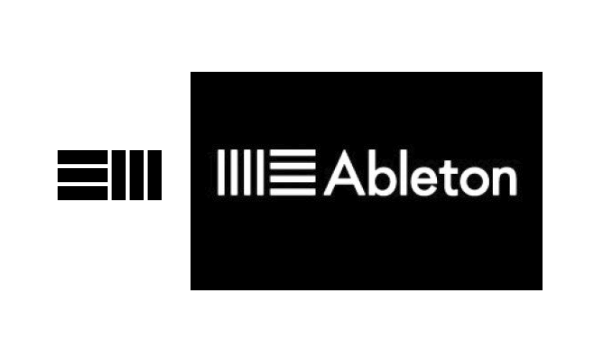
Sometimes it seems all the good ideas have already been taken: https://www.logoarena.com/logo-contests/e-m-technik-n4395/8
And so it goes… ![]()
Great advice, I agree. I must work on a better idea.
Thank you all guys. You’re great!
I agree. My first boss, ages ago, told me the first truth I ever learned: “There’s nothing new under the sun.”
Excellent!
Yes, me too.