Tell me if I executed the graphic design principles or not.
Providing background information is helpful.
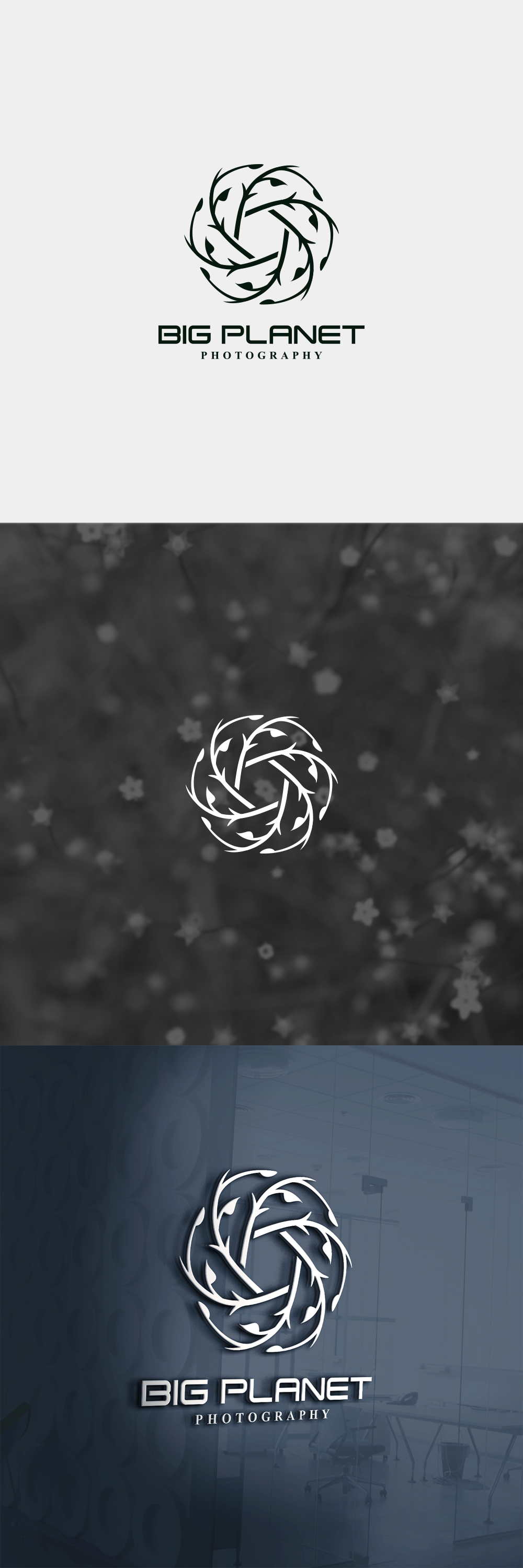
What I see is an aperture that is made up of branches. This indicates nature photography which the name seems to support.
If that’s the case, I’d say good job on the mark. It’s a nice, creative solution to combine two elements like that.
The type, on the other hand, needs some work. The two faces don’t mesh. At all. And the “big planet” type is not sensitive to the mark.
1 Like
Yes it’s plants and nature photography.
Regarding the type, In the brief they want kind of mature and modern feel so I combined the serif and san serif. Please tell me what would you change? And what do you mean by the “big planet” type is not sensitive to the mark. If you are interested here is the brief https://www.designhill.com/logo-design/contest/photography-logo-design-required-89610/design-brief
Thanks for replying !
It’s too bad this is for a contest site. I’m completely opposed to them for several reasons, but that’s another subject.
As for a critique of your logo, I agree with everything Steve said. The mark itself is very nice. Using an aperture to represent a photographer has been done a million times, but I’ve never seen one made from branches. I really do like it.
That said, the typography is off. The futuristic, sci-fi-looking personality of the sans-serif face neither matches nor complements the aperture mark. If it were me, I’d use a much simpler, more neutral sans-serif. For that matter a serif face might work too. You made this particular problem even worse with the small serif face at the bottom, which clashes with the sans-serif you’ve used and introduced yet a third competing personality into the composition.
This logo has some real possibilities, and like I said, the mark itself is great. You just need to fix the type by finding a typeface that complements the personality of what you’ve drawn instead of pulling things off in competing directions.
2 Likes
Thank you so much for replying.
I totally agree with you on contest sites, I really want to take my career to the next level and get out of these sites. But I am a beginner and I didn’t find anything close to them to show my work and improve myself as a graphic designer. I know I have to get clients outside of those sites but I don’t know how. This is what I am trying to do. And this is what got me here. As you see I am new here and this is my first post. I hope a good experience here and know nice people. The most important thing to me now is knowing how to get clients (correct me if I am wrong in any point). I hope you get what I mean.
Regarding the logo I will try to improve the type. And can you please tell me any advice on how you match the mark with the type (e.g: If someone wants a modern look I always use san serif). Is that right. Thanks again!
Hi,
i believe that serif typeface needed in this case because it matches with the organic feeling of the batch branches. Try to get a good match of san serif with serif.
I’d probably stick with the sans-serif, but I’d make it a bit smaller, bolder and track it out some to make it look more expansive, like a BIG PLANET should.
1 Like
What do you think of this. And can you please tell me how you know that the serif match better that the san serif (I mean any advice on how to use the right type for your symbol). Thank you so much!
1 Like
I stuck on your first intent for using 2 typefaces. One san-serif for the BIG PLANET and one serif for the PHOTOGRAPHY. I justified your option for the use of serif saying that is more organic and matches with batch branches.
Didn’t say (serif) it matches best..
1 Like
I got it, thank you. What would you change if it’s yours?
I like it.
1 Like
Definitely. That last iteration is very likable.
1 Like