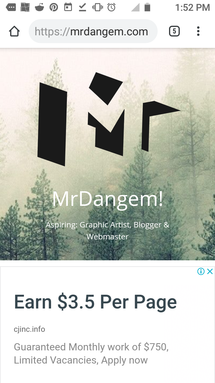
I made this logo when I’m still practicing AI. Now I want to make it more appealing and modern.
My site main topics are:
First: My freelance graphic portfolio.
Second: My free graphics that I made that is 100% editable.
Third: Personal Blog
I made this logo when I’m still practicing AI. Now I want to make it more appealing and modern.
My site main topics are:
First: My freelance graphic portfolio.
Second: My free graphics that I made that is 100% editable.
Third: Personal Blog
One problem in reshaping letters to resemble other objects is that it often leads to awkward, forced contortions where neither the letters nor the objects look right. When it works, it can be great. Usually, however, the end result fails to live up to the promise of the idea.
I see.. I also think so. In my draft it looks great but when I made it in AI I find it not appealing and yeah awkward.
Do you know have any ideas of a specific thing sir that reflects my blog?
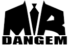
Just totally a matter of opinion, but the suit and tie might work just fine if you stop trying to incorporate the M and R into it.
I know you want it to read as Mr. Dangem, but it doesn’t really do that now. However, if you just have a nice icon of the suit and tie, it might imply the Mr., since people who wear suits are more likely to be referred to as Mister anyway — at least more so than a guy in a t-shirt and sandals.