Hey Guys, this is a website for a dummy client. It’s meant to be a fashion website and the theme behind it is intended to be classy and modern.
Thank You
Hey Guys, this is a website for a dummy client. It’s meant to be a fashion website and the theme behind it is intended to be classy and modern.
Thank You
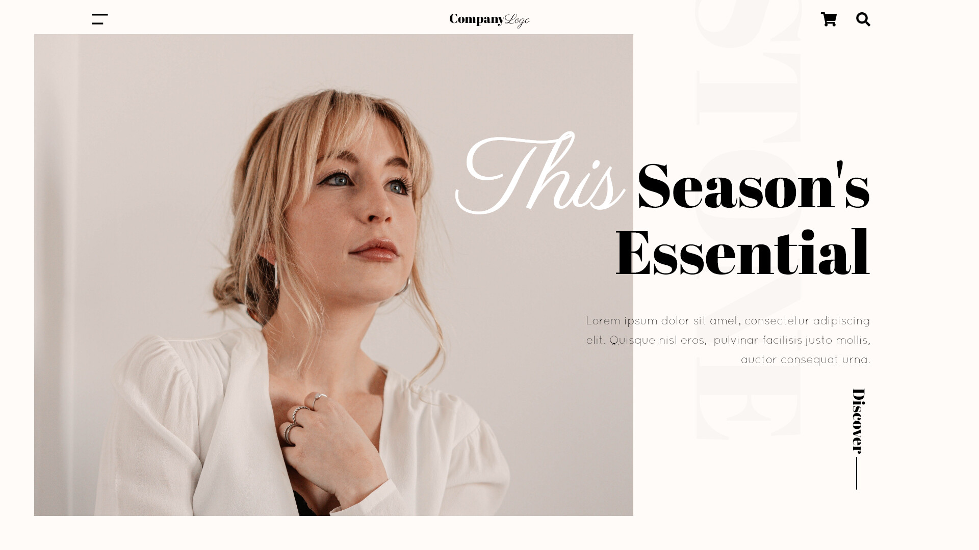
It has an elegant look, but what’s its purpose? What’s it about What is it selling? What’s its point? This season’s essential what? Making something elegant and classy is great if that’s what the job calls for, but just what is the job here?
I understand this is sort of a mockup or a template to be modified, but if it’s for a dummy website, also give it a dummy purpose it’s meant to accomplish other than just to look elegant, classy and modern.
What is the very faint type in the background that’s set at a 90° angle? Why is it there? It looks like a mistake or the ghost of an image showing through from the other side of a printed page. Subtle is fine, but all-but invisible and unreadable makes it meaningless.
The Lorem Ipsum paragraph is set in awfully light type. If it were me, I’d beef it up slightly.
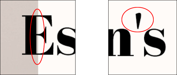
That sliver of tan to the right of the E’s vertical stroke needs to go – it’s an awkward little detail. If it were me, I’d move the E to the right, so that the edge of the tan area lines up with the middle of the E’s vertical stroke.
Use a proper apostrophe. This mistake is a real deal killer. In a website’s body text, a straight up-and-down typewriter-style prime mark apostrophe is forgivable, but in a headline? NEVER! It stands out and draws attention to itself like a giant oozing cold sore. Once you get it fixed, you might need to tighten up the spacing around it too.
This was super helpful, thanks a lot man :)))