Hello I am a first time author who is in the end stages of a book on Pomology (fruit science).
I am using the KDP built in cover art creator on Amazon KDP for my paper back book.
One of the chief limitations of the KDP built in cover art creator is the lack of ability to move a preset number text boxes and a very limited way of altering images.
Within these constraints I would like this community to critique my cover art for my book.
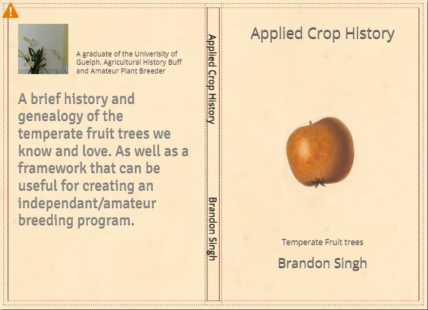
Here is a screenshot of the cover art below (the warning triangle is just to indicate that DPI is lower then desired by the system, it will still send however).
Why would you still send it if thee requirements are not being met?
You need to get your title on the spine. Your descenders are below the recommended safety line.
Who are you appealing to as readers? I’m interested in plants and in fruit trees but none of this is engaging to me. I’ve been burned only once on amateur published books, and this one screams “don’t” to me.
At the risk of being too blunt, there’s nothing about the cover that’s working — sorry. There’s no way to tweak it; it needs to be redone from scratch.
Like @PrintDriver, I’m interested in the subject matter. I’ve planted several apple, pear, and apricot trees in our yard. The information in the book might be great, but I’d never get past the cover. Unfortunately, people do tend to judge books by their covers since they view them as a prelude to what’s likely inside.
If I were you, I would hire a professional designer to give the cover the appeal it deserves.
Like many other requests before, my suggestion is:
Go to any bookstore, look at other books, fiction or non, and study how their covers were structured. Chances are you will get some idea of what to do, or what not.
I chose a singular apple as it was an historical image and the text would not cover the image and vice-versa based on the fixed perimeters of KDP.
For question number 2, yes this is where the author’s photo would go but, I do not have a good quality picture for that purpose, so I used an orchid pic I had.
For question number 3 the colour background was an attempt to make a 19th century book cover look without paying any money as the images were royalty free.
For question number 4 thank you, I will change it.
I will probably scrap this design and look into hiring an artist or just use a preset KDP background, if I cannot afford it. Thank you all for your feedback. It is much appreciated.
Absolutely agree with @RedKittieKat and everyone else. Not ensuring that you have a strong cover could easily discourage people from reading/buying/looking at your book. So, even if the content is absolutely amazing, it would be a huge deterrent with a substandard cover.