Please critique my logo design for a brand GOYA

GOYA is a goat yoga studio where individuals can do yoga with small cute goats. The owner of the company is leslie and the purpose of the company is To build strength and awareness in both body and mind through the unique experience of practicing yoga with goats.
Goya’s brand identity revolves around fun, relaxation, and wellness. The studio promotes a holistic approach to fitness, combining physical exercise with mental well-being in a unique and enjoyable setting. goya yoga studio’s main core values are wellness, fun and eco friendly.

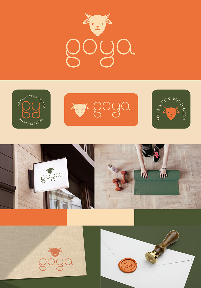
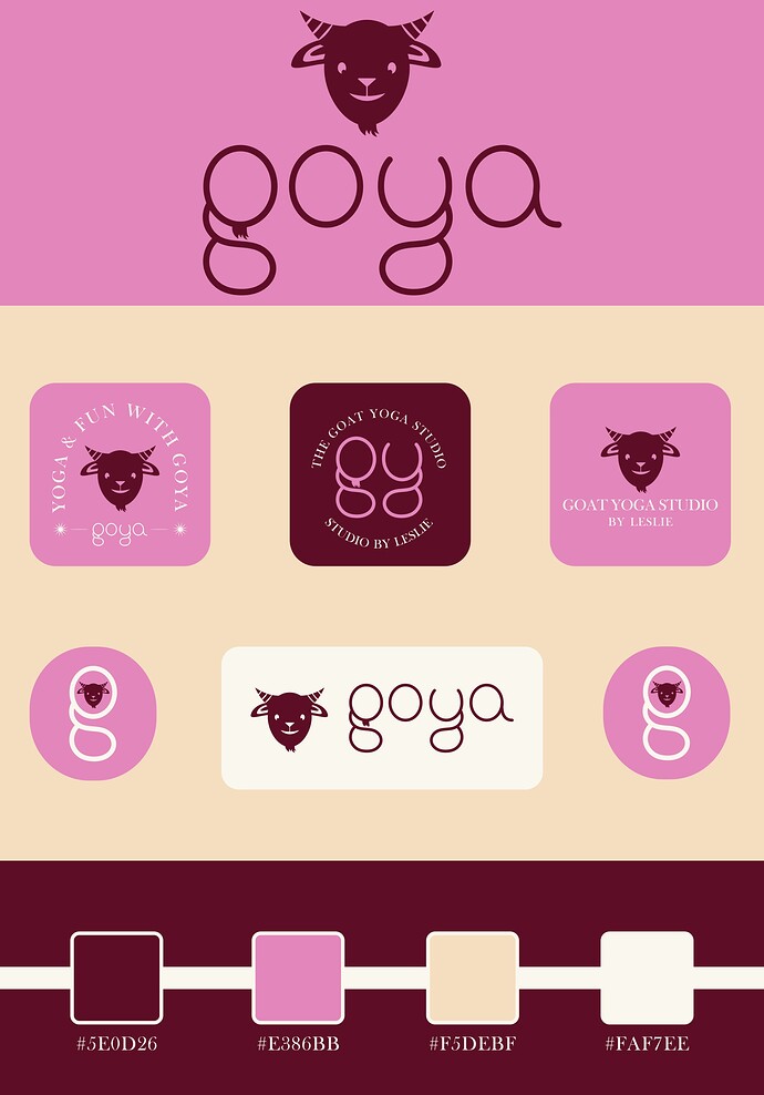
Here the concept I applied is the cuteness of small goats to represent the fun and relaxed side of the studio as well the round and soft shapes in the logo to create the feeling of cohesiveness, I have also included the moustache in the G to show some character, I included small case letters to represent the feeling of comfort and relaxation.
The typeface I used is the Baskerville to create contrast and color palette I have chosen is being stolen from somewhere I am weak at choosing colors but the colors also represent sense of joy and classic feature of the company.
I am a beginner in the design field this is a practice logo from fake brief, Please review my work I really want to improve my design and feel free to give your honest thought on the work
Thank you for your time.
smells like strawberry yogurt :blush:

2 Likes

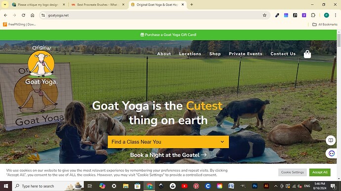
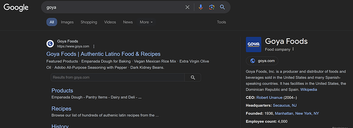
Yoga with goats is about the furthest thing from my mind when I see “goya”

google apparently agrees.

I thought this was going to be one of those student remakes of an established logo (Goya)
Since most designers don’t have a say in the company name, you just have to go with it.
I’m not sure doing yoga with baby goats around would be very safe for the clientele, LOL. Unless it’s Chair Yoga. Baby goats are very…random…when underfoot.

Comments:
This looks like the color scheme of an ice cream parlor, not a yoga studio. Do some research.

Beard on goat + beard on G = redundant.

White text on light pink is very hard to read (Think contrast)

Yoga + Fun doesn’t = Goya.
Goats + Yoga does = Goya. Sort of.

The center small logo, the GY one with the dark signboard, that one is baffling because the GY doesn’t match the name Goya. It might match into “the goat yoga studio” so which is the name of the place again? Don’t do both.

Same logo, you have the word “studio” in there twice.

If that is a brand standard with color callouts, you need more than just the hex numbers. If you want print collateral, you are going to need a standardized system like Pantone (or whatever is used locally in your location.) Hex colors look different on every monitor and there is no print standard for them.

2 Likes

Thank you so much you paid attention to details of my work, it is a fake brief from a brief account on instagram, yoga with the goats is called goga and right now it is also trending, goya is the name of the studio, I was also shocked when I read goat yoga but I just researched and tried to make a logo for fake brand for my practice.

I will surely work on the color scheme and my knowledge on colors, and the point you mentioned beard on G I will remove that.
I am very thankful that you paid such attention on my submark logos it is my first time making submarks

can you please tell me if the overall concept is good and appealing or it is too much cliche?
about the color hex code I see everyone using hex codes to present the logo and color schemes but i will surely research on it.

Thank you for your feedback I will change the color scheme for surely so it looks like a yoga studio

Hey Priya, can you tell me what account you got it from? I love fake briefs for practice, I used to use a website but it was never much creative, this account surely sounds like it is lol
thanks!

Hii jojobs, this brief is from a page of instagram which is thebriefdiary, the brief is given and anyone who wants to submit the design can post the design on hastage they give and the fun thing is they also make it like a contest, the two winners are being chosen on the basis of judges and other on the basis of people choice. Its definitely worth giving a try.

1 Like

Fake briefs are one thing to help you learn – thounpgh universities do that pretty well already – but briefs in the form of competitions, should be avoided at all cost.

2 Likes

corrected some mistakes and color schemes, I hope it is better. Please critique the design

I don’t get it.
I don’t get the context.
I don’t understand what it is.

may I know why?
It is a practice project and yoga with goats is a real thing which is also trending nowadays.


colour palette use:
orange for playfulness flexible nature of the brand
olive green for natural feel and subtle feel
cream colour for genuinety of the brand

round shaped logotype shows playfulness

Is there anything else you think is questionable please tell me

I didn’t know that. Weird.

My extended family has goats. I grew up on a ranch, and my nephew keeps goats behind my house in my hometown. Goats indiscriminately poop and pee on everything. They also bunt people with their heads. They like to climb on things. If you lay down in front of a goat, it will jump on top of you, which would be uncomfortable and disrupt the whole point of yoga. I assume this goat yoga thing uses tiny miniature goats instead of full-sized ones, which might be dangerous.

It sounds like a weird, gimmicky thing that has nothing to do with actual yoga, but hey, if people can make money selling something that people want it and are willing to sign an injury liability waiver, well, why not?

I like your second color scheme. It’s very nice. The colors complement each other and set a nice tone for the visual brand. However, I don’t care for your reasoning for your color choices; it relies on paralogism.

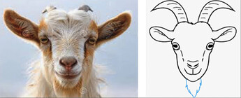
The logo does not look like a goat head — it’s the wrong shape. Goats have a muzzle that protrudes forward, but your logo does not suggest one. Goats do not have forward-facing eyes; their eyes are on the sides of their heads, which gives them a wider field of vision than humans.

Stylization is fine, and logos don’t need to correspond to reality, but when they occupy the uncomfortable spot between realistic drawings that get the anatomical features wrong and something more stylized and forgiving, the result can look a bit weird.

1 Like

Thank you for your review and feedback for the part of goat’s face I will certainly do more research in the future when designing suck logos, And I have often seen designers define the reason for the selection of thier of their colour palette and colour choices they made based on the brand’s image.

Yes, I’ve seen it, too, and done it myself. Let me explain.

Colors certainly have emotional qualities that designers use to help evoke desirable emotions from the target audience. For example, greens and blues tend to have calming effects. Reds and oranges are more aggressive. Browns are more earthy. Yellows can evoke a warm or friendly feeling.

However, the totality of the color use and composition, when combined with all the other elements of design, plus the text, headlines, and layout, adds up to the emotional quality the design composition might convey.

As an analogy, music is similar. Music can evoke powerful emotions, but that ability results from a carefully constructed composition and its rendition, not the individual notes.

I used the word “paralogism,” which is reasoning that appears logical and convincing. However, upon closer examination, the logic falls apart as superficial and fallacious.

You wrote…

Yes, orange can be playful if used playfully, but so can purple or yellow. Describing orange as flexible is a quality that could be said any color.

Olive green can convey a natural and earthy quality, but it’s also a color associated with armies and guerilla warfare.

Cream color seems to have little inherent emotional connection to being genuine — at least to me.

Even if your analysis of what these colors convey is correct, their combination in a design layout changes the emotional quality of the composition to something other than the simple sum of the parts.

State and municipal flag designers in the U.S. almost always use the same arguments. For example…

  • The blue background represents the sky over our state and our unlimited possibilities.
  • The red represents the courage and bravery of our citizens.
  • The circle encompassing our various state symbols represents the unity and cohesion of our state and history.

Those arguments are examples of paralogism. Each could just as easily apply to the opposite.

  • The blue background represents our blue depression over the state’s economic stagnation
  • The red represents the brewing anger of our citizens.
  • The circle encompassing our various state symbols represents our state’s constrained, old-fashioned, insular thinking.

Thank you for expanding my perspective on design, particularly in the realm of color. I truly appreciate the way you articulated the concept with relevant examples.