I did a logo for a soccer team. The name of the team is Real Arsenal. How can I make it better
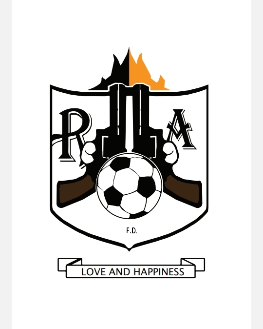
Nowhere on the logo does it saw Real Arsenal.
You need to dump the two arses off the side of it - what they are supposed to be I don’t know. But they do look like bums.
I guess it’s the triggers, but I can’t stop seeing arses.
Why is the R so much bigger than the A?
Lastly - do you think this is good?
Because I don’t think its very good.
Why two guns shooting into the air and fire coming out of them. Then a message about love and happiness???
It makes no sense.
2 Likes
Thank you for the feedback
Way too complicated with too many ideas jammed into one logo: guns, fire, a ball, a shield, a banner, a slogan. There’s just way too much going on. Why “Love and Happiness”? Why the initials “F.D.”? Why just one spot of orange drawing attention to itself? The typeface (Algerian) you used for the R and A is too busy. The lines in and around the ball are too thin — they’ll turn into a blur at small sizes.
In general, simplify.
1 Like
Thank you. You’ve been helpful
Shouldn’t one be able to see through the trigger guards?
I get it: “Happiness Is A Warm Gun”.