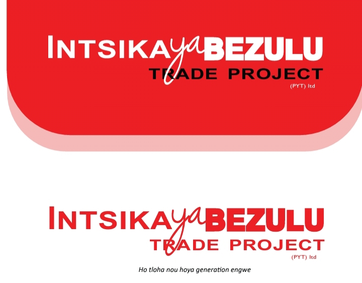
Please help me improve my logo design skills. Made this logo for a small company
I think with four separate treatments of the typography, it borders on being too cluttered and lacking in consistency. Also why is the L in BEZULA shorter than the other letters?
Just-B is right; there is way too much going on with this. Simplify, simplify, simplify. Try setting Intsika in the same face and all caps like BEZULU, Make the L the same size as everything else. Put TRADE TO THE LEFT OF THE y’s descender and PROJECT to the right. Not saying that’s going to be a great logo, but I’d be willing to bet it will be much stronger than what you have here.
Sorry, but you should start over. There is nothing good about this logo.
Logo design is looks like initial stage, but not bad. But you can use different fonts or you can use character in the logo design. And you can watch lots of logo designer’s designs which will give you more idea a should be design.
Too many typefaces. I can’t say I would ever use more than two, and even then, one typeface must show true dominance.
I see potential here though. Perhaps use the typeface used in Intsika, I would say a lighter/medium weight for Intsika and using the same typeface, use a font variation for Bezul that’s bolder. Very much like you have it, only using the same typeface will make a cohesive difference.
“ya” can continue to have the script typeface, I like that, but position “trade project” (using same typeface as Intsika, only smaller) so that the “Y” in “ya” perhaps falls between “trade” and “project” - or, falls just in front of trade, and have ‘trade project’ not exceed, or better yet, match, the right justification in Bezulu
Thank you very much everyone you are really helping me make better logos

