Hi Everyone,
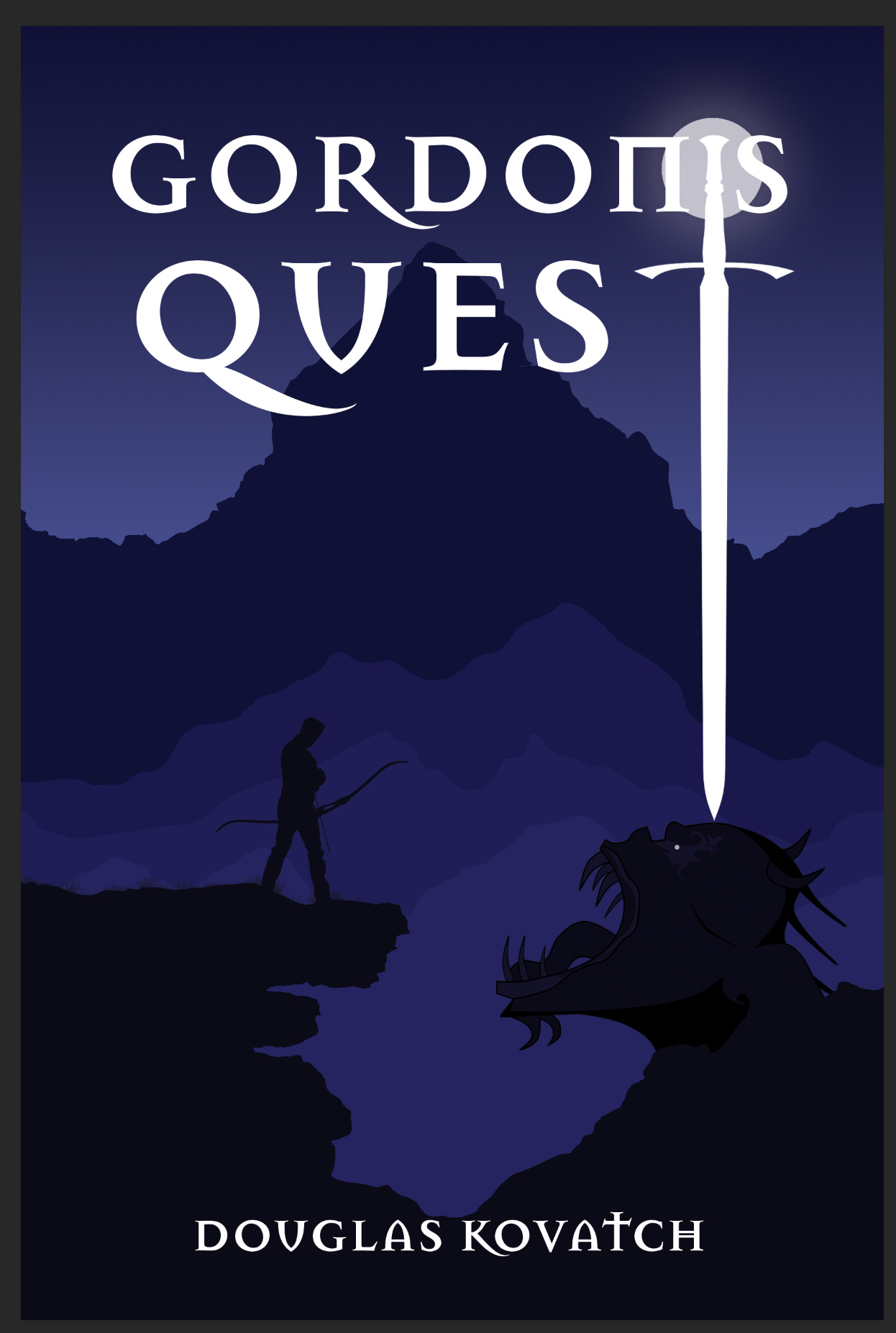
Recently i participated in a design contest and made a book cover. The book is about a man who took a journey to cleanse the world from evil in a world which has changed due to some incident.
Please provide your valuable feedback.
Regards
the right image looks nothing fierce or slayable at all.
looks like it is sadly begging for more treats.
make the face look downward or give them evil eyes and we have a winner!
Did you intend the dark gray border around the edges to be part of the cover design? If so, a border like that would create noticeable irregularities on the covers not trimmed perfectly (which would likely be most of them).
This isn’t something the designer would typically decide, but a book like this would benefit from a subtitle providing just a bit more information about the book. I’ll also mention that front book covers can’t be considered as something separate from the spine and the back cover — they all need to work together.
I likely wouldn’t have the tip of the sword sitting precisely on top of the monster’s head. It creates a small focus of attention that’s a little odd. The single point of light in the illustration — the monster’s eye — is another one of those things that draws attention to itself. The placement of the moon directly behind the sword’s handle is interesting.
If it were me, I’d probably selectively lighten up some of the illustration and introduce some subtle tonal differences in the colors so that everything wasn’t just a solid, monochromatic purple. When I squint my eyes just a little bit, the cover (other than the typography) turns into little more than a dark, solid shape.
Despite my comments, there’s a lot that I like about what you’ve done.
Thanks Just-B for the critique. I don’t have borders around the image, i think it might have come up when i was taking the screenshot. The client has asked only title and author name to be displayed on the front page that’s why i did not include the subtitle.
Thanks once again, I leaned a lot.
Regards
Dev
Thanks for the critique EB_comix. I will work on the demon. your comment “looks like it is sadly begging for more treats” was absolutely right now that i see it from that angle
Once again Thank you for the critique.
Regards
Dev
I think I would make the image much bigger even if it would mean cutting the mountain off at the top. The title can cover most of the mountain and that’s fine. The majesty that a cover like this needs to convey will come through with that.
I would also move the author’s name up a bit. Right now it feels like both the title and the author are falling shy of the image, which kind of hinders the cover coming together as a whole.