Post the brief, please.
I like the overall appeal!
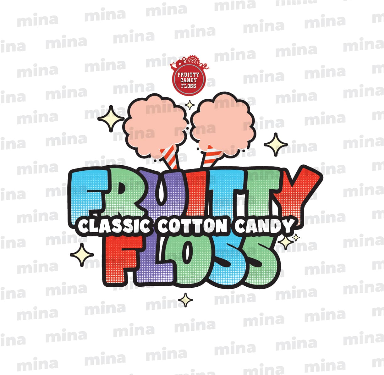
I would make the 2 cotton candy much bigger that is the focal point of the graphic
since cotton candy is fluffy, try using less clouds outline and maybe ad more contour on the pink by using lighter and darker hues to bring out the cotton candy.
I hope this helps!
I’m with @HotButton, I think we need a lot more information to offer a meaningful critique.
Also, post a copy without your watermark.
The small red logo at the top is out of place. If the logo you designed is for Fruity Candy Floss, there’s no need for another logo above it. It’s a completely different style with a clashing font, and as others have pointed out the transparency isn’t really working here. If you had to put this on a different background, the design might look strange when the diffferent colors interact with it.
The part you designed looks ok by itself, but I also think the pink cotton candy shapes clash with the rest of the deesign.
This topic was automatically closed 365 days after the last reply. New replies are no longer allowed.