Hello lovely people taking time out of their day to look at my post! I am seeking feedback on these logos for a working group that is setting up education programs about zero waste, and making recycling hard to recycle items accessible to a small island in the GBR. Their main focus is educating people about zero waste, encouraging people to use recycling programs outside of regular recycling, and reducing the amount of rubbish sent to landfill.
There will also be a zero waste shop opening in conjunction with the working group. They will be selling items that encourage and promote the zero waste lifestyle.
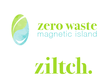
have tried to use some of the feedback I received to improve my design. I took the leaf and waterdrop out and arranged them less ‘vaginally’ lol. I also used colours that are less boring and corporate. With the type I chose to use cut out bits for the store logotype to get the feeling across of using less and chose modern and environmental colours.
Thanks to all that reply.
The logo is interesting and the leaf is readily apparent, but I’m unsure about the water drop being especially recognizable. If it ever needs to be reproduced in black & white, as opposed to greyscale, you’ll need a separate version for that.
I like the typography (definitely would not track it out as suggested above).
Even though I like the colors, the green lies outside the CMYK gamut. The bottom half on the screen capture below shows your original RGB. The top half shows what it will look like when converted to CMYK. The colors are also a bit light and lacking in contrast when placed over a white background, which impairs legibility from a distance (assuming you might be making signs).
Is “ziltch.” a part of the same logo? In other words, do they run together as in saying, “Zero waste on Magnetic Island — Ziltch!” If so, the "ziltch doesn’t have a good compositional or grammatical relationship with the words above it — it looks like a separate thing. If they’re two separate logos, which I suspect is the case, I’m just not sure the “ziltch” conveys enough information on its own about zero waste to communicate the message.
On a positive note, what you’ve come up with has a fresh, clean, pristine, sunny, tropical island look, which is totally appropriate for your message.