I’m a Product/Service Designer by trade but I’m doing a Branding freelance work so that I can improve my Graphic Design skills.
The brief:
Construction industry. The company will build mainly residential buildings.
We chose the name “Sancus” because of the meaning and also because of its connection with Rome, which is known to have some of the most ancient constructions standing until today.
In ancient Roman religion, Sancus was a god of trust, honesty, and oaths.
The reasoning behind how I got until this point:
Since it is a construction company, I chose straight lines and a simple square grid to reinforce the trust, strength and structural aspects of a solid building.
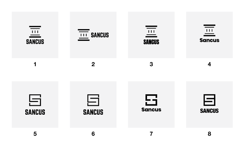
1-4: Concept of a Roman column representing the name Sancus and its origin 5-8: Concept of a floor plan + letter “S”
I prefer the first concept since its more unique. The second one, although graphically interesting, might be too generic. Any other construction company beginning with the letter “S” could use it. What do you think?
1 - 4 > I’m not really digging these. The column concept isn’t a bad direction, but you’re not there, yet I think you need to spend a lot more time sketching out ideas to really flesh this one out.
5 - 8 > Five seems really disjointed. Six is the strongest option in this row, but I think it could use some more work particularly with regards to the relationship between the type and the mark and the font choice. Seven is my second favorite mark, but, again, you need to refine the relationship of the mark and type. Eight seems a little off.
Personally prefer 7 so far but still not sold on it. Totally respect the research you’ve done to get where you’re at though. Curious and not trying to sound cheesy, but who is the client they’re trying to attract? You say residential builder, but are they and/or doing some of the architecture/design since you’re working in the ‘S’ floorpan? Is there a particular price range of houses that they typically build (indication of client lifestyle and expectations).
Only an opinion about the all caps type choice, but that’s getting a little snug while the ‘column’ is more open. Either way it seems like the type could be spaced out a bit more in all of them.
Watch some https://www.youtube.com/user/30by40 for maybe some inspiration. I just like his perspective on design for that particular industry.
Remember you’re not designing for your client, you’re designing for theirs. If you really want to know if something is going to work, download a PSD mockup and slap a few ideas you have on a pickup or something real quick, take a step back and see how you feel about it from their perspective.
Oh yea, and sketch, sketch until your fingers bleed, not to find a good idea, but to get rid of all the bad ones.
I think 5 - 8 are the strongest, but I like 8 the best. I think in terms of branding trucks, equipment as well as stationery and web products the ‘Sancus Stamp’ works really well. It reminds me a little of Hanson (https://www.hanson.com.au/) - in a good way.