About AlphaForge:
AlphaForge delivers a premium, disciplined, men-only fitness experience ilt arobuund growth, accountability, and modern athletic design. Every touchpoint — visual identity, messaging, environment, coaching — reinforces a singular mission: to build men who build themselves.
AlphaForge stands for structured strength, real progress, and a powerful brotherhood culture.
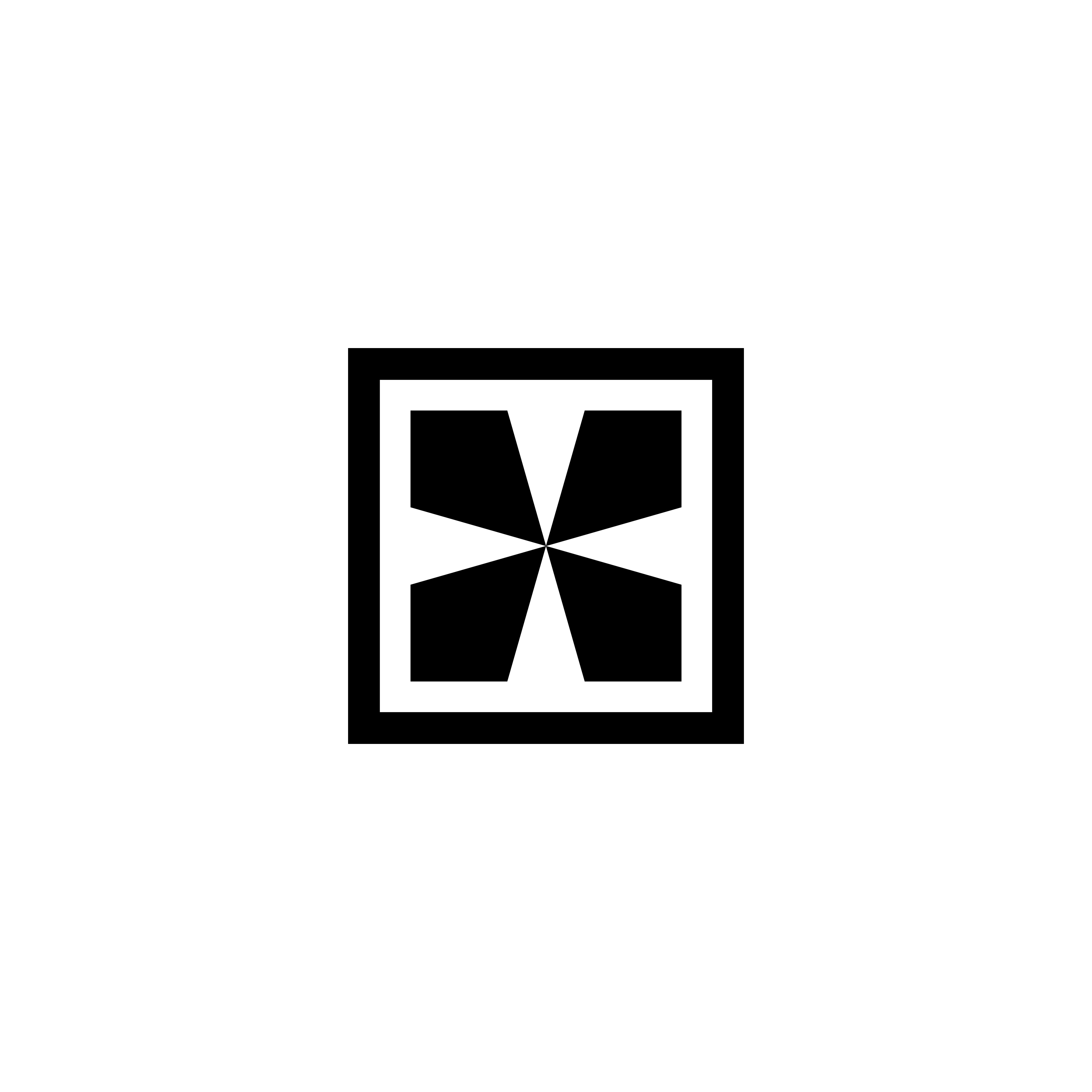
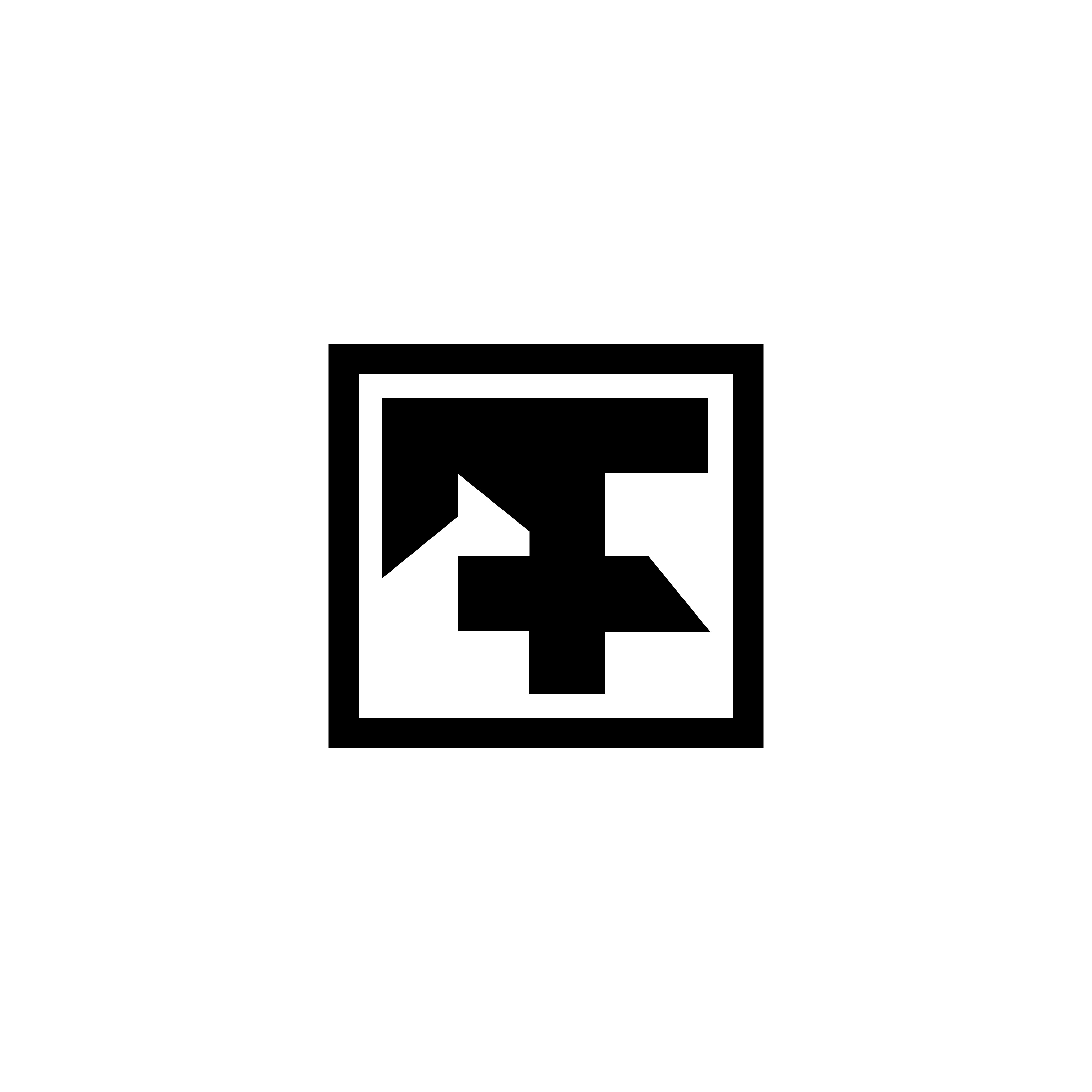
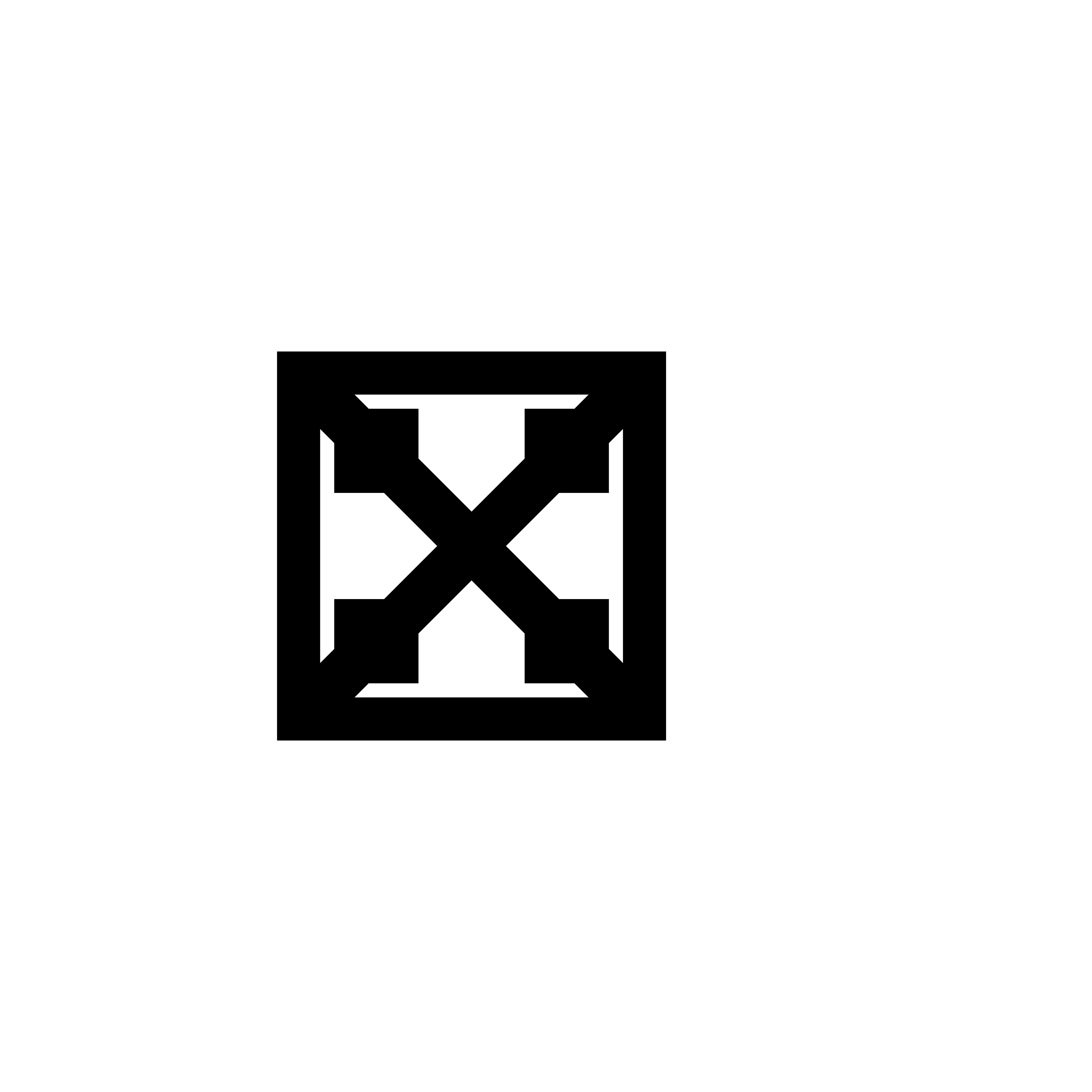
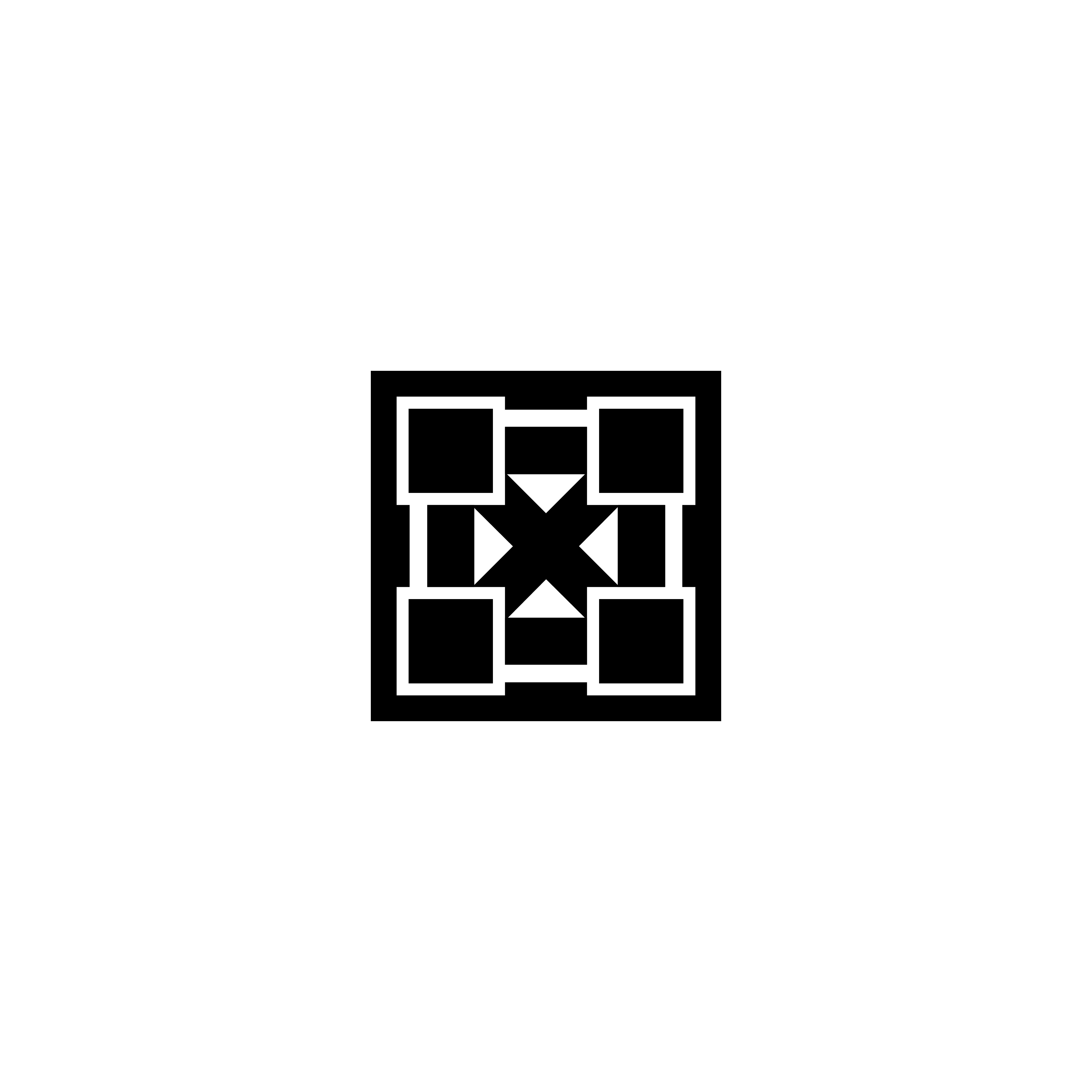
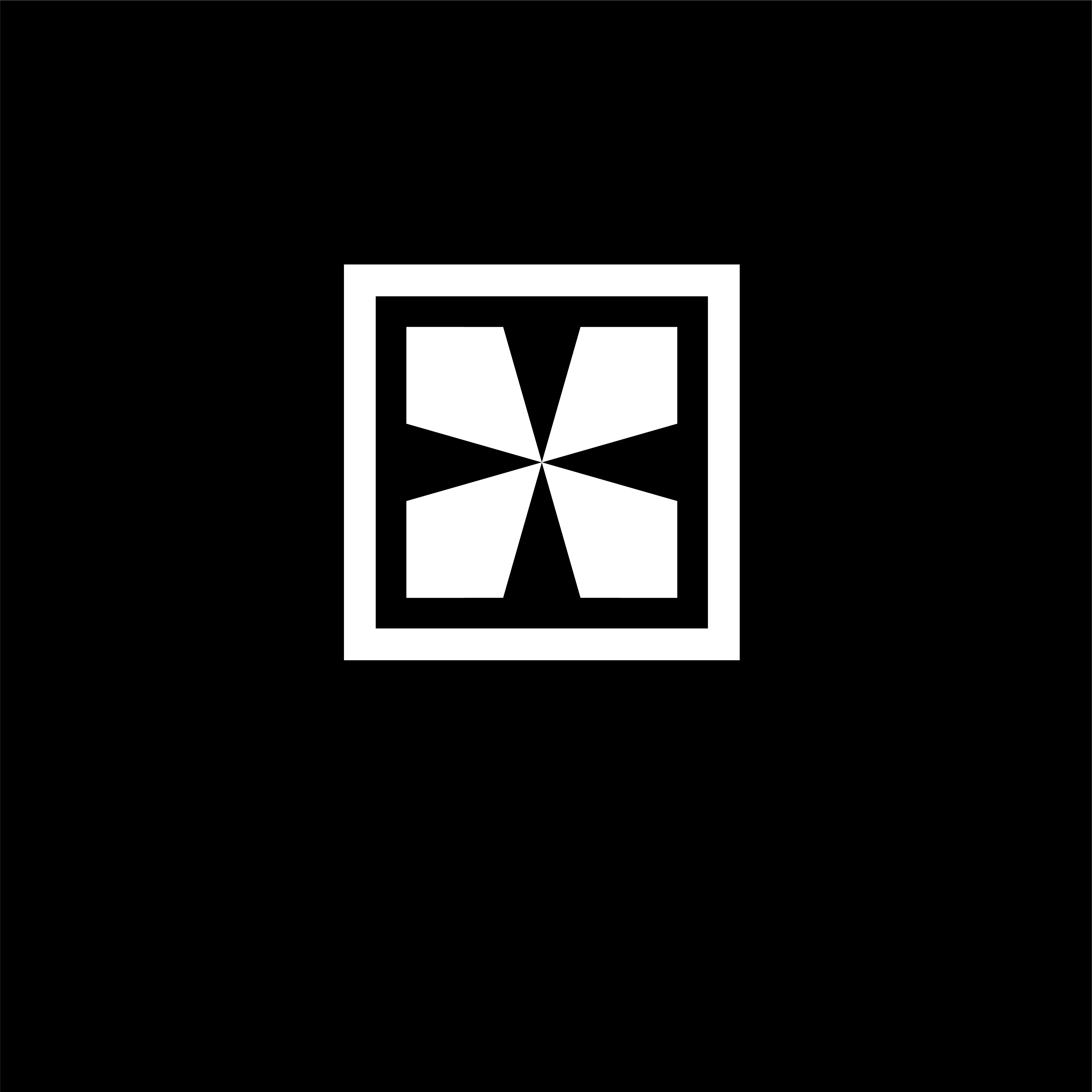
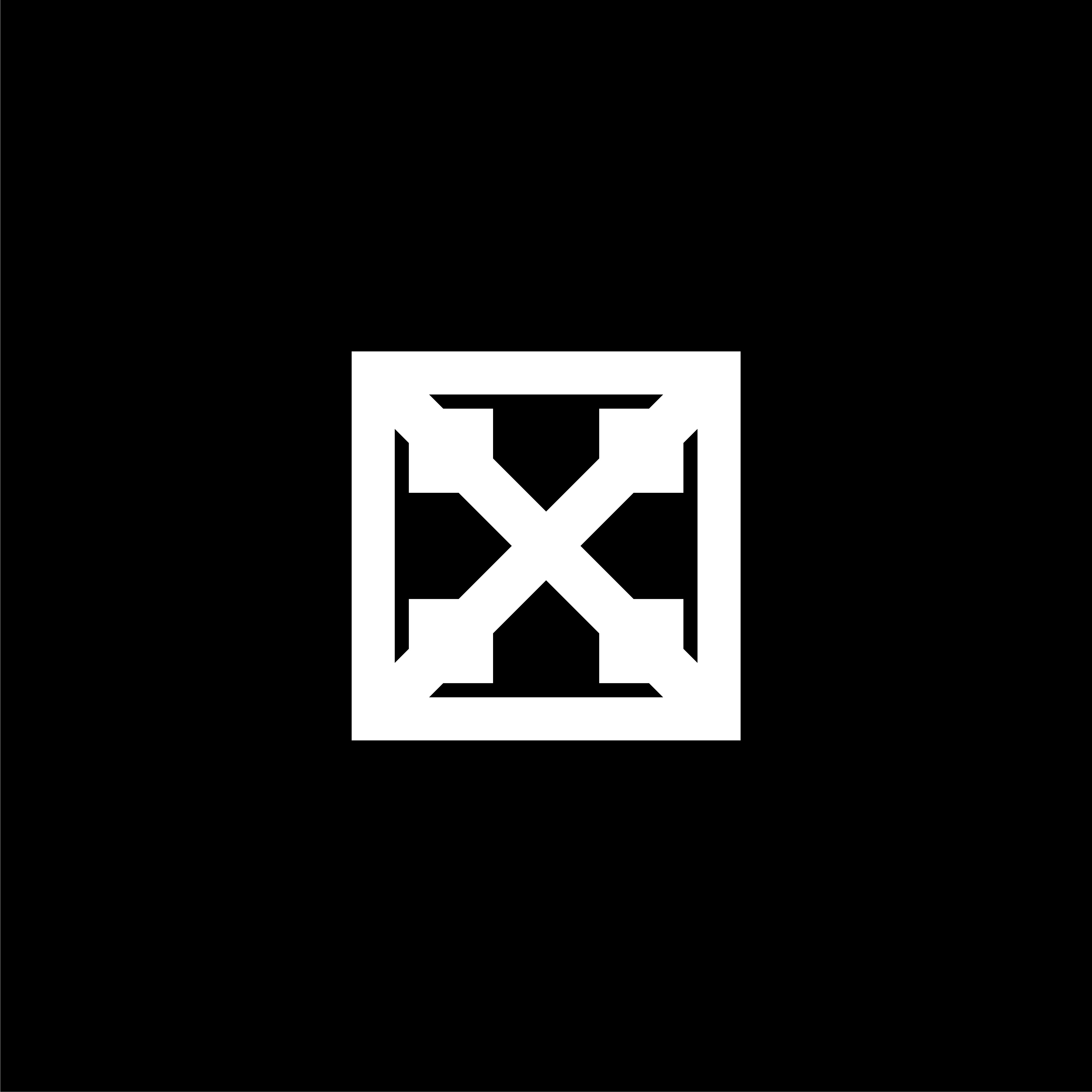
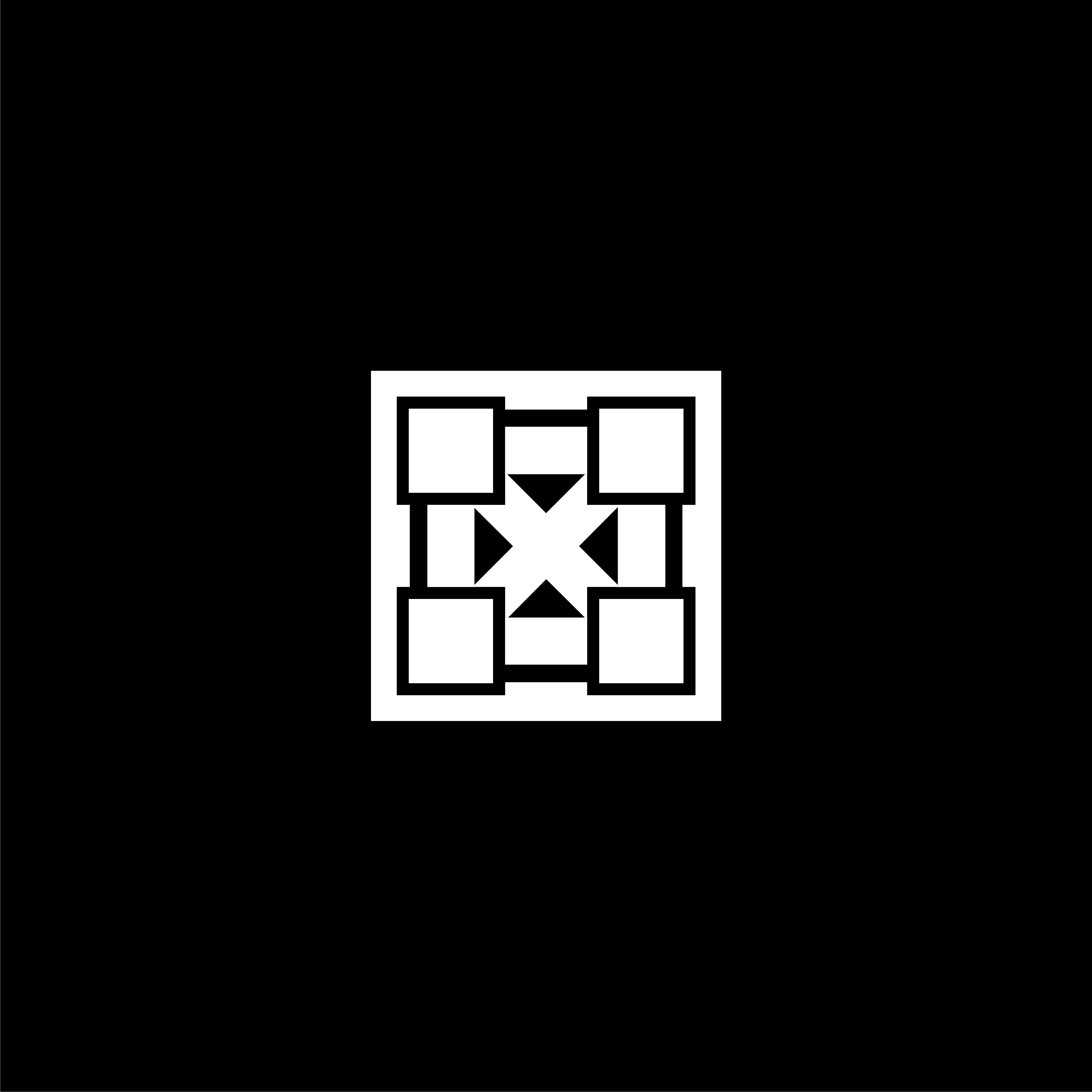
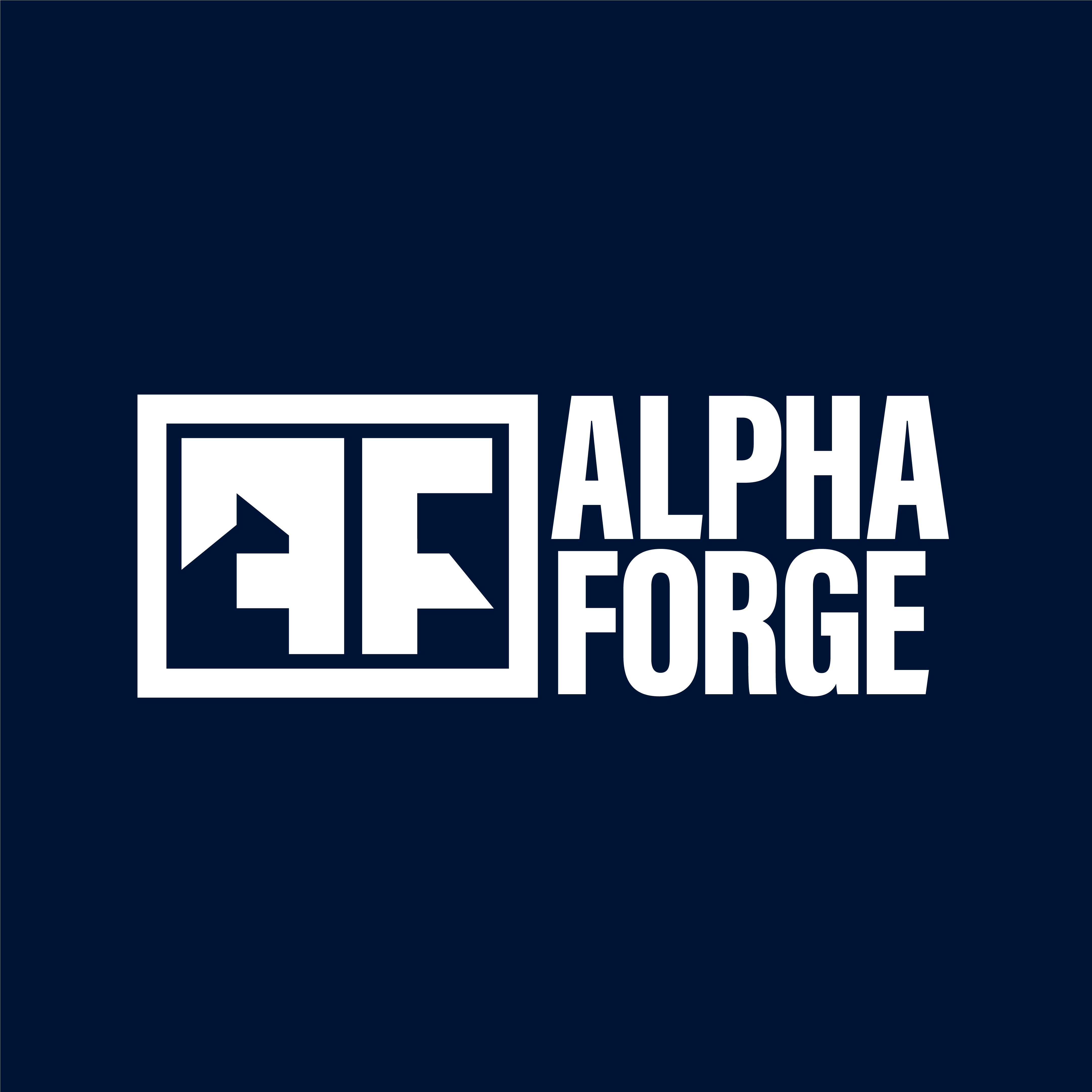
The square/rectangle shows the limit of human potential. The four small square are tied by lines show brotherhood and and these are closer to the potential limit of human mind and body. The diagonal line shows strength and stability.
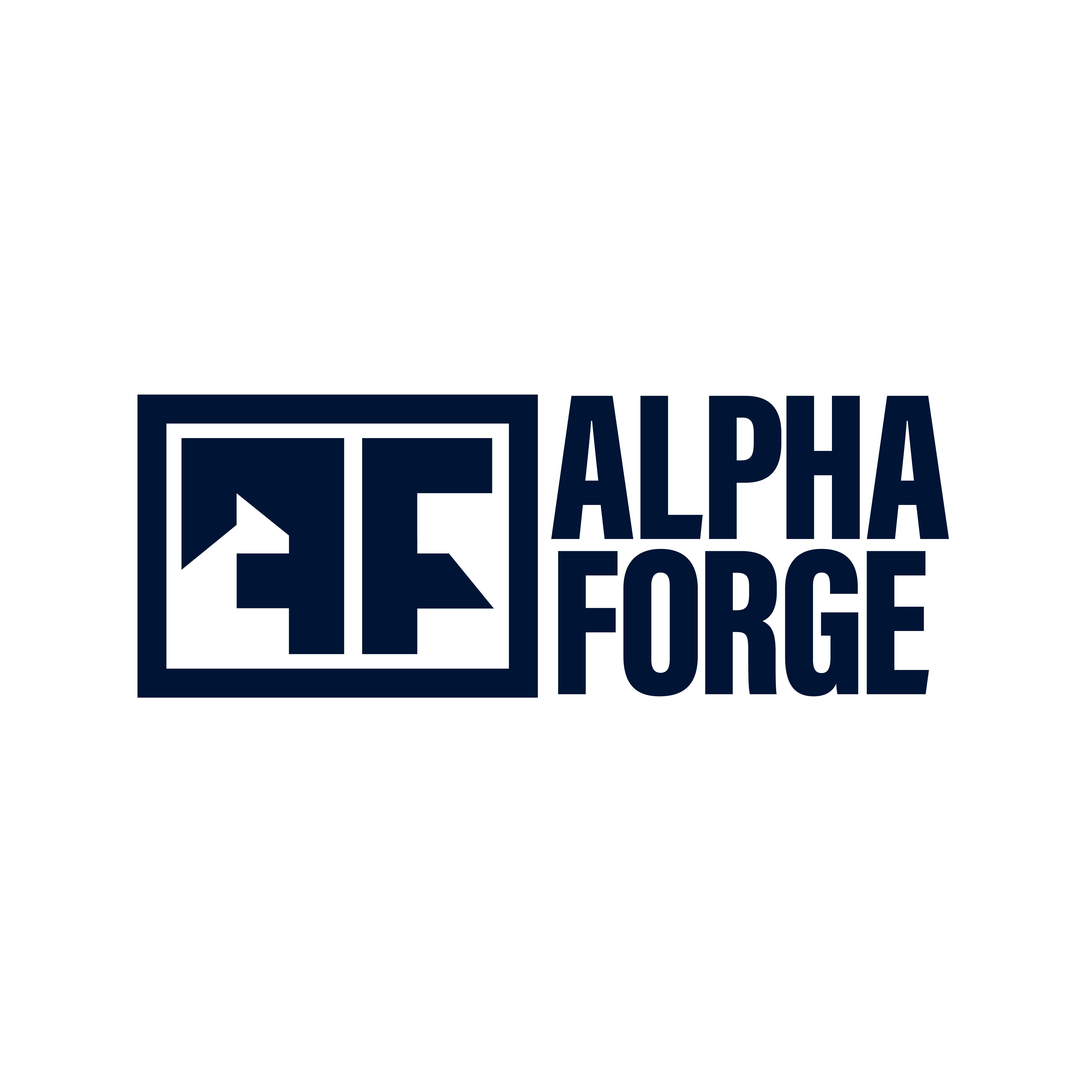
The monogram contain letter ‘A’ and ‘F’ inside rectangle. Please give honest feedback.
These are all a bit generic looking to my eye. They remind me of breeze blocks (do an image search if you’re not familiar with the term) or a dingbat font.
For me all of them, there is only one icon with ‘Z’ but the others there is not reference even Z or A.I would say try to combine the letters in different mode and make a new logo.
You used the word ‘icon,’ but I’m going to assume you’re referring specifically to a logo.
I think you’re making a fundamental mistake. A logo needs to immediately communicate, either consciously or subconsciously, an idea or an emotional quality that is appropriate for the entity it represents.
I think you already understand that, but you’re making the mistake of assigning your own meanings to shapes that won’t be shared or understood by the target audience.
None of the attributes you have mentioned, nor the A and F letters, are present in the logos that you designed. For instance, you mentioned the diagonals representing stability, but from a cultural perspective, diagonals convey the opposite: instability and the suggestion of something tipping over. Another example is your use of the square to represent the limits of human potential. But to me, a square suggests being boxed in and artificially constrained from achieving the potential that exists outside the box.
Logos need to immediately communicate and resonate with the target audience. A logo that requires a paragraph to explain what it represents isn’t doing its job. You’ll never be present to explain the logo to people. They must understand its relevance to the entity it represents on their own, with no explanation from you.
The icons all look bold, masculine and somewhat meaningless - just like I imagine a fitness coaching experience for aspiring alphas (which are mostly still in omega status though). So I would say they are all perfectly on brand!
Thanks I appriciate your feedback. I agree with the meaninglessness of the diagonal line but there is nothing wrong with the rectangle as you can see in the picture. However I really appriciate your critique.
Alpha Forge makes sense if you want a brand that feels gritty and unapologetically masculine, the kind of place where discipline and hard work are front and centre.
Forge is a strong word and gives you that sense of shaping and building, which suits a men only fitness space.
The only thing to watch is that Alpha can feel a bit loaded these days and sometimes drifts into cartoon tough guy territory.
If your whole vibe is steel, sweat and no nonsense, it fits perfectly.
If you want something cleaner or more modern, it might box you in a little. Overall it works, just be sure it reflects the identity you actually want.
It depends how you see, and how others would see your design and each one have different views and perspective. From my point of view The “A” looks like a “F” just inverted to be sincere and the client of the customer would say “I just see two FF’s but where is the A ?”