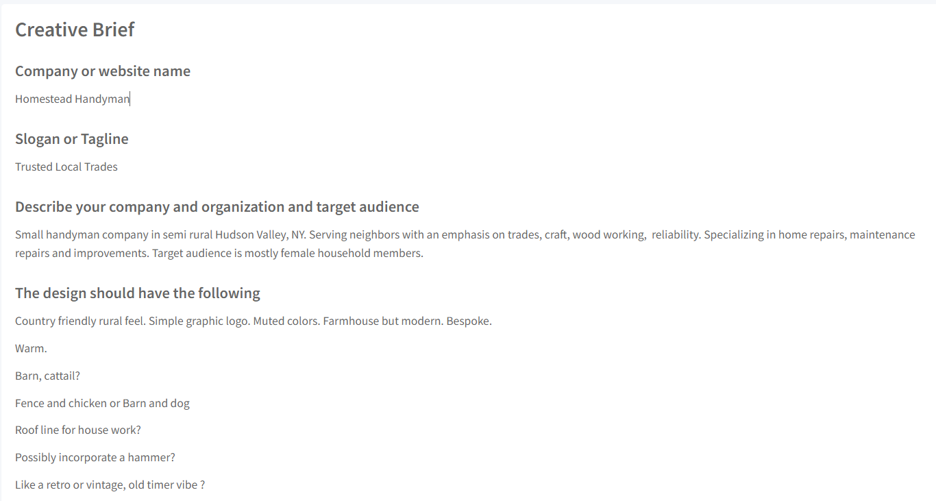
I attached the breief screenshots here.
1 Like
Honest feedback. Well, OK. I’m going to assume you’re a student looking for a serious critique.
First, I think the overall composition and typography looked good, but that was before I enlarged it enough to see the details. That’s when the problems became more apparent.
In no particular order, here’s what I saw.
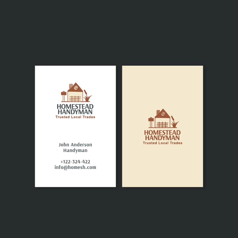
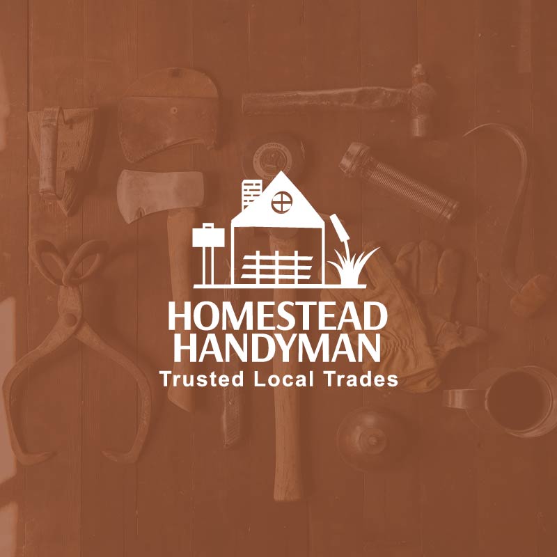
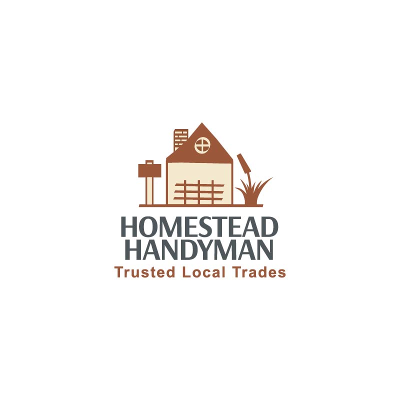
The roof on the house is crooked and off-center. What’s going on with the round window that appears to be two separate windows superimposed over each other? At first, I thought the object to the left of the house was a sign mounted on a pole, but I’m guessing it’s supposed to be a giant mallet or a hammer. The fence resembles a trellis, or perhaps it is a trellis. I have no idea what the giant plant-like object is to the right of the house.
The typography that says “Homestead Handyman” is nice. However, the typography beneath it needs work. Pairing two similar typefaces rarely works. In addition, the letter spacing is too loose. Tracked-out lowercase words rarely look good.
The biggest problem, however, is resorting to the obvious solution. If Nike had done that, the logo would be a shoe. If Apple had done it, the logo might be an iPhone next to a computer. The McDonald’s logo would feature a hamburger, a shake, and fries. Of course, there are times when the obvious solution is the best. At other times, especially with beginners, it’s often just the easiest way to solve the problem when nothing else comes to mind.
You can do better and be more creative. Push through it. Use your imagination to dig a little deeper.
1 Like
Well, Nike was the goddess of victory, so the wing-shaped mark wasn’t especially obscure but it also wasn’t seen as “clever” at the time. They needed the word NIKE alongside it for years before the mark stood on its own. Recognition took time.
As for this logo, I can see the intent. Maybe the idea is that the house flaws and all represents the kind of work a handyman deals with. And with the word Homestead, it suggests a focus on outbuildings, farm structures or rural properties. Of course, it’s equally possible that the meaning of the word was misunderstood; the illustrated building has a domestic-style chimney, which muddies that interpretation.
I don’t think there’s anything inherently wrong with a logo being direct. For small businesses, clarity can be more useful than abstraction. I’ve lost count of the number of times I’ve contacted a tradesperson only to realise they specialise in commercial work, not domestic simply because their logo and name didn’t communicate it clearly.
On the Apple point I’m not convinced the logo would ever have been an iPhone next to a computer. The iPhone wasn’t even conceivable at the time. Their original mark was a highly detailed illustration of Newton under a tree a nod to inspiration and knowledge and the modern bitten apple is a simplified homage to that origin. Just like Nike, once the brand became globally recognised, the symbolism no longer needed explanation.
The broader question is whether being “obvious” is an issue. For global brands, abstraction can work because recognition fills in the gaps. For a small or local business without that level of familiarity, being upfront about what they do isn’t necessarily a flaw, it’s practical. The key is making sure the execution is strong and the concept is clear.
1 Like
Thanks for your critique yeah I am a kind of student but not a regular degree student. I am learning on my own so your feedback means a lot to me.
The client asked to incorporate certain objects you can see on the brief image. However you did a good feedbck. Please be more specific that what should i do to balance typography here.
Thanks you nailed in
Is this client part of a contest or crowd sourcing site?
As I mentioned, spreading out lowercase letters is generally frowned upon by many designers. I suppose it’s a matter of opinion, but doing it doesn’t look good. Curiously, designers often spread out uppercase letters when the situation warrants it.
Pairing similar typefaces usually causes them to clash. An example is using two different sans-serif fonts together, as you’ve done. It’s generally better to use the same typeface for both, perhaps in two different weights, or use a different style font that clearly contrasts with the other.
I want to clarify something I wrote before. I didn’t mean to imply that a logo consisting of an image of the business, products, or tools is necessarily a bad solution; sometimes it’s the perfect solution. Instead, I meant to more clearly say that doing so is usually the easiest solution, but not necessarily the best. For a beginner or student, pushing past what’s easy helps develop the skills essential to solving both easy and more difficult problems.
In your specific case, if the client specifically wanted the logo to show objects associated with the business, doing so makes sense. If it were me, however, I would probably show that person what he wanted, and if I also came up with what I thought was a better solution, I would probably show him that too, while pointing out the pros and cons for each, then let him decide.