Hey there, I converted the eyes to solid red. I also made the mouth as thick as possible (not too thick - just balance)… it looks much better when scaled down to small size! Thank you!! I was planning to make the mouth thicker and you beat me to it.
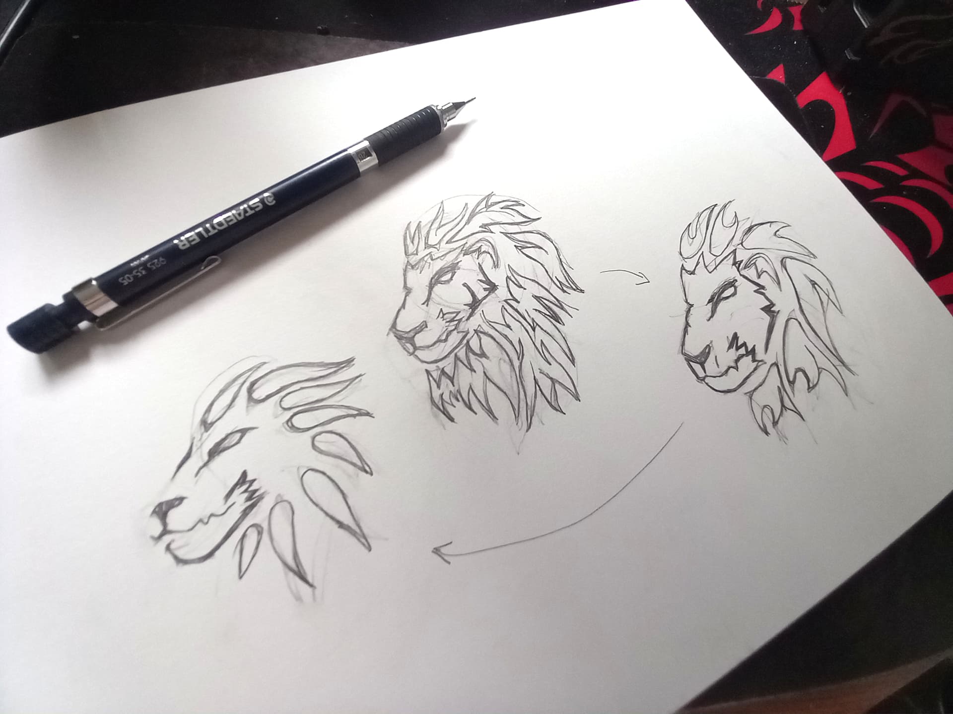
So far, it looks very nice. It looks more ‘simple is better’. Also, I tried to make the manes solid red. However, it makes the logo looks too flat. Made it darker, it loses the shine even more. So, I kept the red shade concept.
I wasn’t crazy about the starburst-looking mouth on the original lion, but these are a step backwards. The type in this latest iteration is also a step backwards. Sorry.
It’s the default anti-spam settings of the forum software. New forum members have a few posting restrictions. I’ve bumped up your user level a notch, so you won’t run into that problem again.
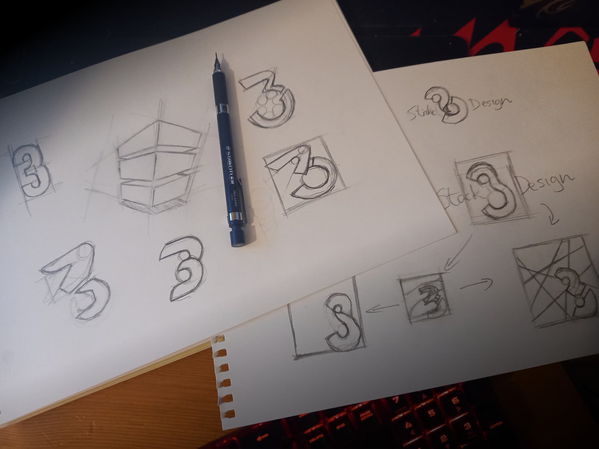
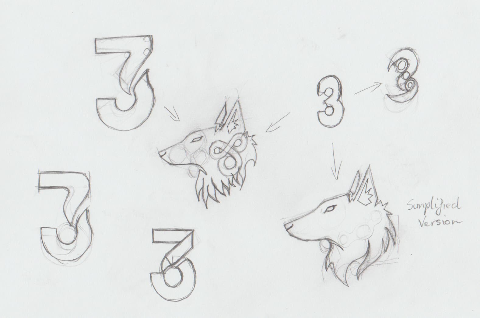
@Steve_O So you prefer the previous font and not the artistic brushy-feel font style? Also, the previous version which has an 3 in it, are you referring to the star burst… of that?
Also, I am trying to make the lion as ‘free form’ as possible and others suggest that my previous lion looks too pointy and has too many shapes. So I refined it, did a lot of repetition and try to simplified it as much as possible. Not only that, the font choice I chose was because I like to convey my ‘artisitic side’ and make it look like it was written with a brush.
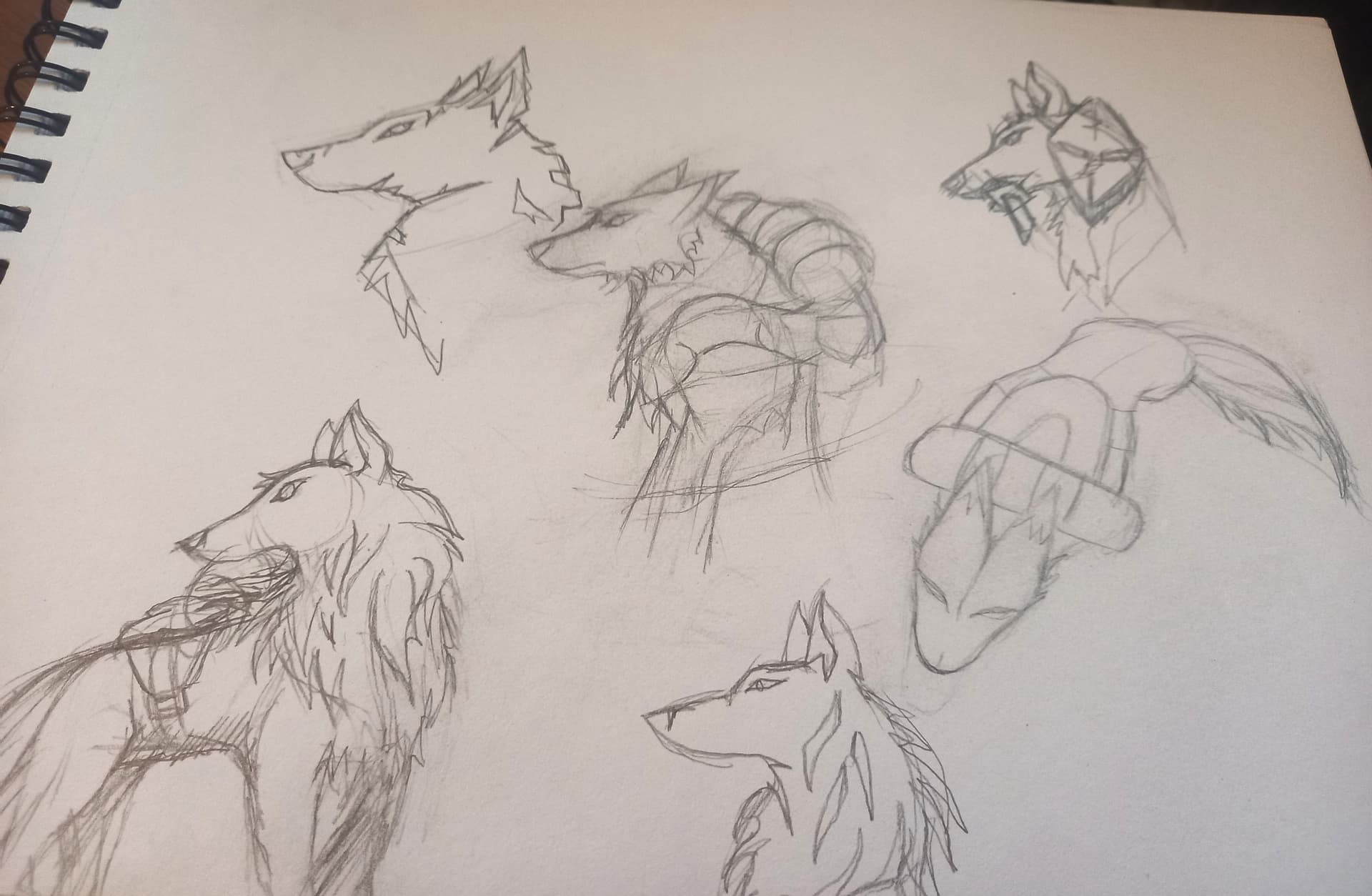
From the other hand, the lion’s mane, I focused on free-form to try and make it look not too pointy and sharp. (A user said something about that)
Definitely. If you go with the brush font, you’ll be regretting it inside of two years.
If you go back to your very first post, the options numbered 24 - 31, the mouth of the lion reminded me of a starburst. It did not read that strongly of a mouth. That one would still need work, but I think it is headed in a better direction that your latest iterations. Also, I would not recommend incorporating the three into the lion’s mane.
All of that said, and this is just my opinion, there is a disconnect between the name and the lion head (or wolf head for that matter). My personal recommendation would be to spend some time exploring and pushing the typographic solutions you started with.
Also, the font style was just an experiment. And yes, I did a lot of research into brushy fonts and compared it to the modern - clean font (which I previously used). Most of the clean font goes well - hand in hand on the website. It also goes well on business card and connects with other fonts used on other platform. Also Just-B strictly told me not to do that and I learnt my lesson. I will also avoid my errors.
Its been a while going back to intense design - work. I enjoy it and everyone is like a client and I tried my best to revise the logos to my best abilities.
“Design has no ending. It will always keep going no matter what you do.”
Anyway…
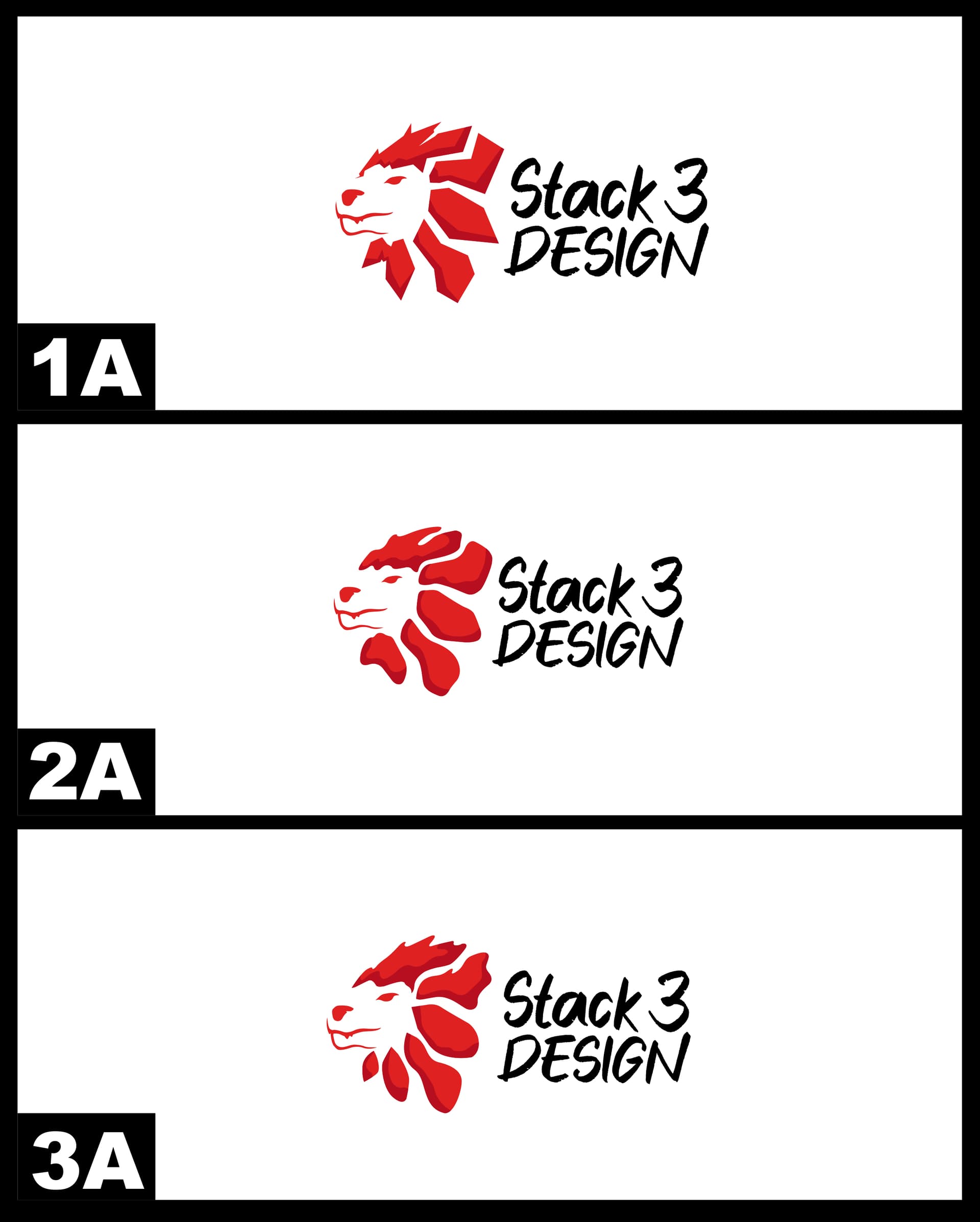
Will these logo be okay? This is my last alteration / revision. I will need help choosing my 3 final logos - 1A, 2A, 3A. Also, I will scale the lion properly when I am working on my website and refine it as I go. (Only repositioning and scaling)
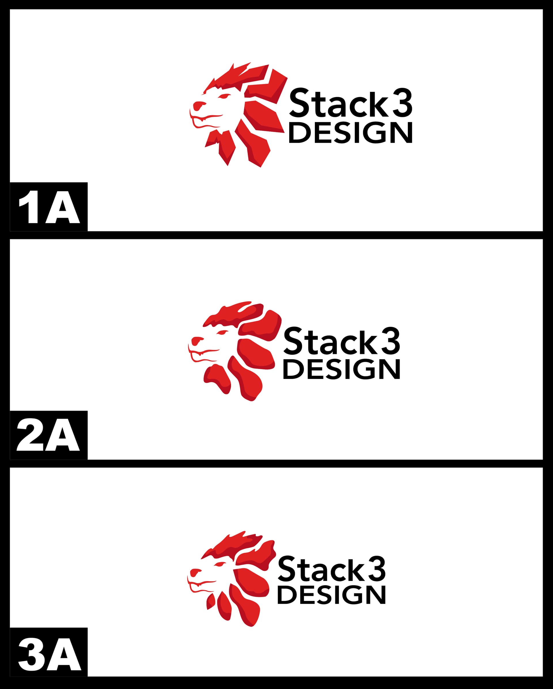
I shall revert back to the clean font. Here is the update:
Obviously I’m not telling you to use these images directly, but you see how the majority of the lines are smooth, simple curves, but they still have defined end points? That was the style I was trying to suggest.
That curved line-style from that lion is overused. I prefer being different… but the brush… maby one more variation wouldn’t hurt. Let me experiment and see what I can do. I may as well go to my design storage and get out some paint brushes and oil paint (oil paint is expensive!)… the hell with it. May as well go for it and use it.
Here are some of my sketches and doodles, RedKittie. Also, what do you think about this everyone? I was trying to make it like ‘paint’ with a true free-form - more like organic. The colours are all solid red. No shades!
Hello there! I would like to thank everyone for their time and their help. I now have a logo. This means I can start working on other projects, rebuild my portfolio and work on my website. My previous portfolio on DA is a hot mess and doesn’t stand out. Even worse, DeviantArt isn’t a good platform… support doesn’t even care. But got recommended to Dribbble + Behance to archive my work to reduce loads on my main website. Supports are better and they are very helpful.
Currently, I am now working on archiving my Stack 3 Design logos and updating my website. I also need to work on my other web-pages.
There’s a lot to unpack here, and it’s clear that you’ve dedicated considerable time and effort to this. I’ll start with what works. The stylized 3 you’ve created in designs such as 12, 13, and 17 is very interesting and has character. Something along the lines of 3, 4, or 5 communicates the concept well without being too busy. I am curious about the signficance of the 3.
I think the wolf and lion concepts aren’t quite necessary and tell too personal a story. Realistically, I don’t think clients need to know about your personal struggles. I think the term “lone wolf” is a red flag since it portrays someone too stubborn/antisocial to work well as a team. That said, the illustrations themselves are well executed.
I recommend taking the stylized 3, continuing to experiment, and maybe refining your colors and typefaces. The standard red and black are very common in tech and give off a somewhat generic feel. The work is strong overall, but I think you might reach something great if you keep pushing a little further.