Please help me decide on my final logo?


Hello everyone,

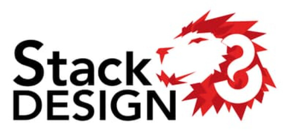
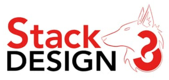
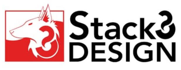
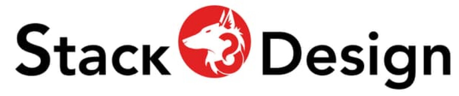
Lately I had been working hard on my website and logos. Also one of these logos will also be use on business card design (which I will do next after this), FB Page, Twitter and so on. Therefore, I’d like everyone’s opinions and help me choose the final logo!

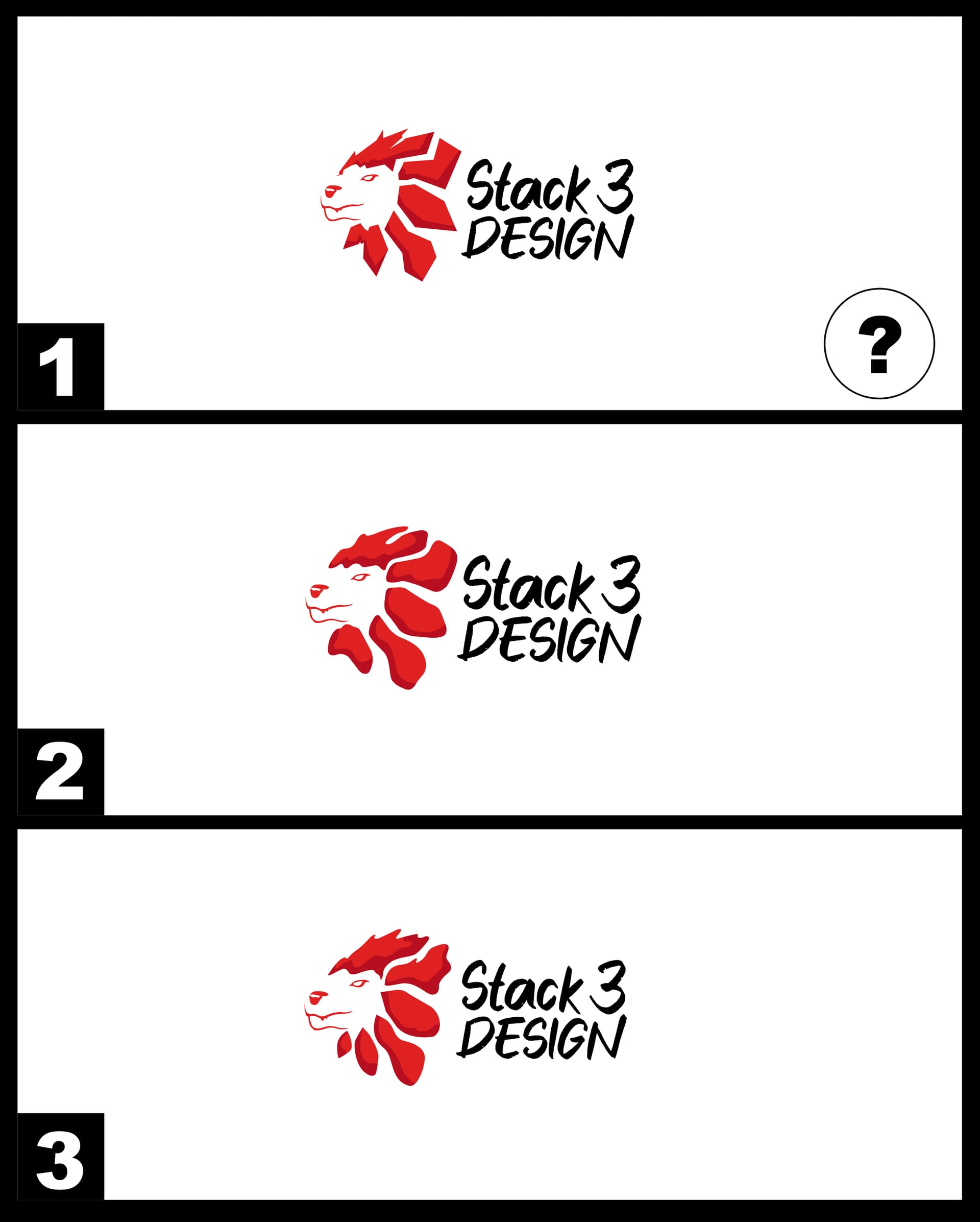
From the pass, I used to be “Lair360 Design” and I’ve come to my senses that I need to change my identity and improve. After brainstorming for a few weeks and parked my domain, I’ve settled my choices to this: ‘Stack 3 Design’. Also, some of friends on Discord said that ‘Stack 3 Design’ sounds better and it stands out better than my previous name: Lair360 Design (where I do agreed with them that it doesn’t mean anything or convey what I do!).

Regarding logo design, I understand that I will get slated and pinned to the ground with harsh criticism. But I will do my best to take everything on board to improve and do my best. At the end, if everyone isn’t happy with the logo, I will just scrap everything and go back to the drawing board. Its simple as that. Sometime, you have to start over…

As someone who wrote a book – told me: “If you can’t write down a clear path. Delete it and start again until you get it right.”

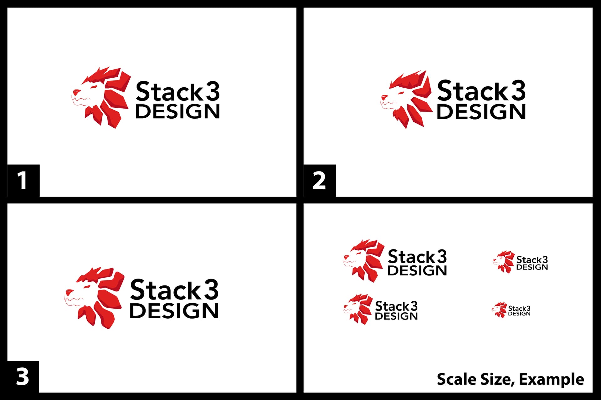
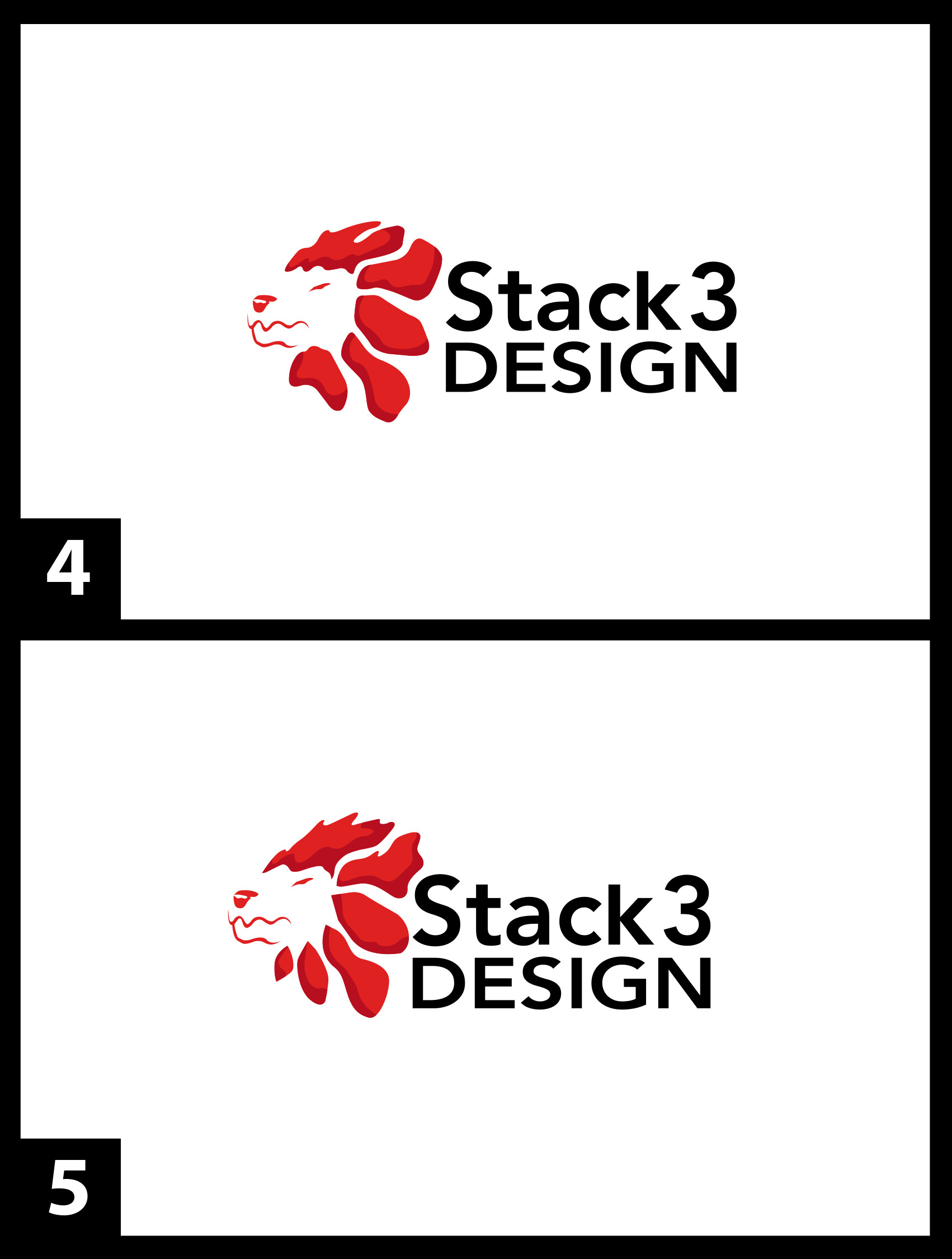
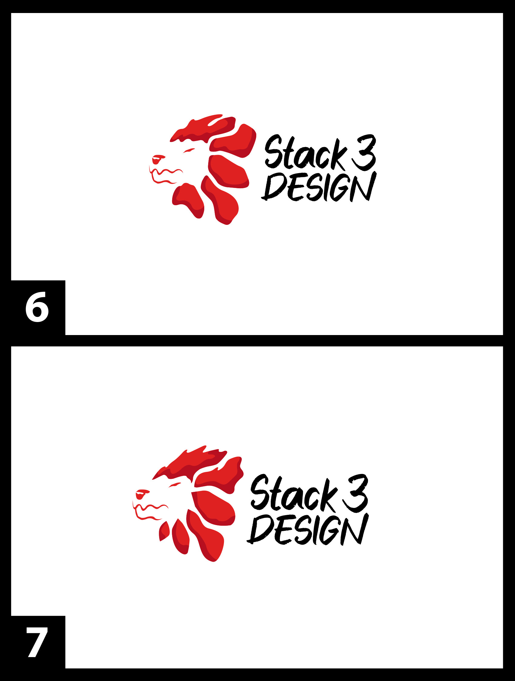
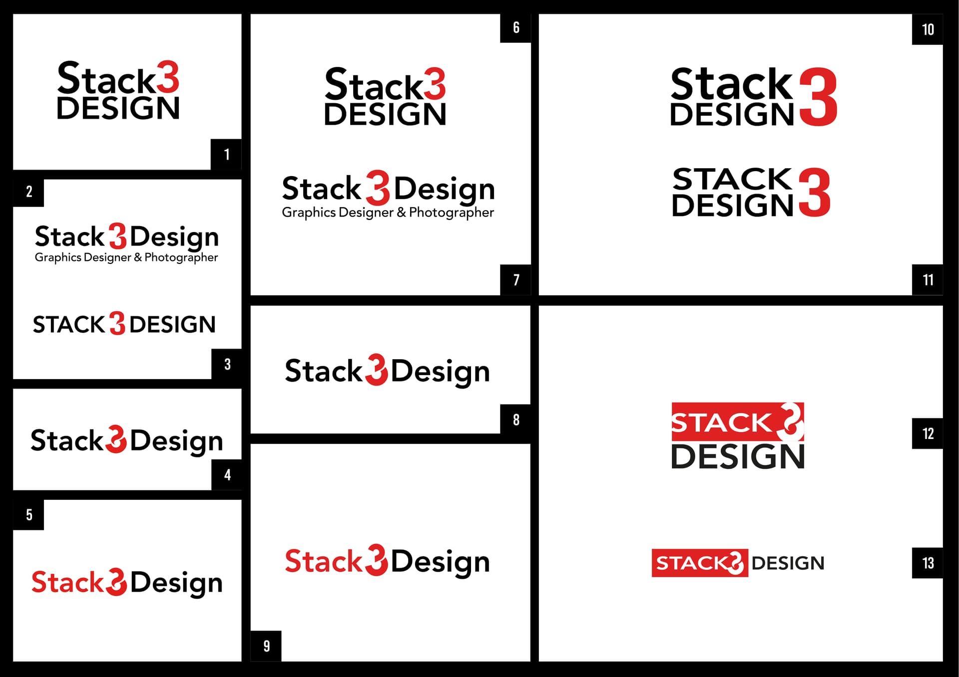
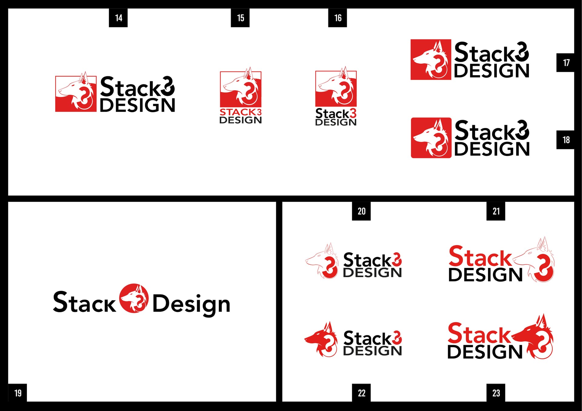
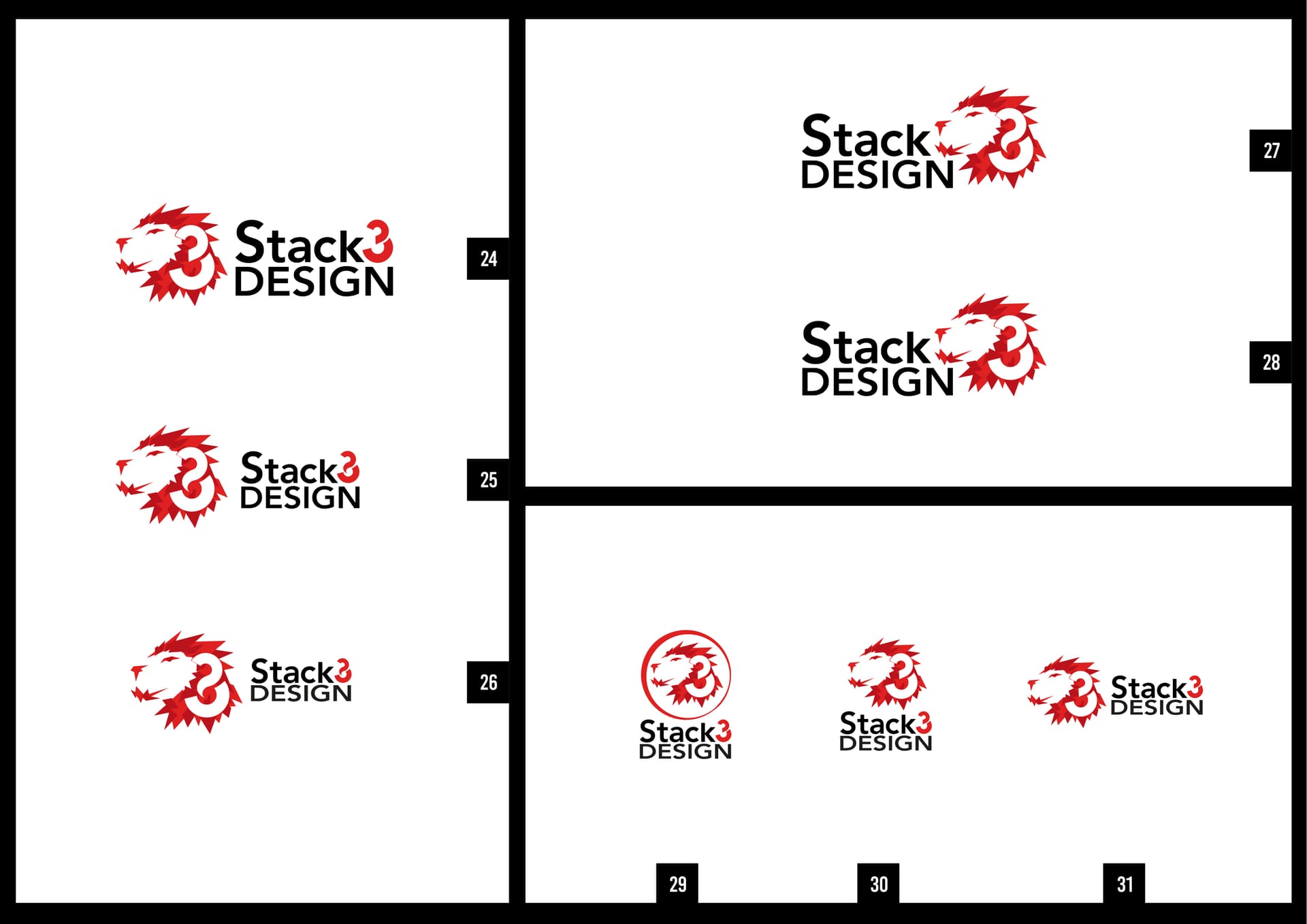
Working on my logo, I experimented many forms, styles and compositions, especially on ‘number 3’ by drawing shapes to complex forms and simplifying them multiple times (think of it like repetition). At some point I also use my XP-PEN screen-tablet to draw digitally and see what I could come up with. As I experiment and expand, I thought about a graphic logo-mark of a lion / wolf. So I decided to draw a few design without reference. Just from my head… to be honest, some of the drawing came out as ‘too complex’. So I simplified it until its easy enough to look at or good enough. Just that!

As much as I like to keep my design as ‘minimalism’. From my heart, I would also like to incorporate some form of “logo-mark” (where I can place in corners on all my projects) and use “combination mark” for my website and other platforms like Twitter and Facebook.
Again, I understand that I can only choose one form. But I’d like to strike a handshake with both: logo-mark and combination mark, if possible? If you say no, that is fine. I will see what can be done.

Regarding wolf and lion graphic, these two animals tells a story about me and my passed life.

From my pass at College / University life, I used to multitask a lot and pushed myself where my lectures had to tell me “take a break!”. This shows that I am a hard-worker that never stop. Also, I’ve been working as a ‘lone wolf’ for many years (as a freelance designer). This is because, where I live, its all about oil and gas, restaurants and shopping malls. Even worse, I have to work on other jobs “from the lowest of the low” and trying to keep my passion and my love for design together. At some point, I like to work full – time as a graphic designer and photographer. But… it’s complicated and many companies asked for too much or gave me the silent treatment (for many years now). Also, family and close friends often said to me that I have the strength of a lion - so does my ability to be creative. Playing with Lego, drawing and reading a lot at a young age also sparks my interests in design.

Finally, its been a few weeks already. This is where I go back, rewind to create a website + a brand new logo just to keep everything together. But ultimately, have fun being creative and enjoy art whether it’s digital or traditional.

Please help me decide which logos is the best, needs adjustment or could be improve? Each logos has a number and its easy for me to keep track.

P.S. So far a lot of my friends on discord said that No.25 and 26 is a good choice. Some also love No.22. Also No.24, 25 and 26, a darker red are needed to tell the difference between the lighter red. However, I need more input. That is why I was recommended here…

Thank you very for your time!

Dino Nguyen.

I know I have a tendency to over-word things, but I think short and to the point is better here:

30 designs is A LOT to ask other people to go through and help you narrow it down. I think you need to go through your concepts and chop them down until you can count them on one hand. You’ve got ten iterations of three different base concepts - picking one out of thirty is a tall ask for anyone.

The executions aren’t bad, but I think you need to solidify what you want before you get other peoples opinions. For what it’s worth, the 2nd base concept with the wolf seems to be working the best on a purely visual standpoint.

2 Likes

Thank you for your input. Also yes, I do admit that I did go overboard. My apologies. Also, may I ask about the lion concept? Just curious. That is all.

Notes: I am currently removing and restructuring my logos so its down to 6 only. Will it be okay if I put down 6 logos?

image

You’re trying to cram too many ideas into one logo: a lion, a stylized 3, and altering the size and case of the typeface. It comes across as chaotic and lacking coherence.

The name doesn’t read as Stack 3 Design. It reads as Stack Design. The 3 doesn’t readily communicate as a 3; instead, it looks like a mysterious symbol of some kind awkwardly and inexplicably placed within the lion’s mane.

The treatment of the type (changing the size and case of the glyphs) doesn’t work. It looks random and gratuitous. In addition, as you change the relative size of the glyphs, the relative weight of those glyphs changes. For example, the large S looks heavier than the lowercase letters, and the lowercase letters look heavier than the caps beneath them.

The lion is interesting in that it’s composed of simple geometric shapes, but it needs work. I’m also wondering about the two shades of red and if they’re needed.

image

Same problems as with the lion logo. In addition, the lines making up the wolf are too thin. They look anemic and will become increasingly illegible at smaller sizes.

image

You’ve taken the same problems and rearranged them. I’m not a fan of the 3 symbol. It looks like a question mark or smoke arising from a bowl, but that’s not what you intended. For that matter, it doesn’t seem to symbolize anything — it’s just a stylized 3 that serves no purpose within the context of everything else going on. Again, there are too many elements and ideas in the logo. In addition, there’s certainly no reason to place two of the same symbol in the logo.


image

From your examples, I like these best because they’re simpler. Still, you’re repeating many of the same problems as in the other examples.

You won’t be there to explain your reasoning to people who see your logo. Your past life is irrelevant to your logo because absolutely no one but you will draw the connection. A logo should resonate with your target audience, but you’re basing your decisions on what only resonates with you.

In general, pick one idea and refine it. Good logos rarely contain more than one straightforward, simple idea. Make your decisions relevant and understandable to your target audience.

3 Likes

Since there are so many, I’m just giving you my quick thoughts.

1 – Pretty plain.

2 – Visual mess.

3 – Best so far, but you need to push it.

4 – The 3 looks like a backwards ampersand.

5 – The 3 looks like a backwards ampersand.

6 – Same comment as 1.

7 – Same comment as 2.

8 – Slightly more legible 3, but it’s not there. You could try pushing this one.

9 – Same comments as 8.

10 & 11 – Stack Design 3?

12 – Nope. The art and spacing are way off.

13 – Maybe with a better 3 and more work on the spacing.

14 - 23 – I’m not crazy about the wolf illustration. Also, the 3 doesn’t really mesh in there like you think it does. I seriously doubt anyone would look at 19 and read “Stack 3 Design.”

24 - 31 – Overall, I think the lion illustration has more potential than the wolf. That said, I think it needs more work and none of these are working as an overall lockup. If you want to go with an animal, I prefer the lion; but push it more, and work on the type.

Thank you for the feedback and suggestions. I will go back to my drawing board and see what I can do to improve. Also as a reason, I’d like to keep the 3, because Stack ‘3’ Design. But I need to think hard and see how I can integrate it properly… its a little hard to try and keep the animal while keeping the 3 intact.

Hhhmmm… is it best if I follow the lion’s path and refine it? What do you suggest? Or work on one first then tackle the wolf variation?

Thanks again @Steve_O and @Just-B .

My main suggestion is to pick one idea and refine it. Work on the 3 or refine the lion. Pick one, but trying to integrate both into the logo will likely pull you back into the same dilemma.

There’s no obvious connection between Stack 3 Design and a lion head. Again, it’s another example of two different ideas instead of focusing on one. If you like the name, fine, but make the logo relevant to the name. Stack 3 suggests a stack of three things. Yet, you’re ignoring the obvious path to a coherent solution and, instead, using an incongruent illustration of a lion that has no readily apparent connection to anything.

This line of thinking seems to be a basic and consistent flaw in your approach. Again, one good idea is better than cramming together two or three different ideas.

1 Like

Understood. I will avoid putting the 3 and the lion togheter. Also, this will be my ground-point: refine and improve the lion while keeping “Stack 3 Design” simplified - as in not overcomplicate it.

Will play about with my drawings and keeping ideas as “one good idea”.

Focusing in on just the lion designs, it’s got potential, but I think juxtaposed with the smooth, simple curves of your font and custom character it’s a bit sharp and noisy. It comes off as a bit stiff and rigid to me. If your goal is to have a wordmark and an icon that can be used together or independently, I think they should be more cohesive when displayed together - that’s the core of why, at a glance, I liked the wolf better.

When you’re refining, I’d suggest either incorporating some curved lines into the lion’s shape, or changing the type style to one that ties in better to the sharpness.

And coming from the perspective of looking at just the lion, I don’t see any clear connection to “Stack Three” - I’d work on connecting the name to the icon in some way, but nothing comes immediately to mind.

1 Like

HHHmmm… I see. A lot more information than what I could chew.

But anyway! I am currently scanning in 3 different lion sketches and working on it asap. When it’s done, I shall post it on here. Also yes, I am planning to do some experiment, add curved lines and simplifying it on illustrator. I checked that the lion version that I currently have, its too sharp and pointy. Not only that, if it does not seem to work out… I will try working on the Wolf.

Thanks for the input.

A good logo is simple and memorable. It also works good at very small sizes.

Take your time and study some of the most famus and iconic logos in the world:

There’s also a great, dirt-cheap logo design course with Sagi Haviv of Chermayeff & Geismar & Haviv:

1 Like

Further to the great feedback you’ve been provided with, I would just like to ask: How did you arrive at the name “Stack 3 Design” and why do you think it’s a good name for your design business?

P.S. Why is there a ‘post limit’…? I understand that its there to stop spamming. But protect user… uhm… I am confused. I really am.

Anayway! Back to topic…

To be honest, I don’t look at many other logos and big brands. It deludes my abilities to be creative and all I see is ‘oh, big brands and shapes’ and ‘Oh, that logo doesn’t even look like art’. So in my own way, I prefer hands on experiment, a lot of repetition, refining and pushing myself to grasp the logic behind ‘trials and errors’. I also draw and design everyday and my mind is very active. Yes, I tend to stack my designs and artwork from simple to complex. Also, when it comes to design, my mind tends to go overcomplicated. From there, I just simplified them through many cycles of repetition.

At the moment, I am trying my best to refine the lion logo. So far, it’s looking okay and going in the right direction. Its also an improvement from the previous revision. What I am trying for is ‘less pointy corners’, less shape piled together. Not only that, I scrapped a few other things which Just-B and Steve_O said and suggested.

So far, I love design 4 and 5. What do you think? I am trying to incorperate ‘free-form’ lines and curves to make it like ‘paint’ taking its shape. I also increase the thickness of the lion’s jaw for scaling-down to small size.


Looking at fonts, I tried to go for something that matches with the lion. So I ended up using a brush type font… something which doesn’t have fancy strokes or anything that will overtake the lion.


@pluto

Stack 3 Design came from three things.

First, the word ‘Stack’ - I stack my design through repetition and from trials and errors. As said in previous paragraph, I draw and design everyday!

Second, the number 3 was taken from ‘Lair360’, my old identity. The No.3 also means “all was given” and contains “the beginning, a middle and an end”. It even said that No.3 means something complete and good.

Third, Design – I do design. That is what I love to do. Also yes, I work on other types of art, graphic design and photography. So, photography? I use that as support for my art and design project.

Dino

I’m sorry man, but to my eye, the evolution of the lion has gone in the wrong direction. All the strength normally seen in the angular sculpt of a lion’s face is missing. I can only imagine this lion is underwater and a moment from drowning (or toothless), given that wavy lip line and weak eye. Considering the lion’s tenuous significance in relation to “Stack 3” to begin with, IMO you’re going backward.

1 Like

I am going to try and limit my post. This forum has a limit to how many I can post.

I am trying to go for ‘less is better’ approach. Also I will fix the eyes. Still working on it in the background…

Sigh… a lion in the water? Design 6 and 7 has less pointy lines and it mimics paint in some sort of ways (liquid form). Its not trying to convey drowning and underwater…

Second, I am trying the ‘free form’ approach to convey that I experiment with art and enjoys designing from a different perspective.

Currently your lion’s mouth looks like this:

You shoud change it and make it non-wavy.

The best way to improve your logo design skill is to study the best designs in the world and understand what makes them great, as there’s only so much you can figure out on your own.

1 Like

Looks to me like a dog bursting through a flower.

Here are my revision. I updated the eyes and reduce the wavy lines (as much as possible) of the lion which @Jakub_Trybowski suggested. Not only that, I added some teeth / fangs (not sharp-pointy ones).

Regarding the 1st design, it looks not bad. But I prefer design 2 and 3 as it convey free-form and resembles ‘paint’.

OK.

Now try to make the lines of the face as thick as possible. Also, make the eye and the nose solid.

1 Like