Please, I need feedback on this (help from someone looking from the outside in) about how I can improve and optimize this cat ying-yang logo I have been working on. I have not hit a block like this in a while, and I really need some outside critique and help. Any and all input is appreciated. Thank you!
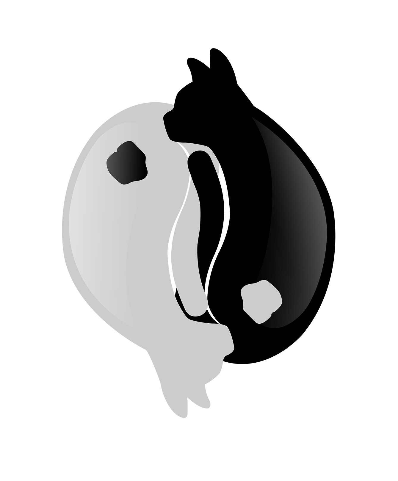
I get what you are going for. Right off .. is this for a logo? If so .. lose the gradient. Also that spot is just not working. Perhaps just a traditional circle or paw print perhaps .. but as is, it just looks out of place.
I like the direction you are going in though .. keep at it ![]()
1 Like
Noted, will take out the gradient and fix the spots!
1 Like
I agree with RKK. You have a nice idea, but the spots really draw attention to themselves as mystery items of some sort. The tails crossing over each other is a nice touch too, but I think those tails and the thin negative spaces defining them could use some simplification and refinement.
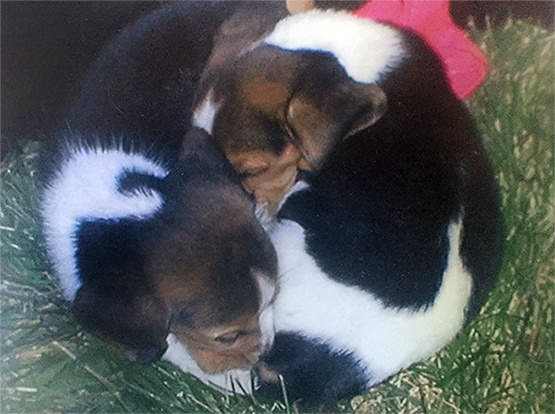
For what it’s worth, your logo reminds me of a photo of our beagle and her littermate when we picked her up a few years ago. We hated breaking them apart and nearly decided to get both of them.
3 Likes
It’s nice that if you flip the logo upside down you still see the same thing, but like mentioned above I would try a different way of showing the tail of the cat or how it looks with the other tail in front of it.
1 Like
I’d echo @Just-B by simplifying or refining the tails, or maybe remove the tails completely. With the white space between the tails it looks like they are sniffing each others rear ends. You could also try directing the heads up more, or position them so it is not directly in that area of anatomy.
It seems to me a yin-yang symbol should flow perfectly, and be equal, the spaces between the tails, and the placement,direction of the heads throw that off.
As @RedKittieKat said, I would also lose the gradient and make the yin/yang spot either a circle or paw.
1 Like
Hey @jenniferlkary, welcome to Graphic Design Forum!
I like the feedback you’ve gotten, and you seem to have a great attitude about it. Shows us the progress you make once you do the edits!
1 Like
Good advice! I was wondering if removing the tails would mean they wouldn’t look like cats any longer? Or maybe having the tails around the outside or something…but now looking at it you and everyone else is right, the negative space there is weird. I will have to rework that. Thank you for the feedback!
Thank you for the warm welcome!
I will be sure to keep you guys posted as I rework it to help me better it!
I’d keep them on the inside, it’s more natural that way (or just remove them and see if they still resemble cats without the tails).
I’m trying to figure out if you just created one cat, then duplicated, mirror and flipped it. But they don’t look symmetrical.
I’d also fix the snouts a bit, they look to square and flat like a pug.
1 Like
Thank you for your help!
So what I did was I sketched it in Procreate on my iPad, and I used the rotational symmetry tool (which draws the exact same image on the other half of your canvas, and then inverts it). What I am having great difficulty with is translating this into Illustrator and making it symmetrical and as you pointed out, no, they are not perfectly symmetrical. I am trying to figure out how to overcome this and watch/read some tutorials on AI symmetry.
I’ll adjust the snouts as well, I thought they might have looked a bit too boxey.
Here is my current working sketch!! Please provide feedback if you are able! Thank you!
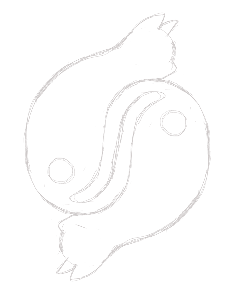
To be frank, I think the snouts look even MORE boxey and off than before. I need to go in and adjust that.
1 Like
a definite improvement. Instead of “hard circles” for the yin/yang aspect, I wonder if you coudln’t have those areas be more along the lines of a patch of fur that is more organic and not so circular.
Well as you can see in the top one, I did try doing that, but people were saying that the “spots” just weren’t working, which is why I switched them.
I think the spots are problematic. The yin and yang symbol has them, of course, but they don’t really come across as fur spots and might look more like holes in the cats. You’ve already taken artistic liberties with the symbol itself, so I’m wondering if at this point those spots are really needed to convey what you’re after — especially when they mostly distract from the imagery by drawing attention to themselves.
Just an idea (that might not work), but I’m wondering if you could subtly curl the tails a bit into those spot areas.
1 Like
It also seems odd to have their heads stick out and “break the plane” of the circle. I think the heads could break the plane some, but what you have seems excessive.
As far as working symmetrically. I would recommend a few starting points. This is just what I would try, you might find another option that works for you.
- Convert your art to a graphic symbol in Illustrator, once you do that, duplicate it (or drag a copy out of the symbol palette) and then double click into either symbol and you can adjust and tweak as needed and it will update to match the other. Once done expand the shape and you can colorize each individually.
- Similarly create one cat, go to the appearance palette and click the little “add new effect” button at the bottom of the palette (it’s a little fx symbol with a drop down.) Pick transform from the distort and transform menu. Set rotate to 180, change copies to 1 and adjust horizontal vertical move as needed. Then working on the art will automatically update the copy. Once done expand the shape and you can colorize each individually.
your main issue are the tails. you could meticulously create the tails on a grid, dupe the shape using an above approach or just straight up copying and rotating and then dupe the heads and work with the outer shape.
1 Like
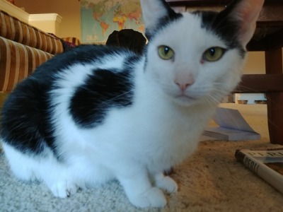
Spots on cat fur are not hard edged, they feather out. You may have to play with it. Organic shapes are fine, but not with a hard edge.
1 Like
You have a good point, they break the plane a bit too much. I was wondering if maybe I should bring them in a little bit? But I don’t want it to look like they have their heads “up” each other’s behinds. I am going to have to play with it some more with the symmetry tool in Procreate.
I honestly think I just need to do what you say, which is meticulously go in and scrutinize the tails. I think I am just going to have to flip, rotate and reflect these shapes in AI.
Thank you for the advice on how to handle symmetry in AI! It’s a huge part of the program’s function, but I’ll admit I don’t know how to utilize everything efficiently. I am going to utilize that advice and post another WIP!
“Fan out”, that is so true! I will study some stock photos (including the one you provided) of the way spots/shapes work on a cat’s fur because the hard edges in the Ying-Yang spots are detrimental.
When doing a logo, you need to determine where fine detail needs to stop.
Using effects to feather the edge of shape in a logo is usually a really big NO.
Adding detail for the sake of detail is often also a no go.
Yin-yang symbols need the dots in some fashion. Have you considered the eyes? Perhaps stylize your kitties more.
1 Like